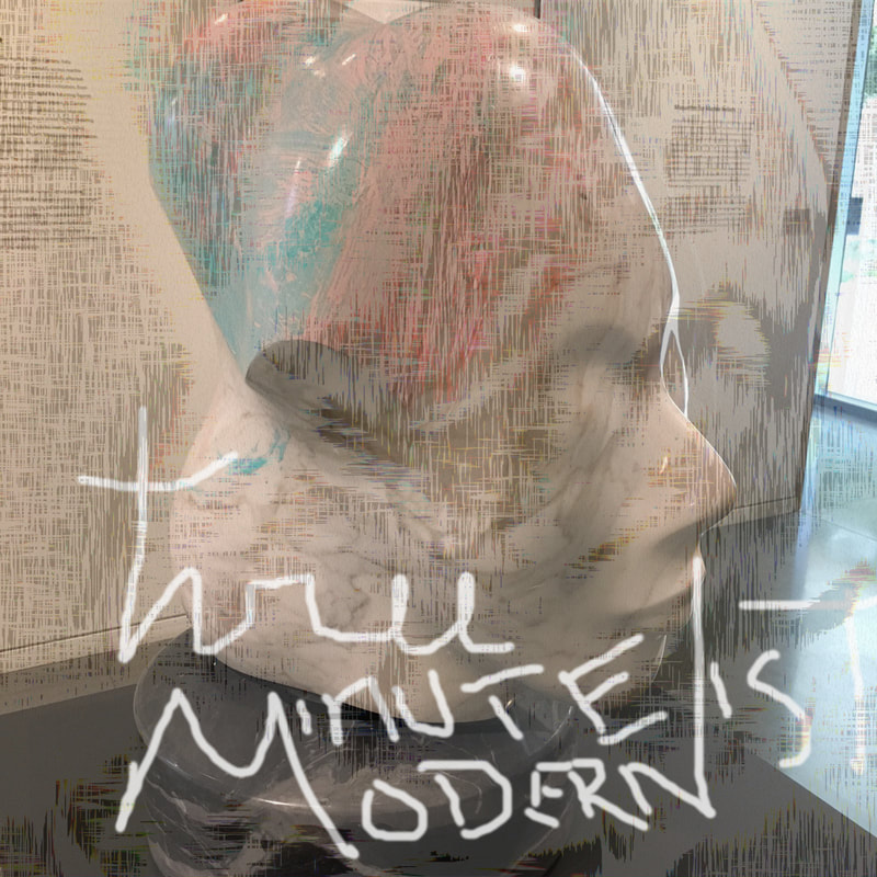
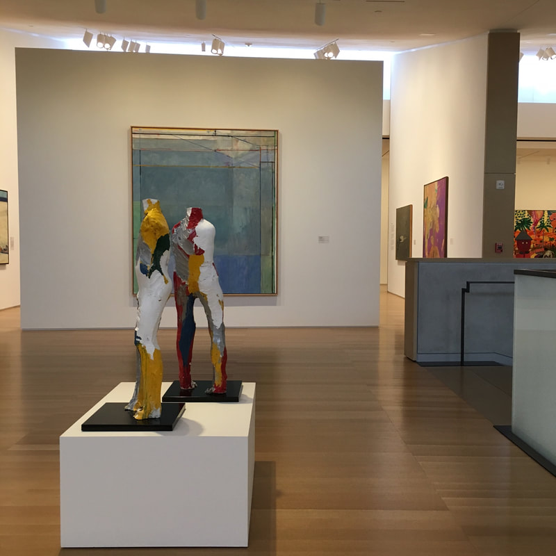
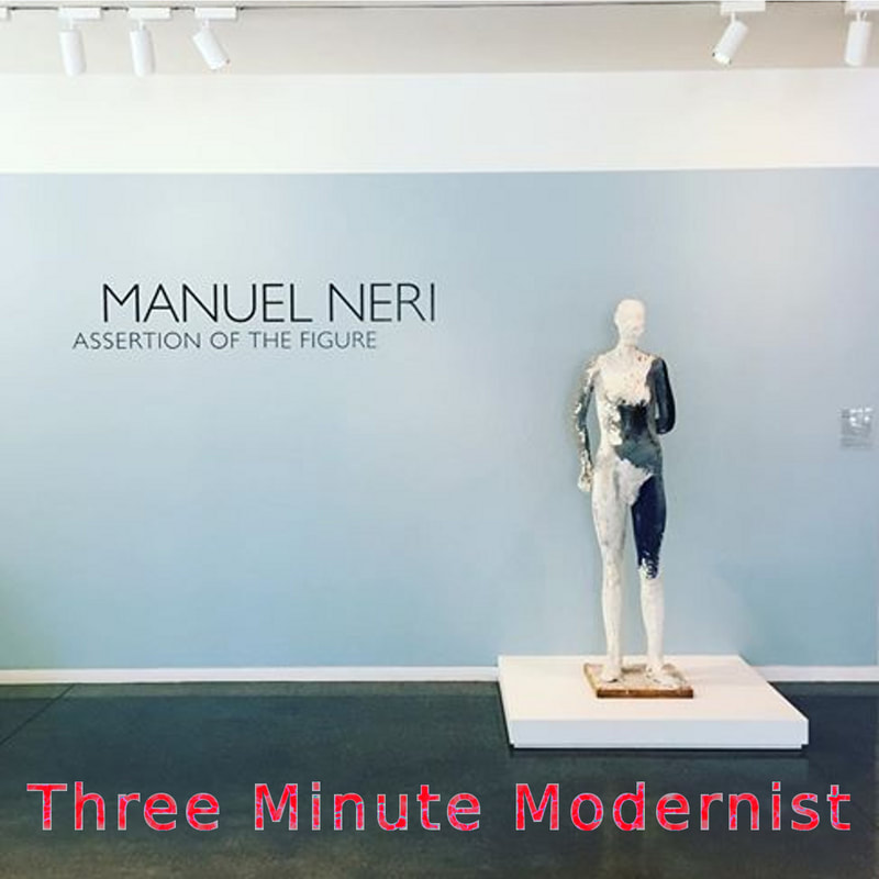
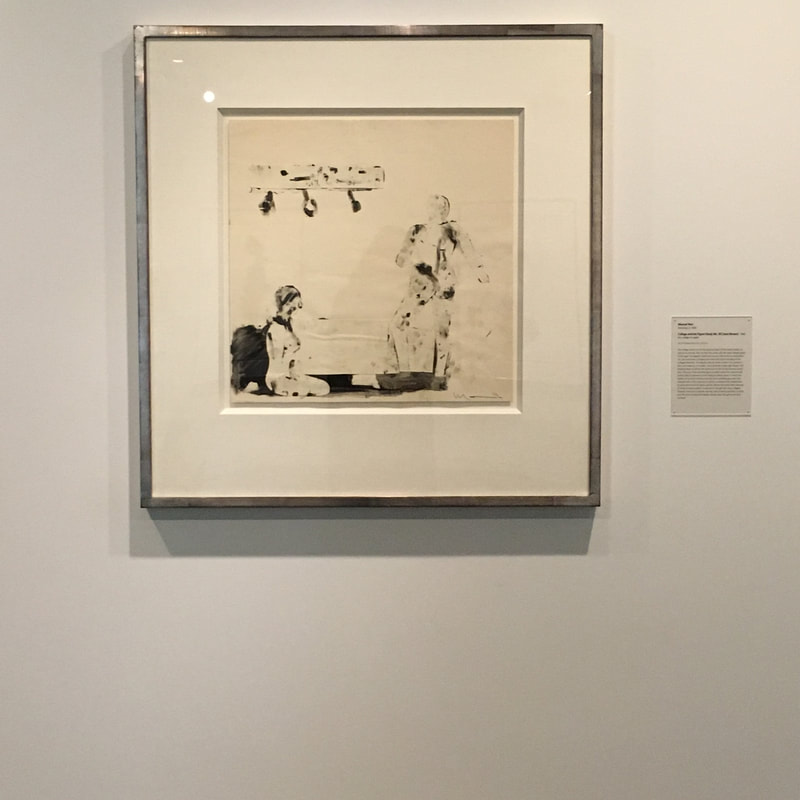
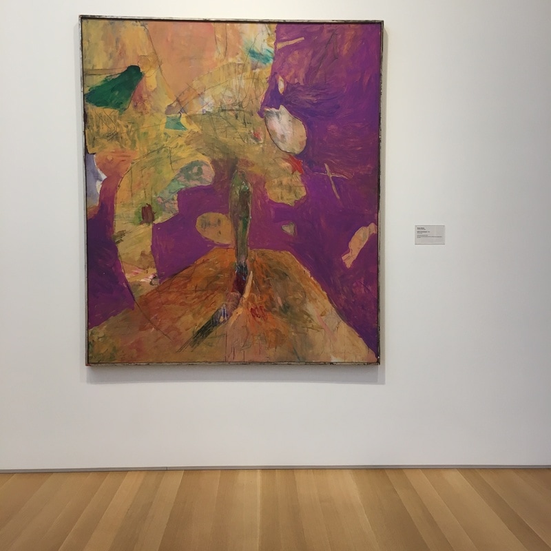
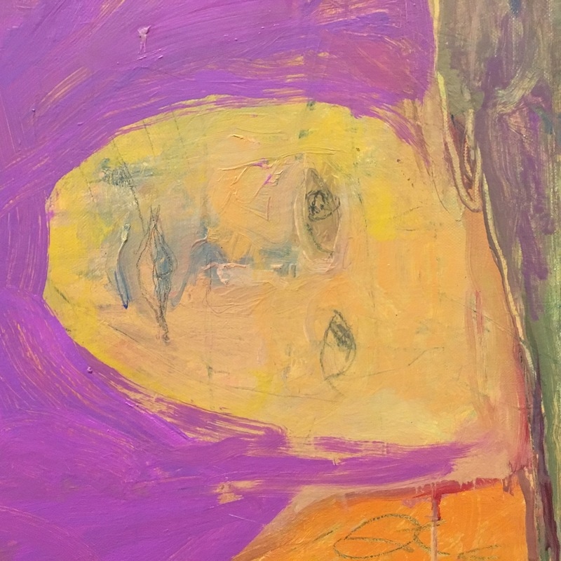
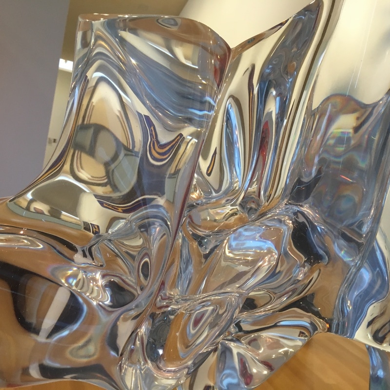
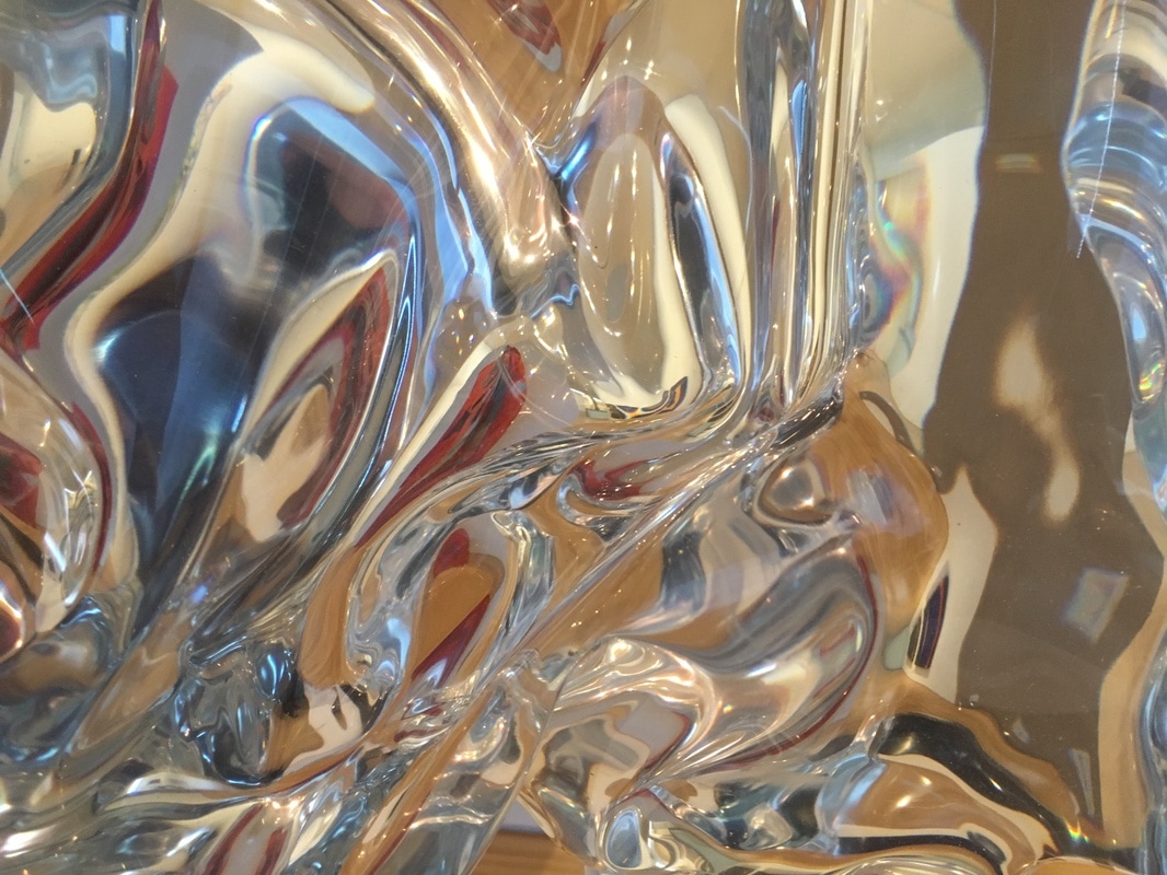
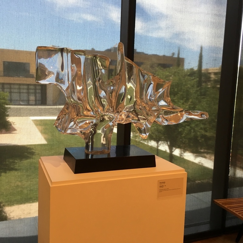
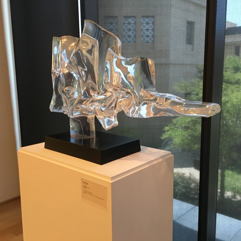
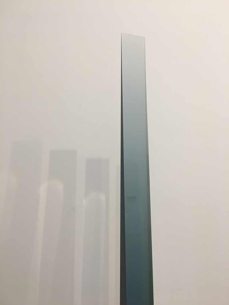
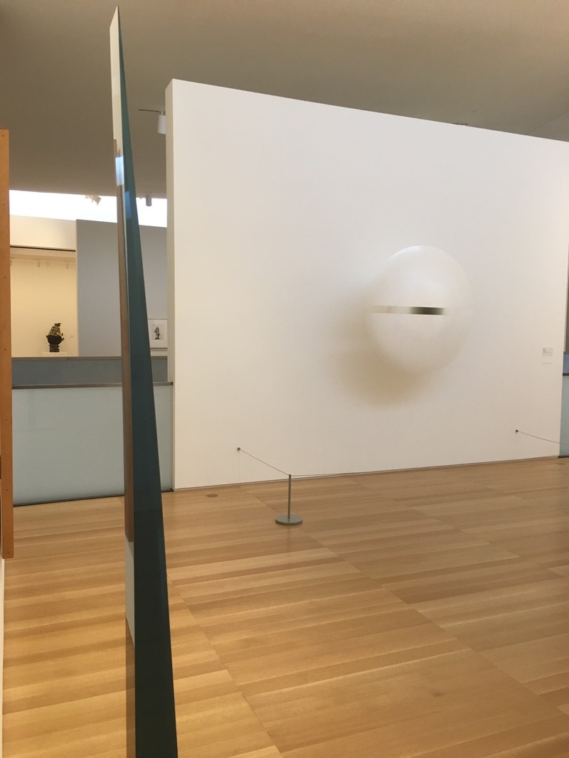
A look at one of the centerpieces of the phenomenal exhibition of Manuel Neri currently up at the Anderson Collection at Stanford!
0 Comments
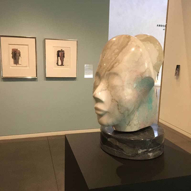
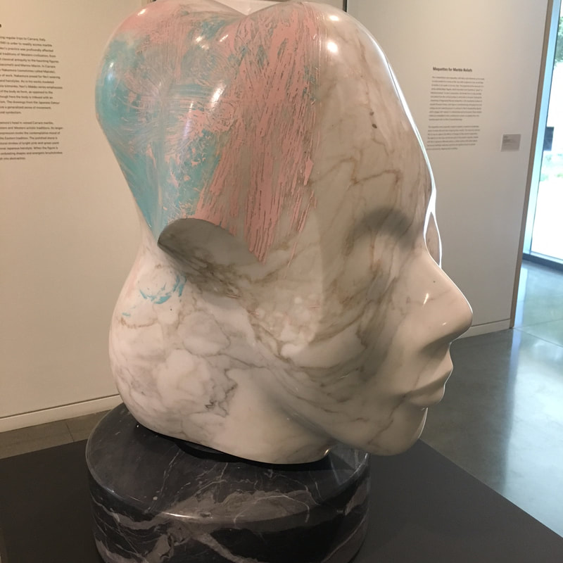
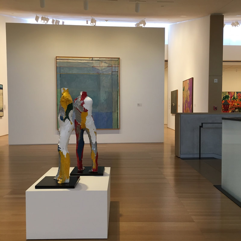
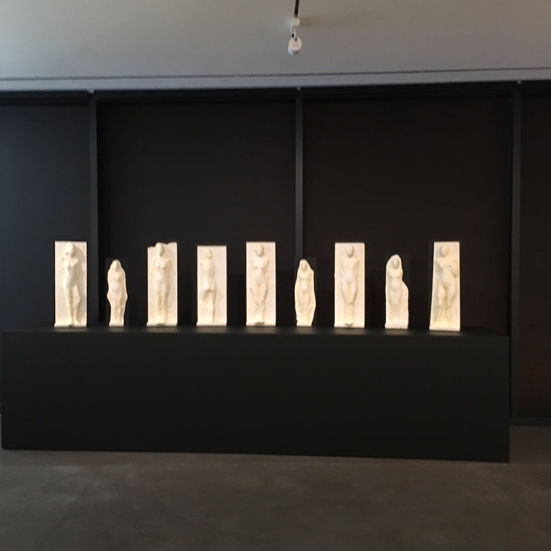
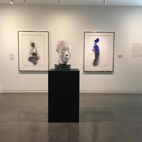
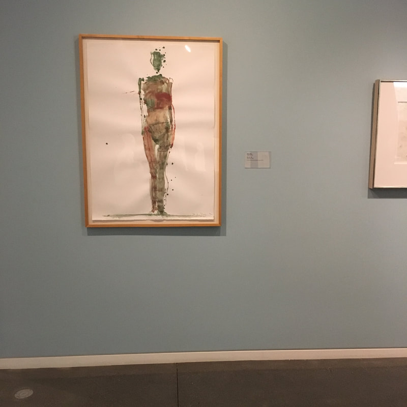
I've talked about Neri some before, about how I don't love his statuary works, but the new exhibition at The Anderson is a remarkable presentation of his work, and especially his works on paper, that really move me.
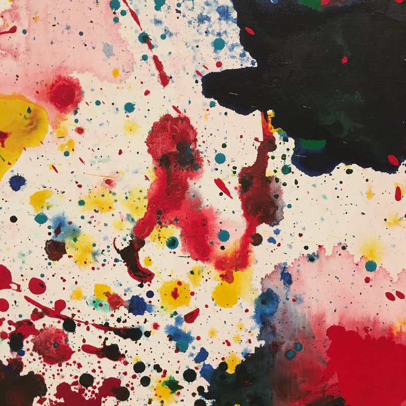
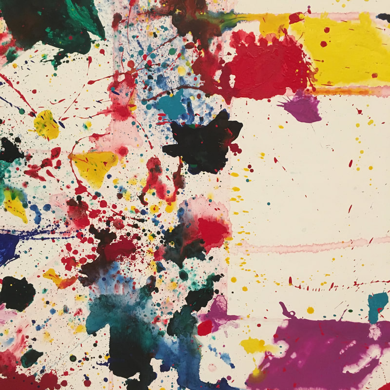
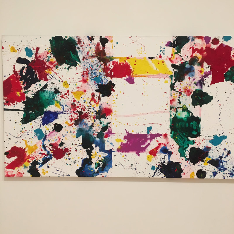
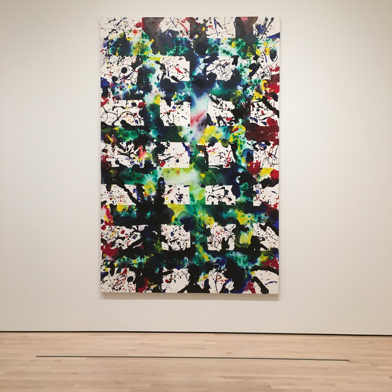
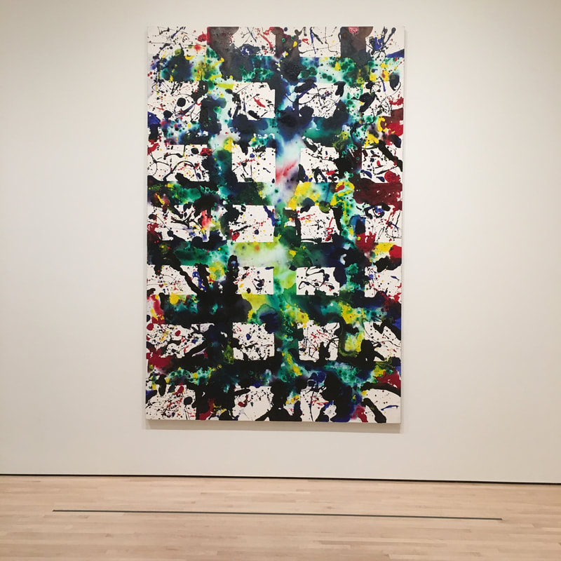
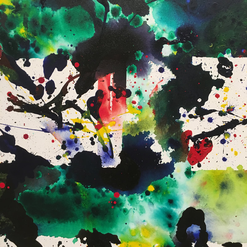
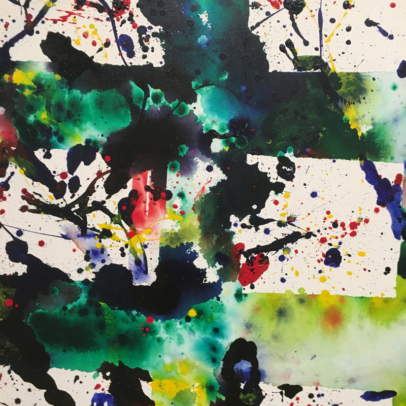
 Sam Francis is an artist in the later Abstract Expressionist vein. He was also th eman whose expressionism wasfar more colorful than Rothko, Pollock, or their ilk. In fact, Francis is more Mitchell, Abbott, Louis, or Frankenthaler than those first 'rounders. The works at SFMoMA are from 1978 and 1980, and they use the structural grid form, but then layers more paint, thin stains of acrylic across the canvas. It is more contained than many AbExers, almost Clyfford Still-esque, but it's color, my ghod the colours! The fact is his palette here is undeniably of the 1980s. It'/s not just the pastel sensation of a lot of his work, but the abutting of teals and reds, yellows and hot blues. It is the feeling of the 1980s, defined before the decade actually started. These works would help define what the 1980s would look like, moving beyond the fine arts space into graphic design, fashion, MTV. 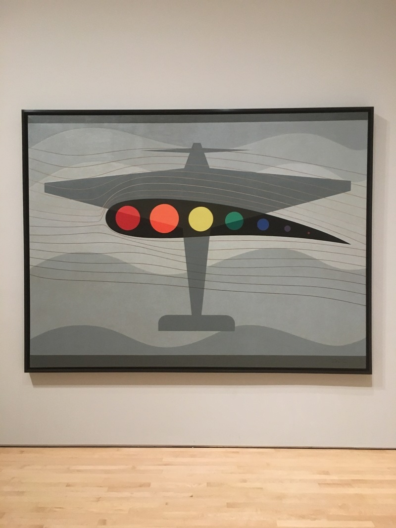 A look at a painting by an artist I had no clue about until my last visit to the SFMoMA
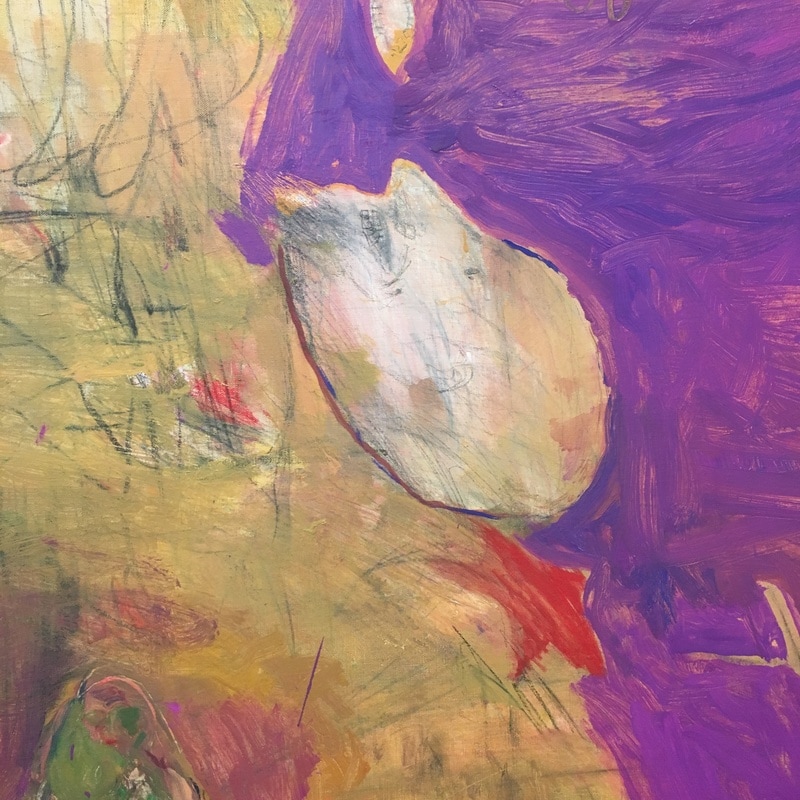
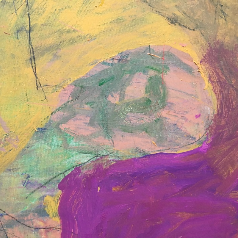
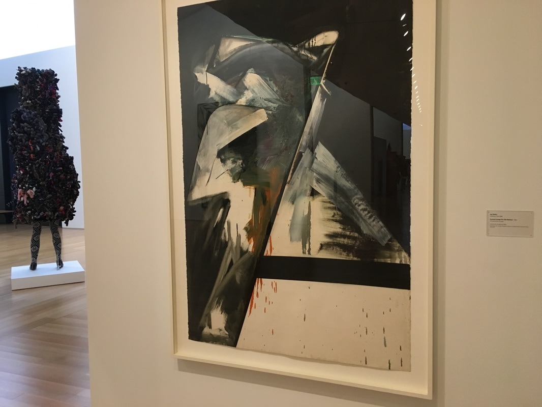
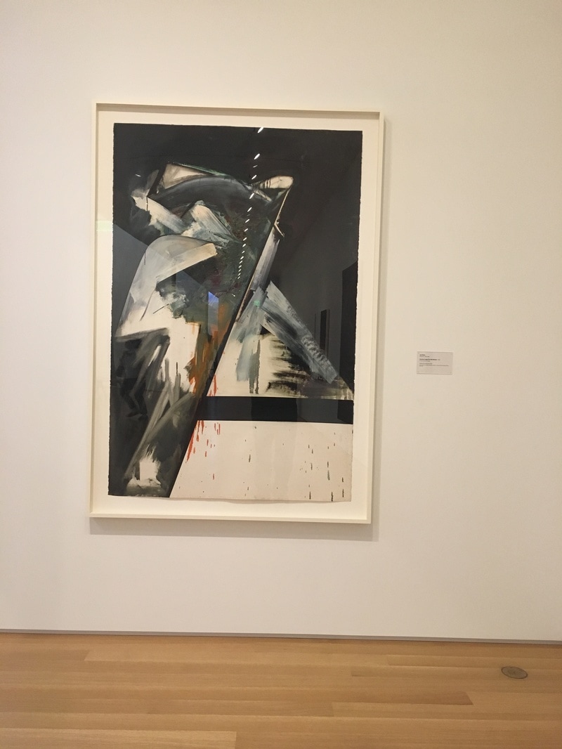
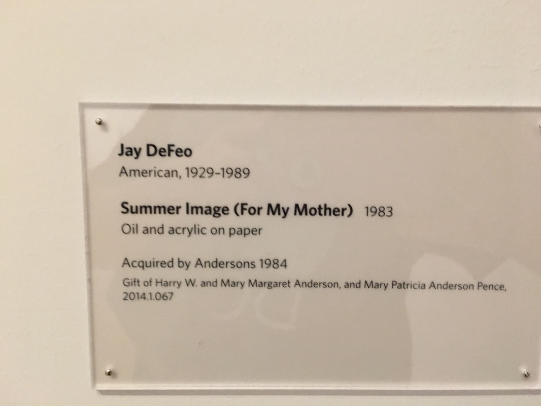
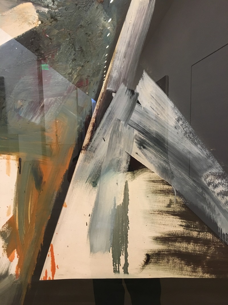
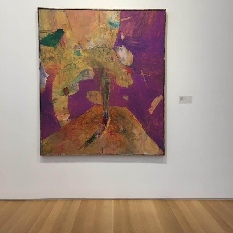 This is a form of Abstract Impressionism. It is the form, or forms, that are recogniseable, while being removed from their context, rearranged, weirded as far as I'm concerned. The effect is one of a whole that is not the sum of its parts, but the grand total of the impression it makes upon the viewer and the canvas. That's right, the canvas matters. In fact, this is an anti-deKooning. deKooning tried to create a recogniseable image in his women, but here, it is the recognition of portions that do not form a whole, or at least that do not form a Nude in Environment.
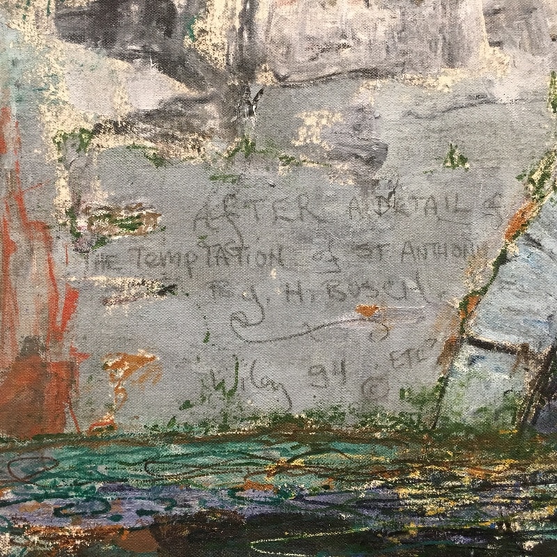
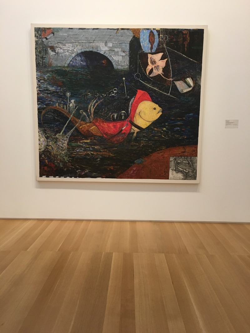
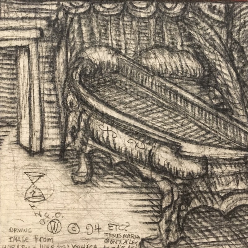
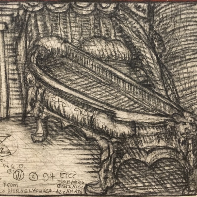
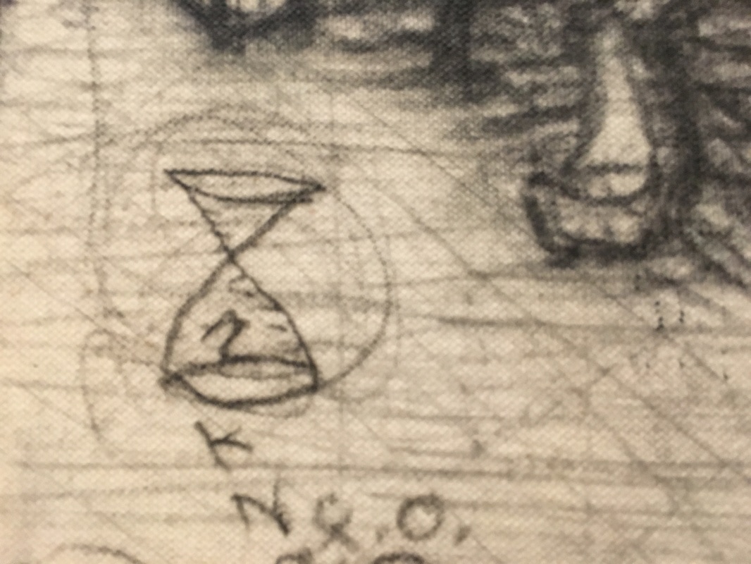
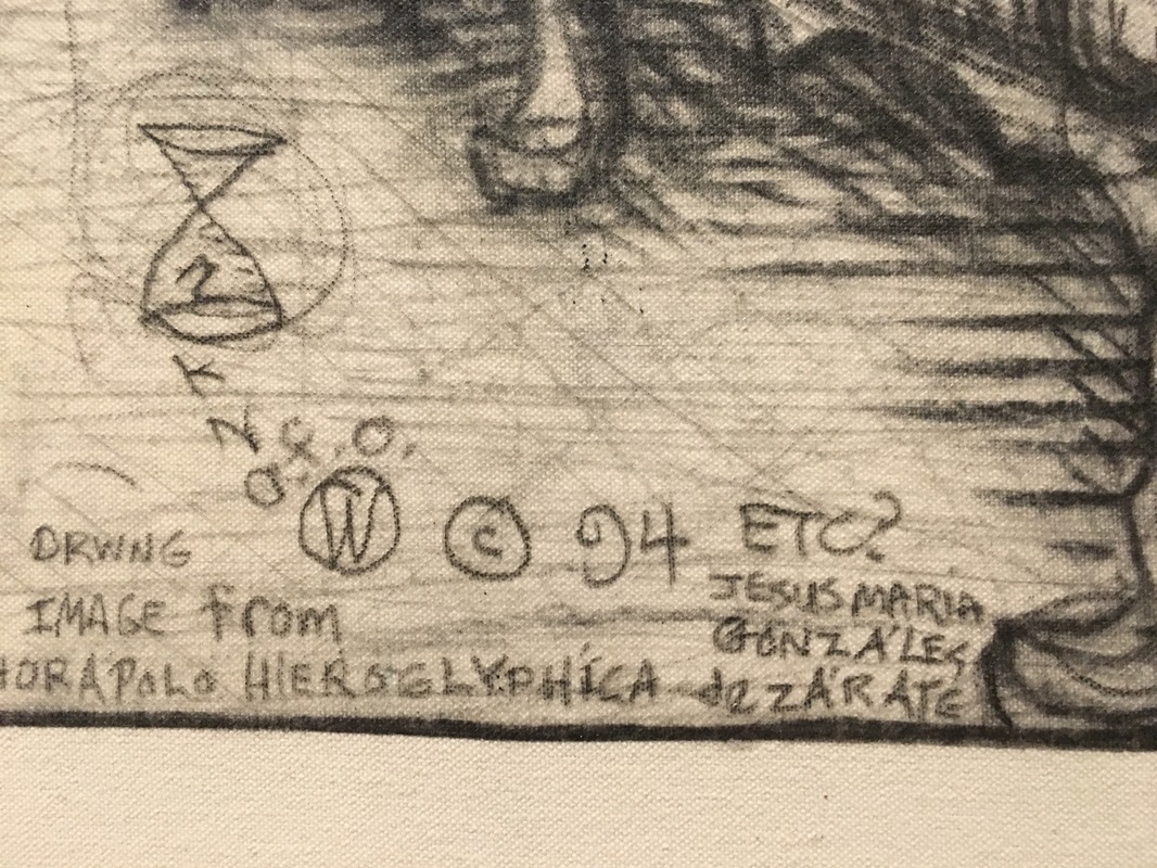
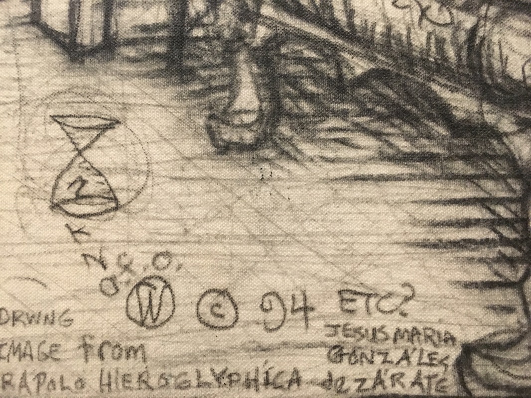
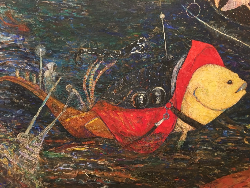
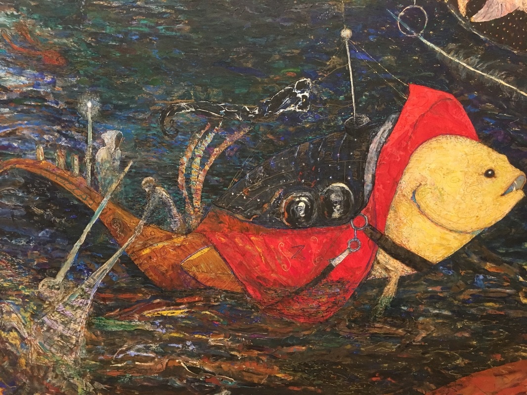
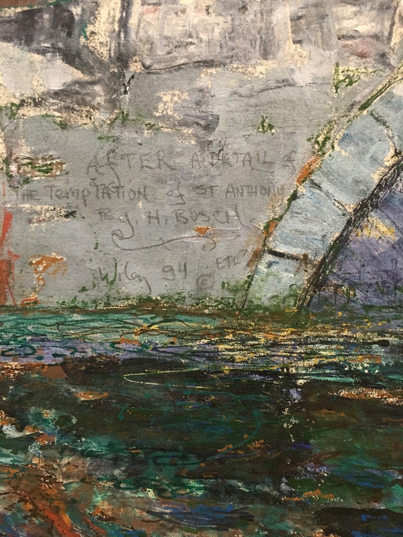
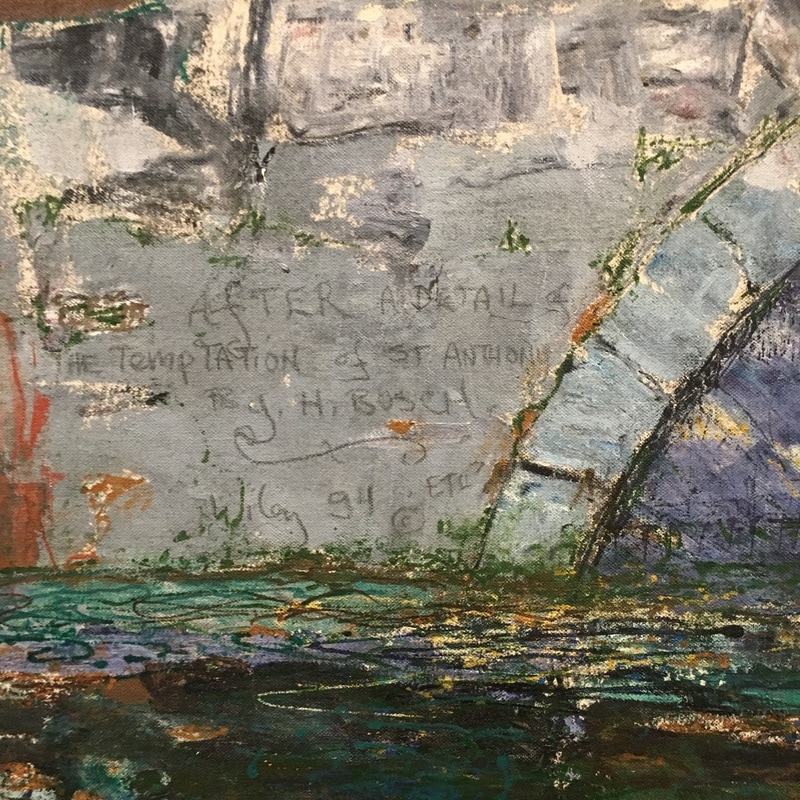
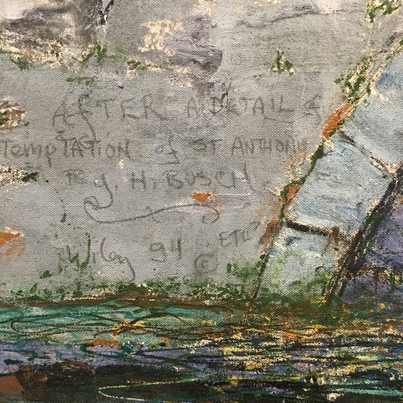
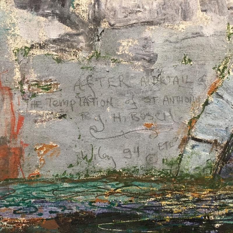
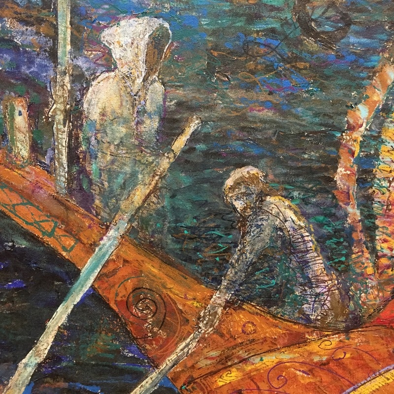
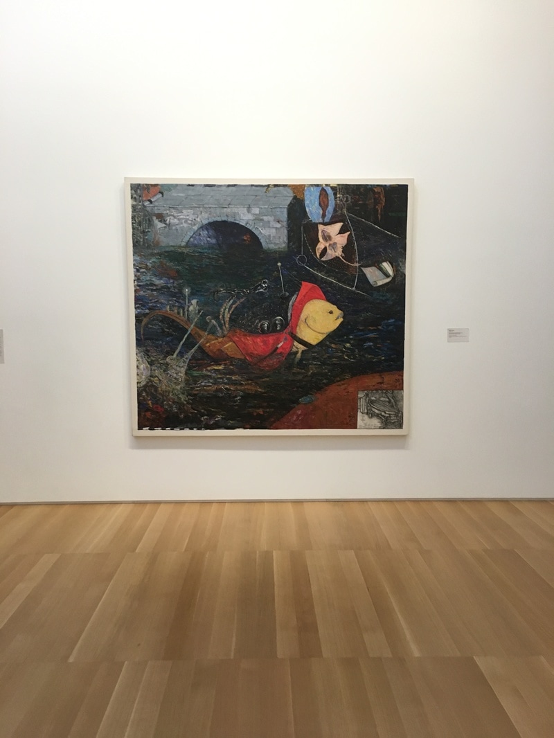
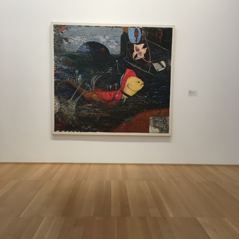
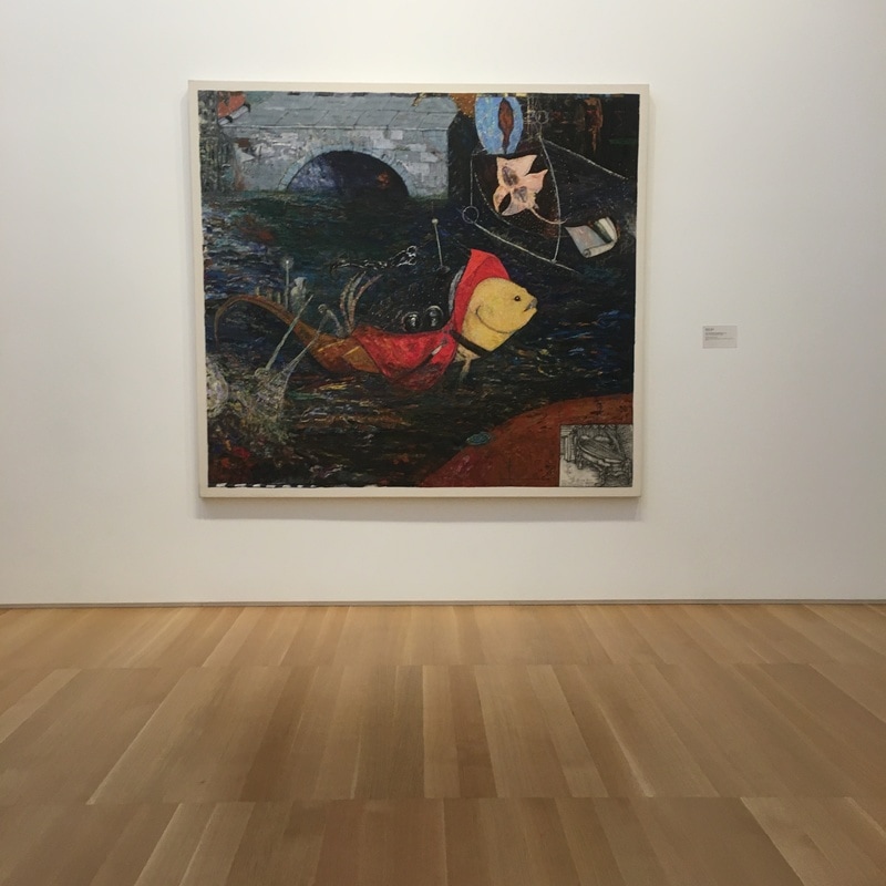
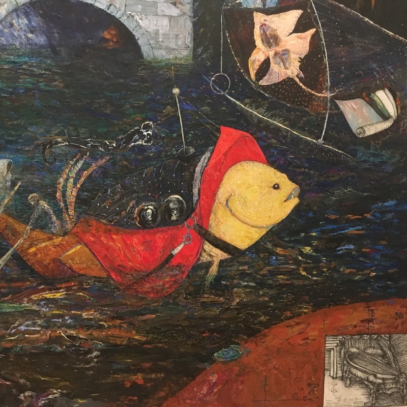
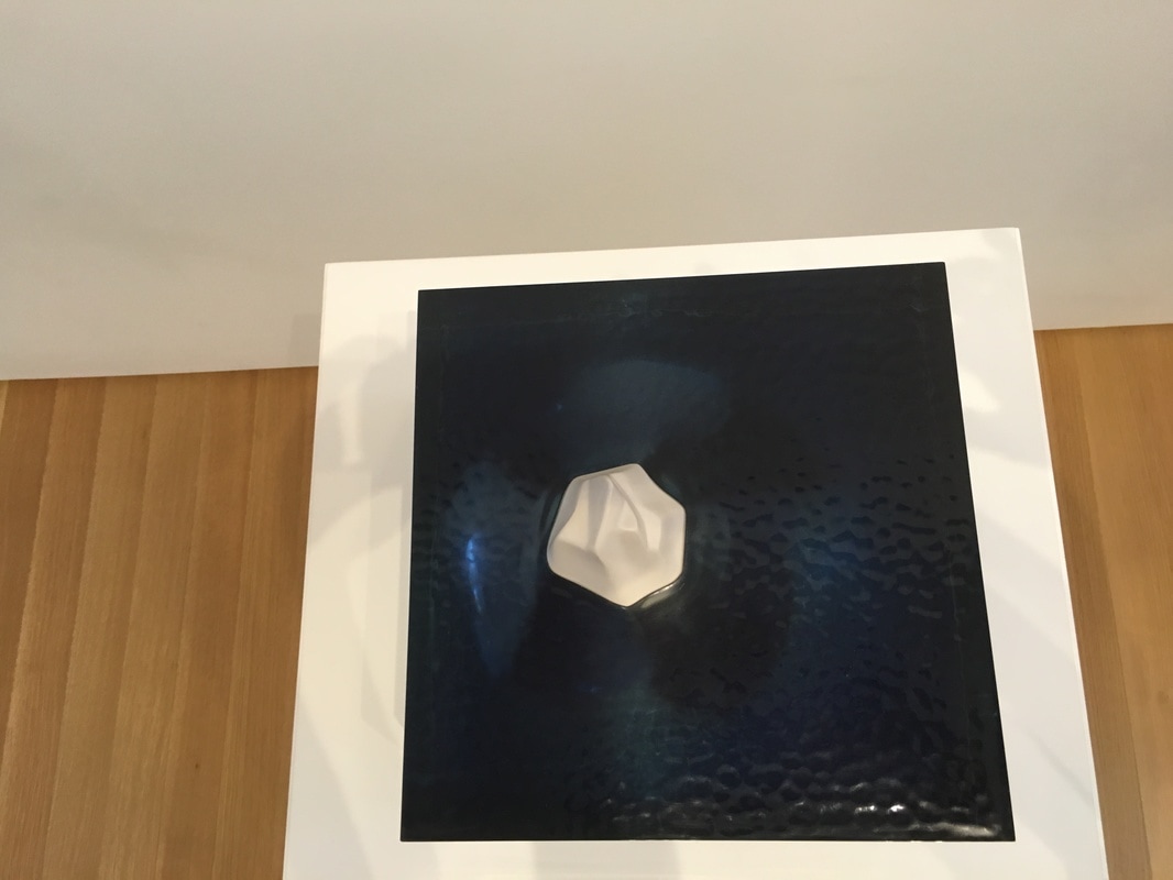
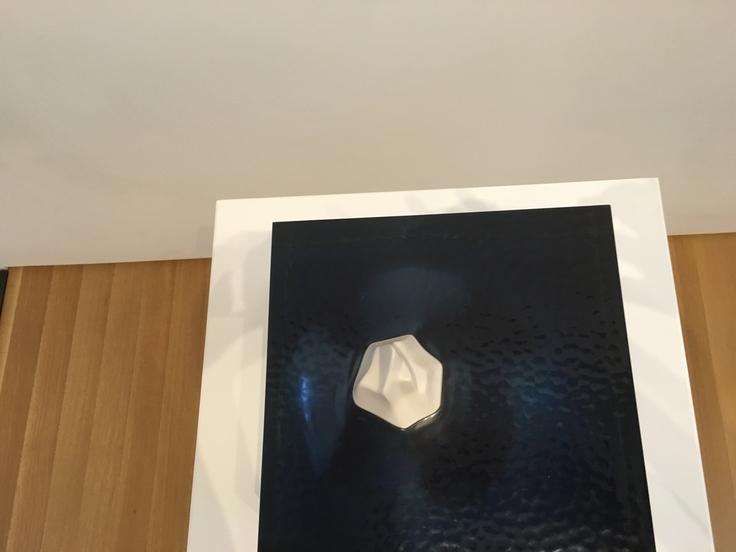
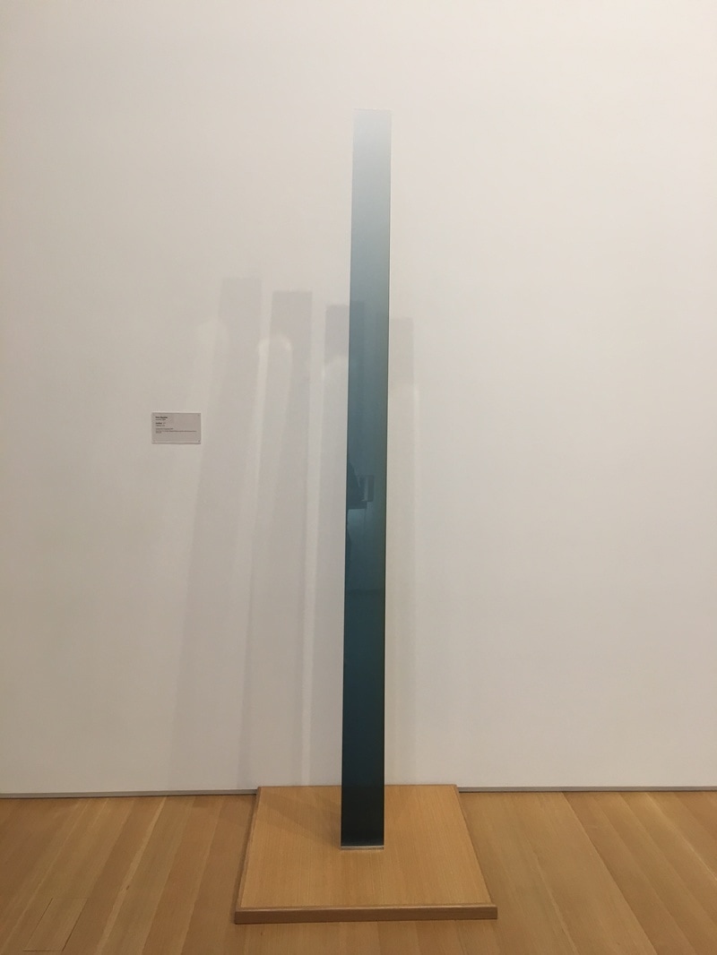
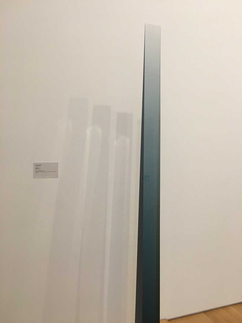
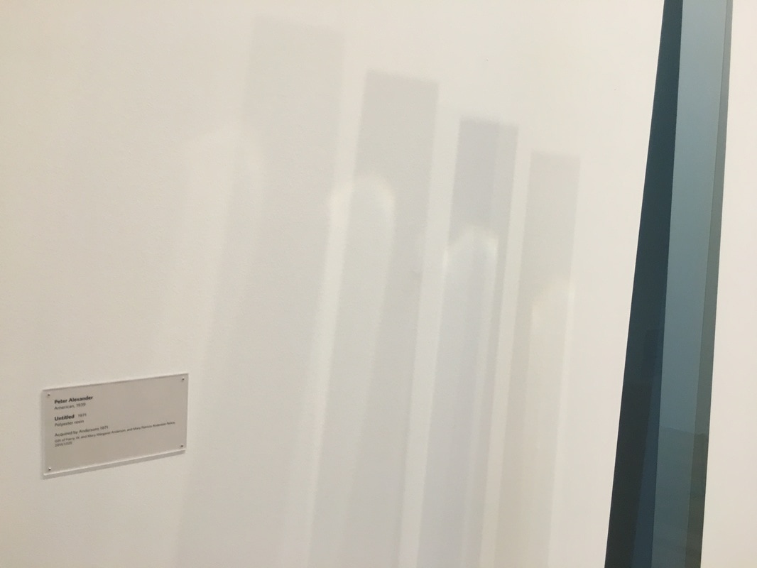
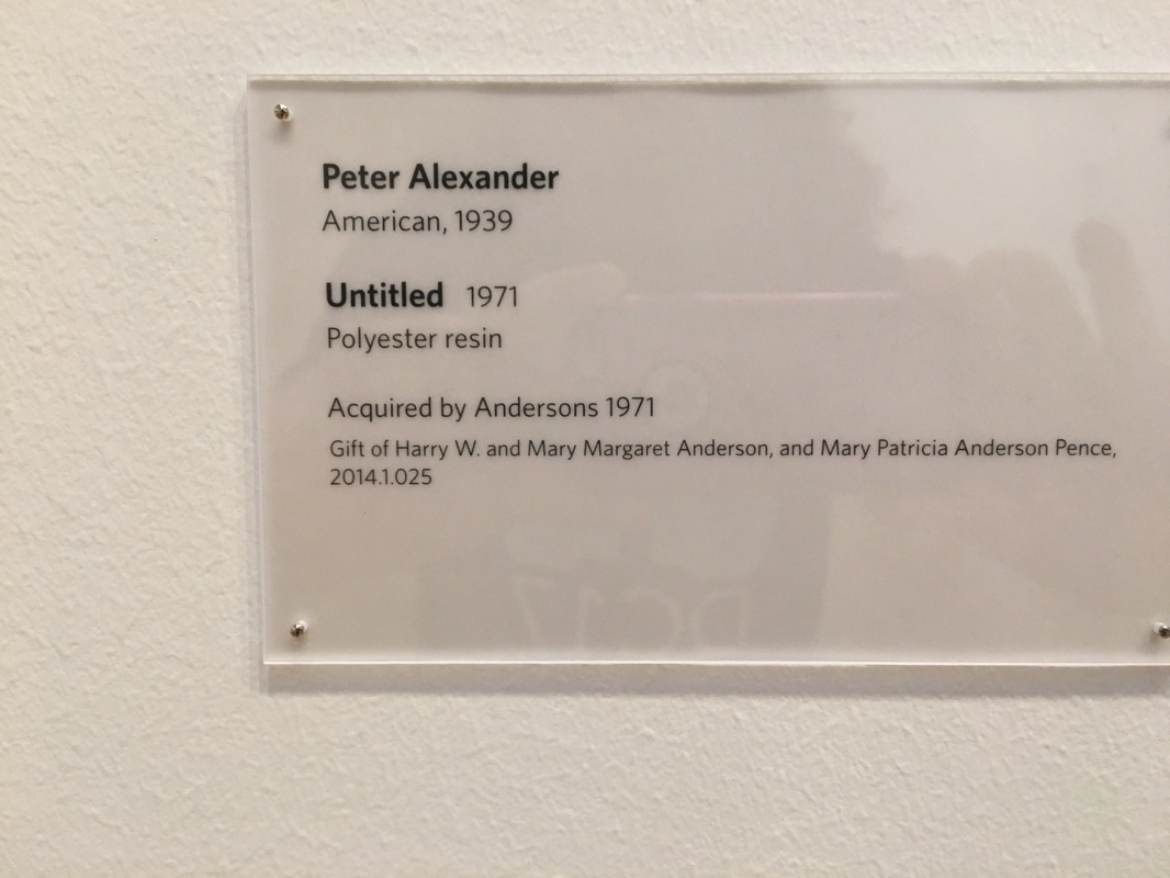
Funkadoobiest. That is what I would qualify this as. Wiley is a personal fave, and this is weird, but it is really in the deatils that this one feels, I dunno, whole. There are words, there are unrelated (or at least lightly-related) images, and there's a weird fish. The overall effect is at once Surrealist, and stylized, like an Art Deco homage to the dreams of Man Ray. It's nothing like that in presentation, but it's a cool phrase that I've been wanting to use... There is joy and terror and wonder and threat to this piece. I Love the effect it gives off, that there is life, and the connection to Heironymous Bosch, the master of mingling horror with frantic joy with existential angst with pure flippin' glee, only ramps it up a little! 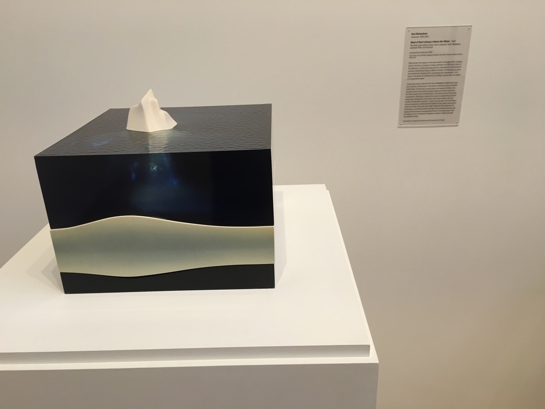 hI am 100% certain that there is great depth to this piece, that it is making many statements about meaning within the context of artistry, about only understanding a portion of anything that is in front of you because unless you look deeper, you're only getting a tiny fraction, about the inpermanence of what we see as opposed to the mass that is hidden from us. I am sure all these things exist, but for the most part, I do not experience them through this one. Because it is too calming. Perhaps it is the transluscence of the blue, of the calming aspect of the shape, but staring at this, as I often have, no matter how ragged I may feel going towards it, leaving it behind, I am smoother, softer, less harried.  How does one piece of art alter how you look at all the rest? Listen and find out! We're coming towards the end of the series, so if you've got ideas for work we should cover, or even if you' like to do an interview, lemme know - [email protected] 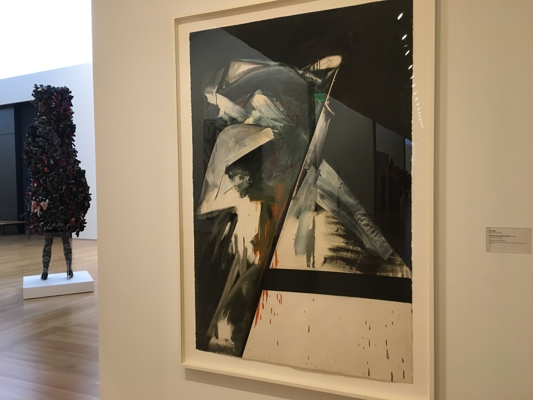 The only thing I can say about this work is that it is what it is, and the methodology seems to support the antithesis of the title. This is a picture of cool greys, |
Your HostChristopher J Garcia - Curator, Fan Writer, Podcaster, and a guy who just loves art. Archives
February 2019
|


 RSS Feed
