|
We are pleased to being a series of podcasts of a wonderful art conversation with Rachel of We Are Weezer (https://www.weareweezer.com/)
This time, like all conversations, it starts with Warhol.
0 Comments
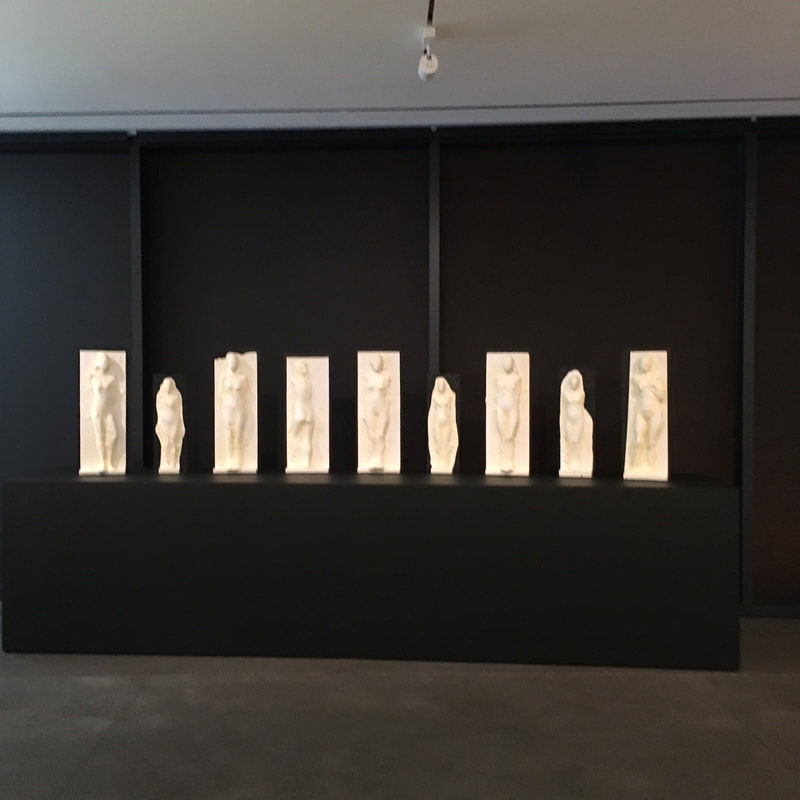
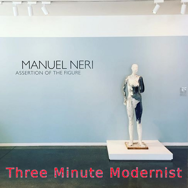
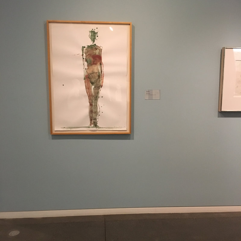
I've talked about Neri some before, about how I don't love his statuary works, but the new exhibition at The Anderson is a remarkable presentation of his work, and especially his works on paper, that really move me.
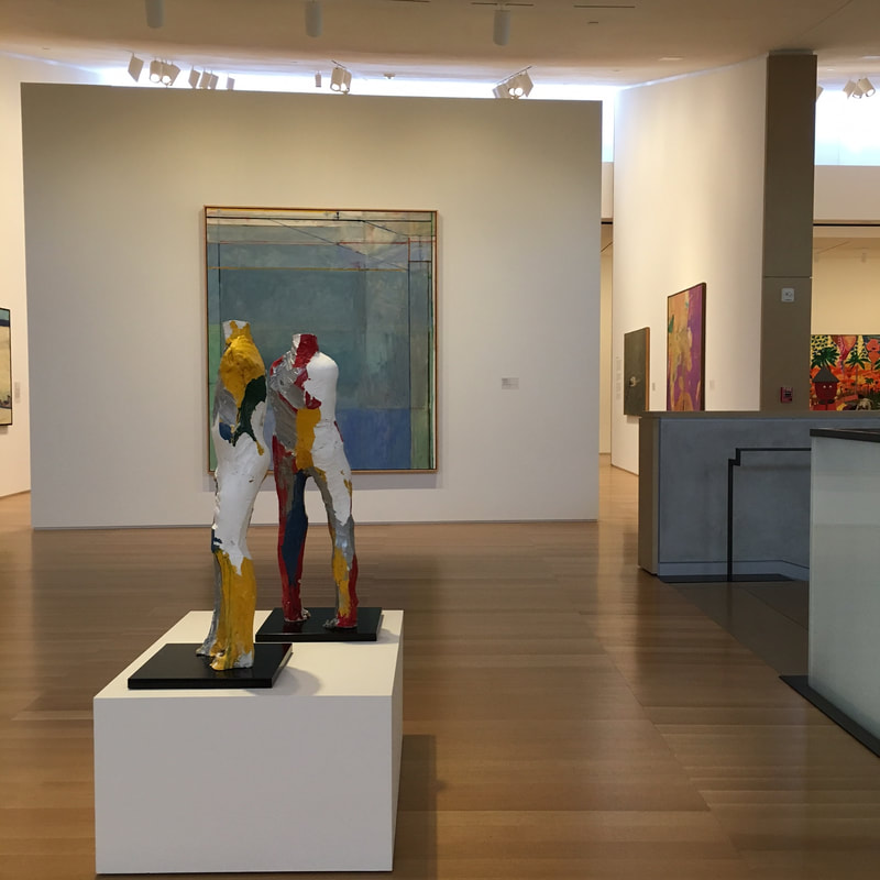
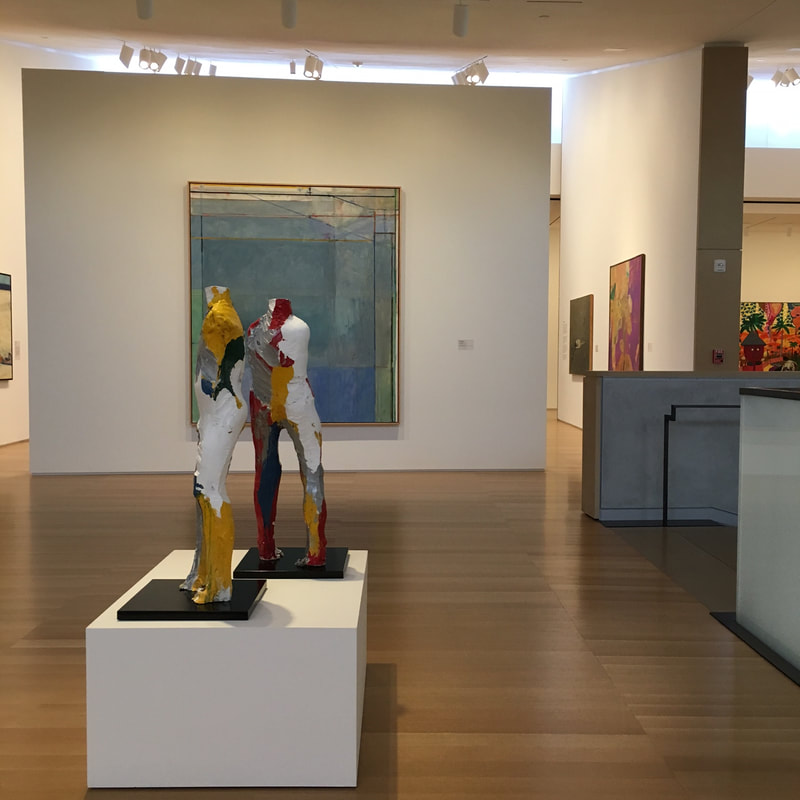
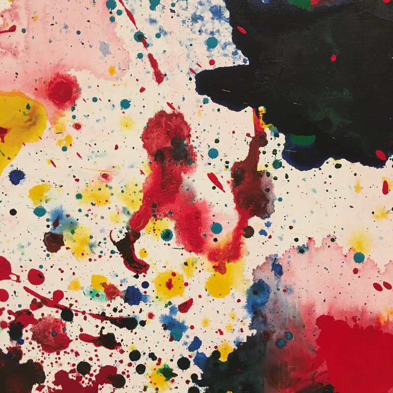
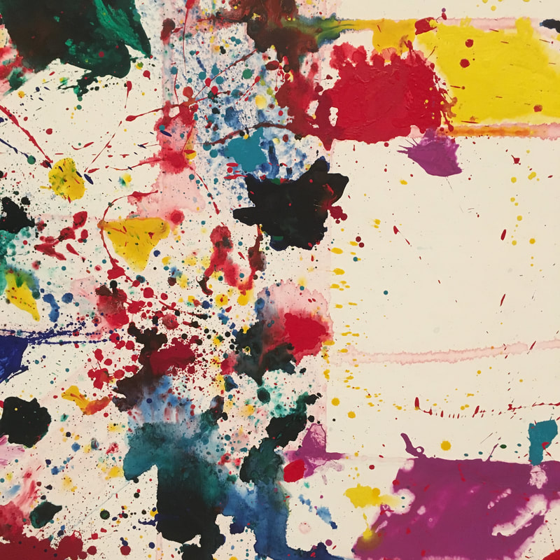
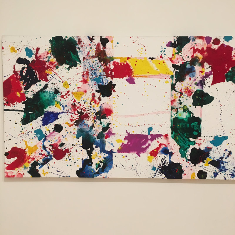
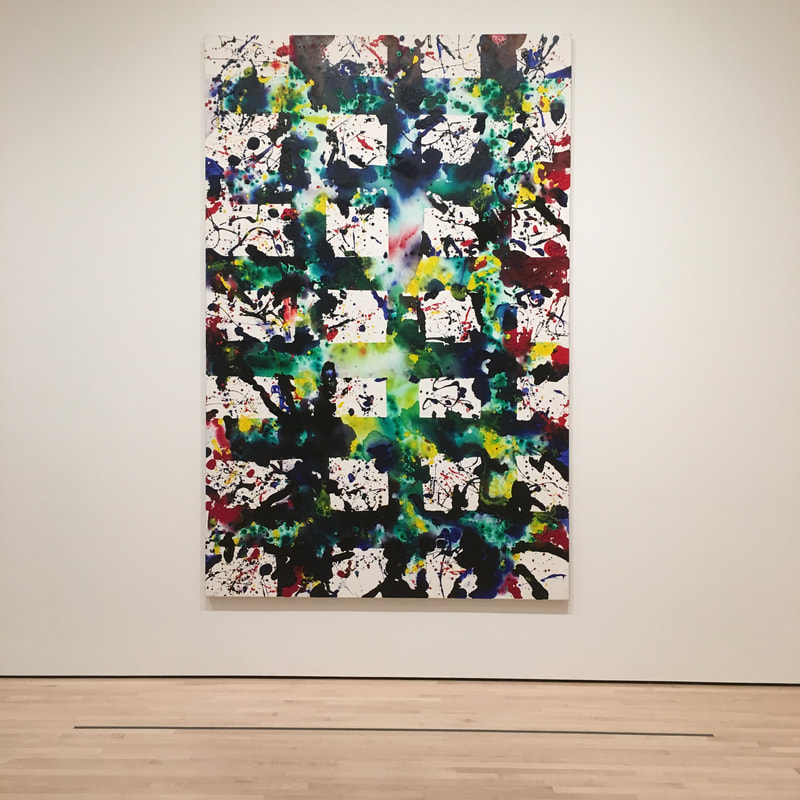
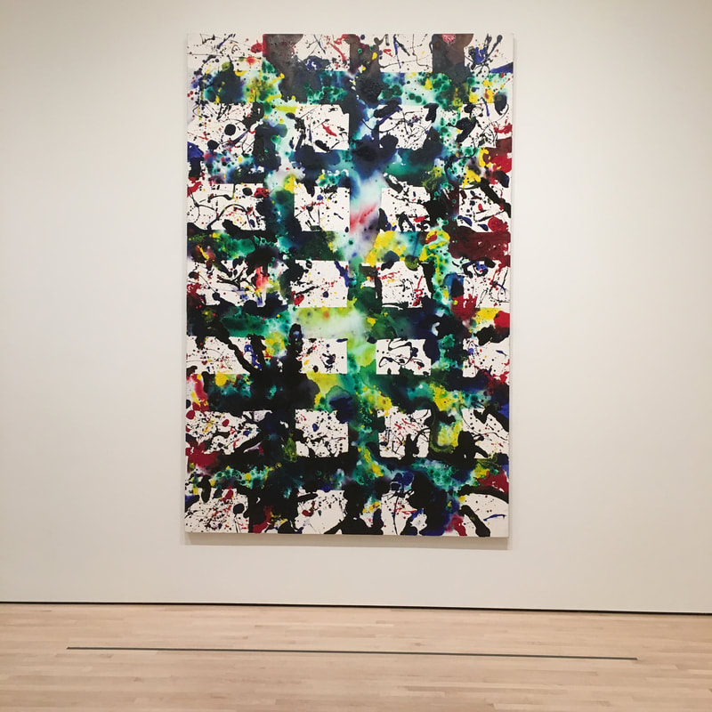
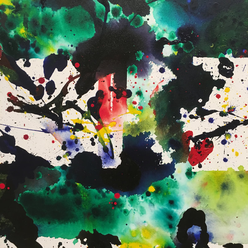
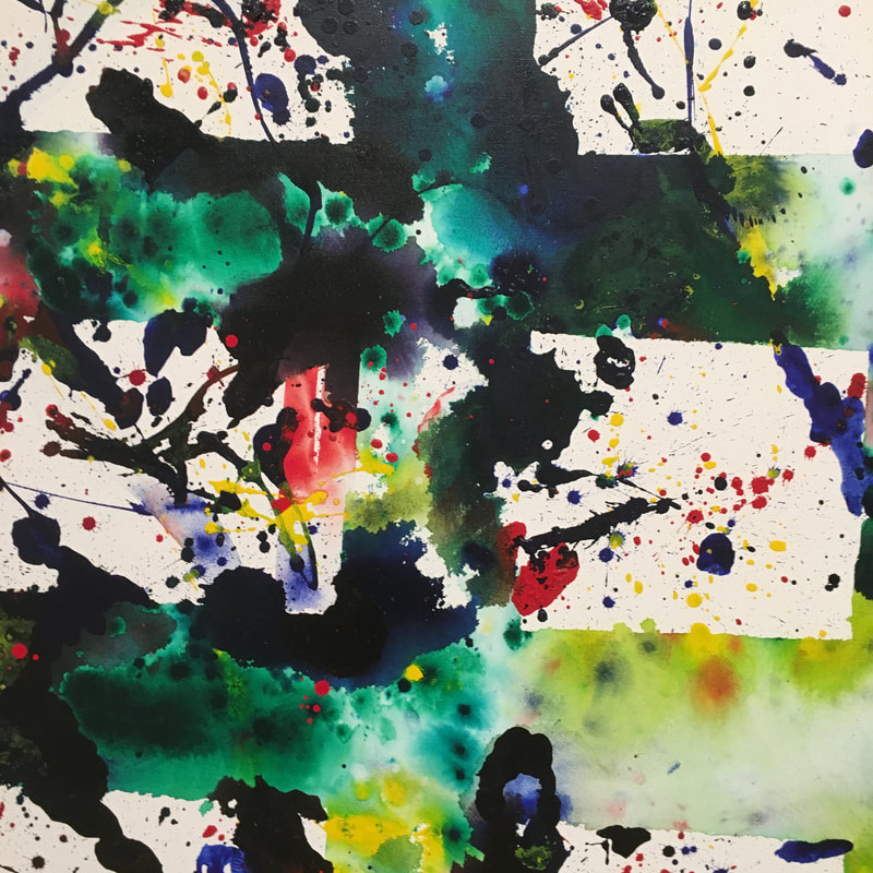
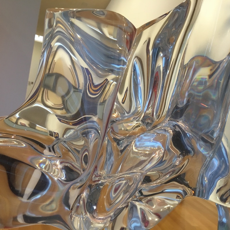
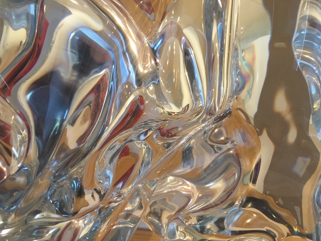
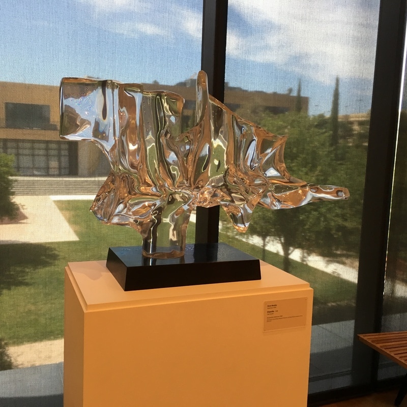
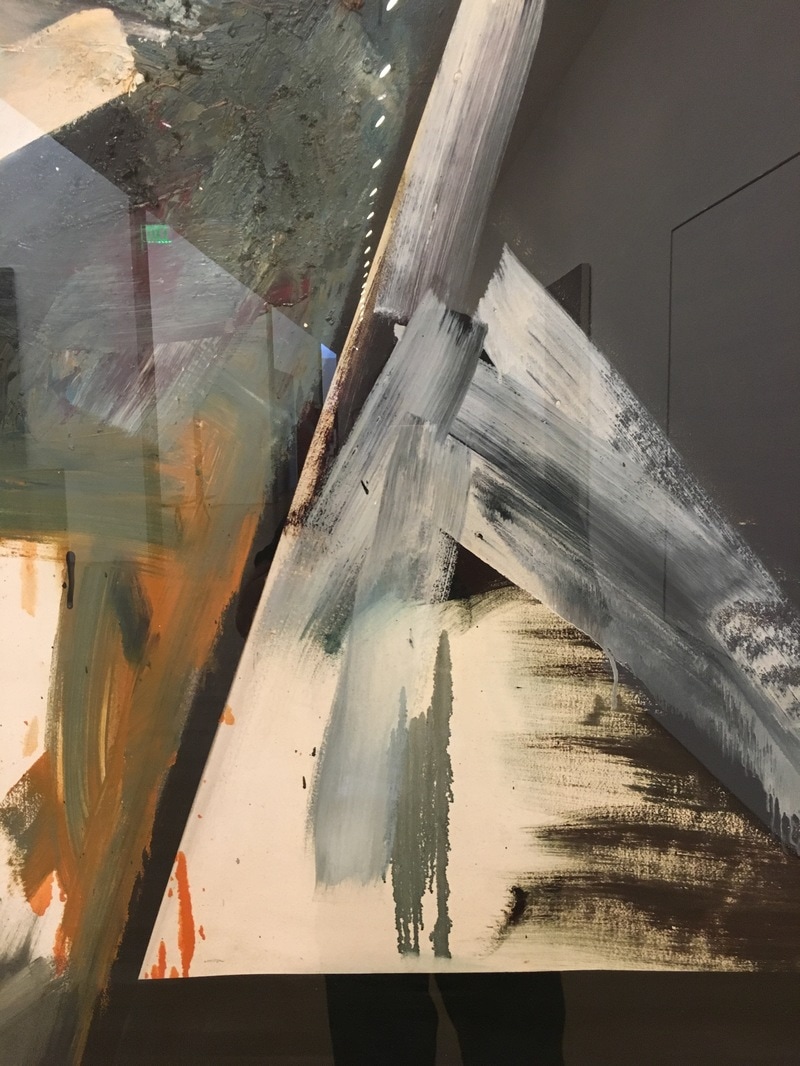
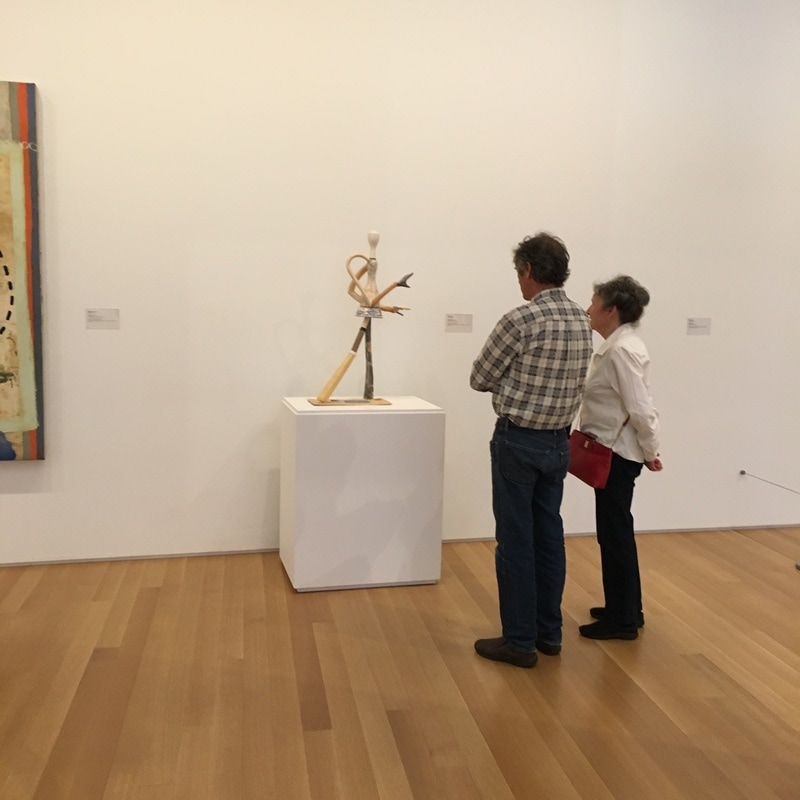
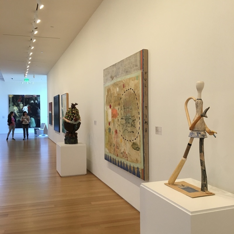
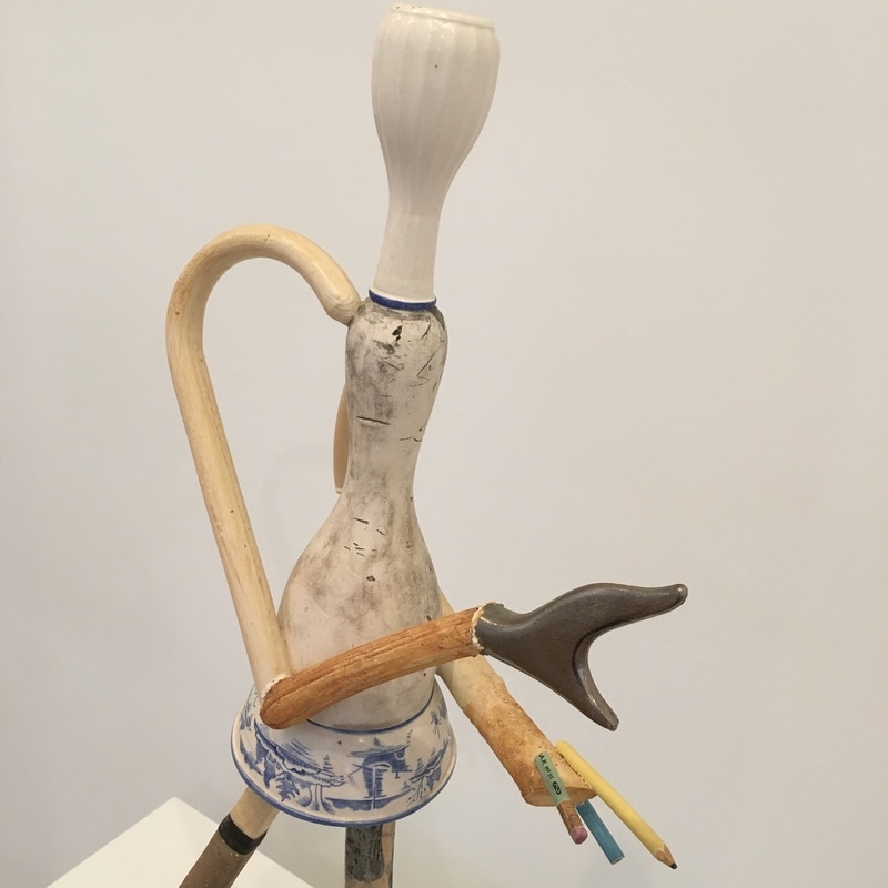
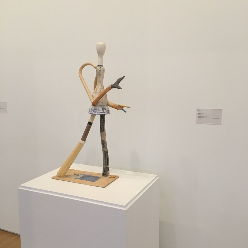
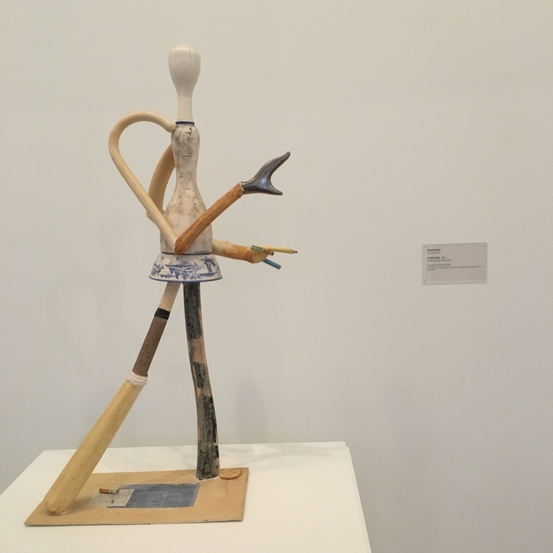
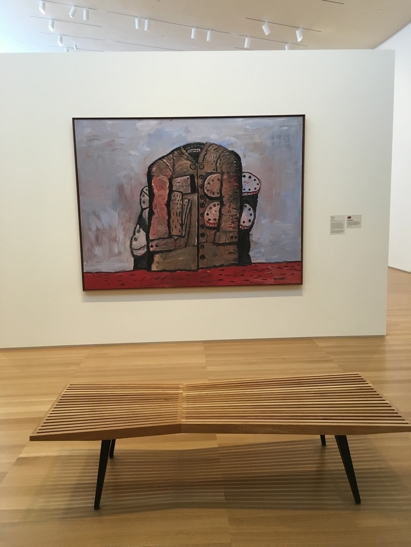
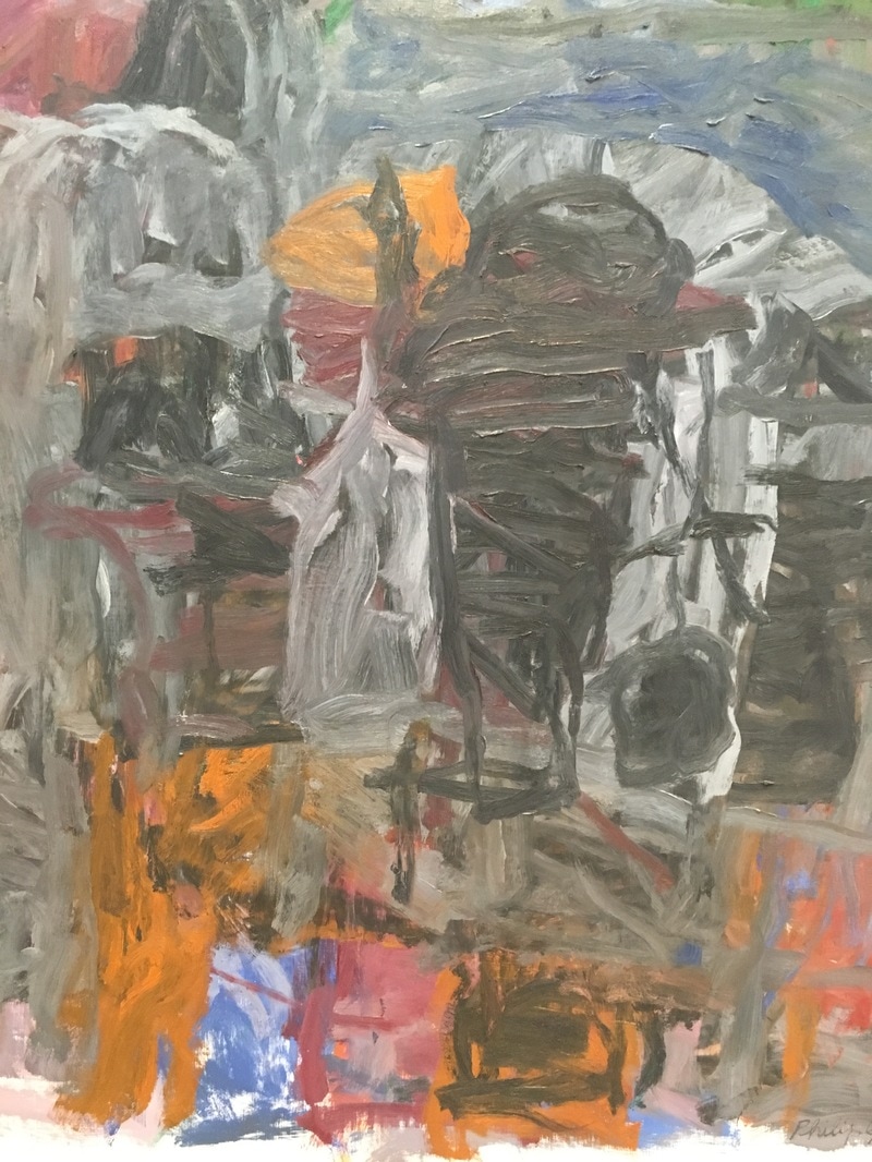
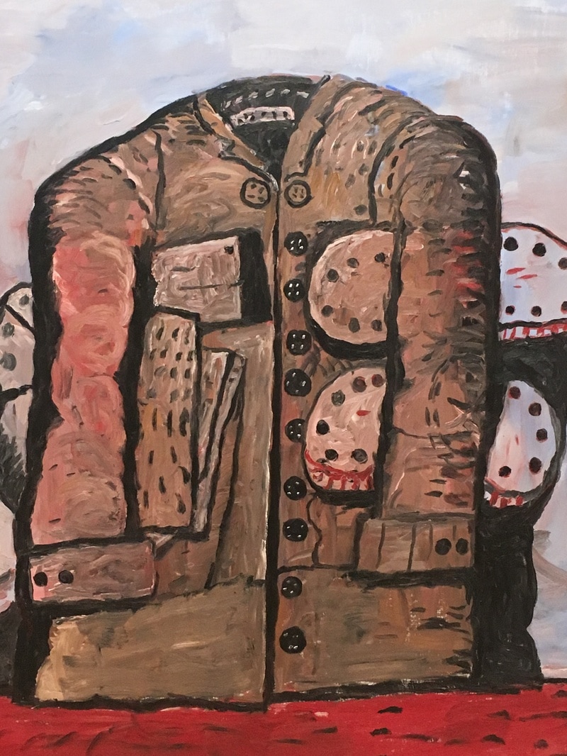
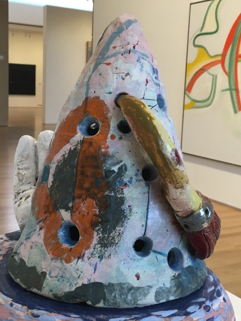
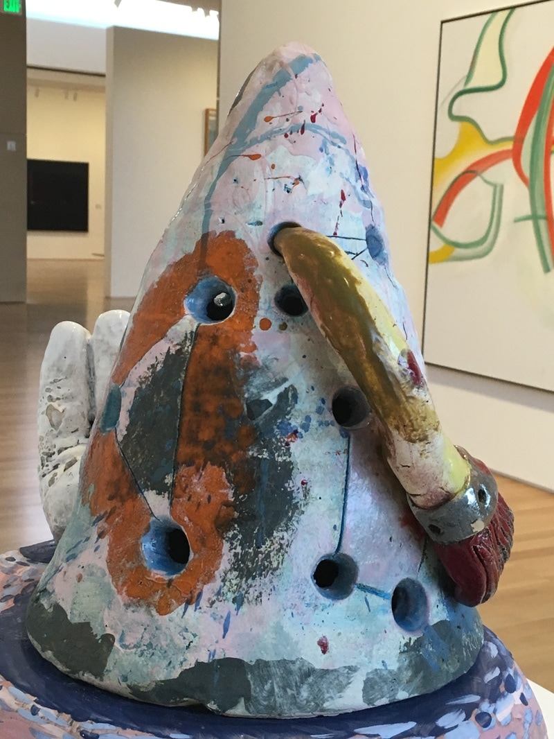
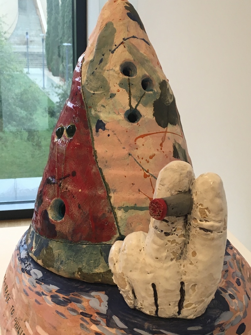
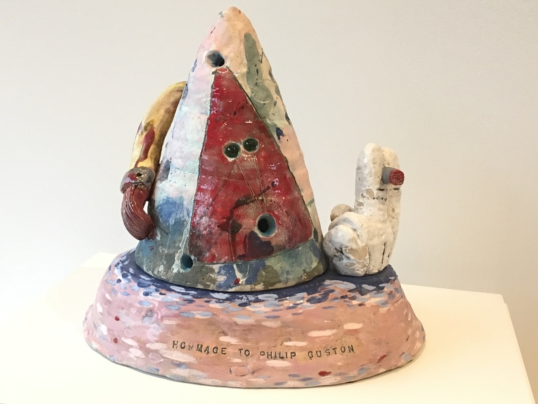
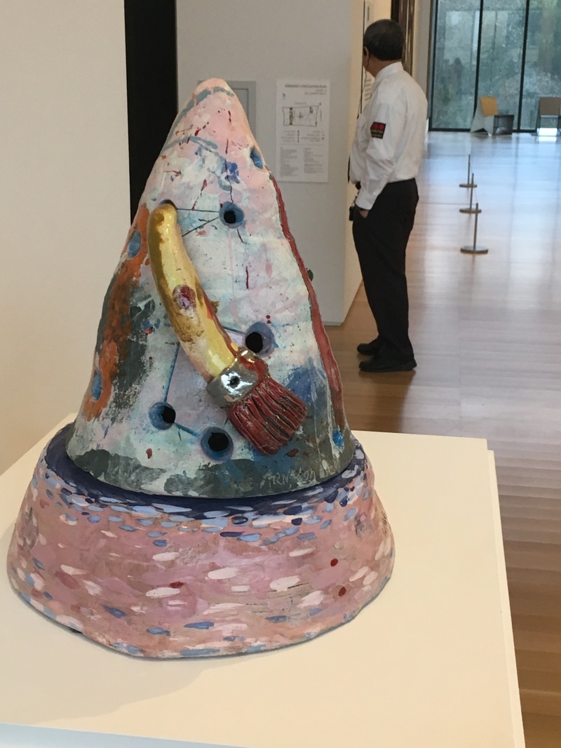
 Sam Francis is an artist in the later Abstract Expressionist vein. He was also th eman whose expressionism wasfar more colorful than Rothko, Pollock, or their ilk. In fact, Francis is more Mitchell, Abbott, Louis, or Frankenthaler than those first 'rounders. The works at SFMoMA are from 1978 and 1980, and they use the structural grid form, but then layers more paint, thin stains of acrylic across the canvas. It is more contained than many AbExers, almost Clyfford Still-esque, but it's color, my ghod the colours! The fact is his palette here is undeniably of the 1980s. It'/s not just the pastel sensation of a lot of his work, but the abutting of teals and reds, yellows and hot blues. It is the feeling of the 1980s, defined before the decade actually started. These works would help define what the 1980s would look like, moving beyond the fine arts space into graphic design, fashion, MTV.  How does one piece of art alter how you look at all the rest? Listen and find out! We're coming towards the end of the series, so if you've got ideas for work we should cover, or even if you' like to do an interview, lemme know - [email protected] 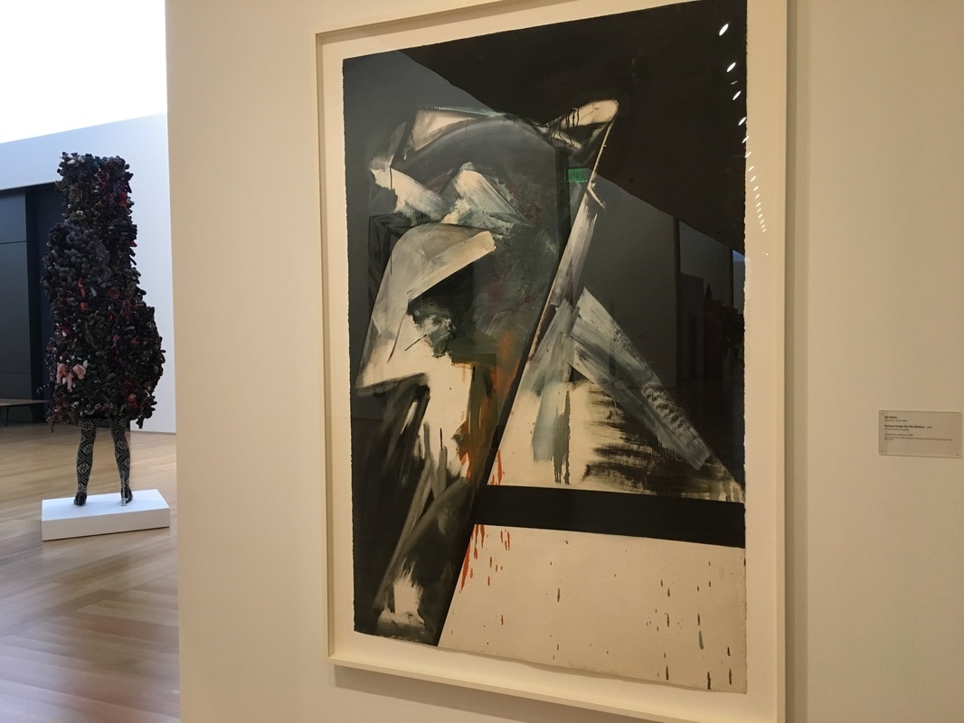 The only thing I can say about this work is that it is what it is, and the methodology seems to support the antithesis of the title. This is a picture of cool greys, 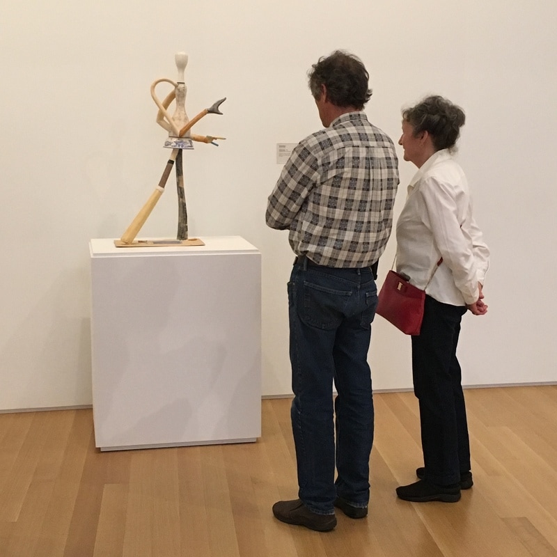 We all remember the moment we fall in love, right? For me and The Anderson, it was here, staring at this piece, a good five minutes after I arrived and made my first fast circuit around the place. This was the piece that got me, the piece that I fell in love with, the piece and made me think about doing this series, writing these pieces, going back again and again and again. I have a thing for sculptures that use found objects, and more so for things that bring them together in a way that establishes an emotional sensation, which this does in spades. To me, this is a story. A story of disunity, how we are all constructed of bits and pieces, often cast-offs of what we used to be, might have been, wanted to become. We are a disunity of these ideas, these dreams, and when we take that step forward, when we reach for a whole, a cohesion, we are still that muddled whole, that assemblage of pieces disloyal and ill-fitting. But we try. We take that step, just like the Canton woman, and we reach forward. It is likely that once we pull the weight off the back foot and try to take another, we'll still be this inharmonious entity without a singular form, but we will have gone forward, perhaps placed ourselves in a new scenario where our inability to become a single thing is our calling card, our definition, our desired trait. Like maybe an art museum, where these things are celebrated. 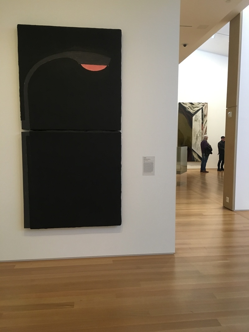 If I have one complaint about what is on view in the Stanford's Anderson Collection, it is the last of Pop Art. Yeah, there are a few pieces, but no Rauschenberg, Warhol, or Lichtenstein, though I know that some of it is on display at SFMoMA. It happens, though I know there are several of each of those folks in the collection. The piece on the floor as I visited that most was a Donald Sultan work depicting a streetlight. Why is it Pop Art? I mean, wasn't Pop mostly a 1960s thing and this is from the 80s? Yeah, true, but art movements don't so much as have edges as they do areas as fuzzy as the boundries of Rothko squares. Sultan chose a simple recogniseable image and gave it to us against a simple black background. There is nothing about the subject that would give us any idea as to the importance of it in the world. It's a street light, that's all. Like Warhol's soup cans or Lichtenstein's comic book images, it's not important what the subject is; it is important that it is being presented on a wall in a museum. It is a lovely piece, and the way it is presented in the space is what made it for me. It is on the end of a short wall. When you are facing it, you're looking down what I think of as the left-side hall. It is as if it is illuminating the way, marking a point in the trip where you can stand and know you're under light, and sometimes when it comes to contemporary art, that's a blessing. 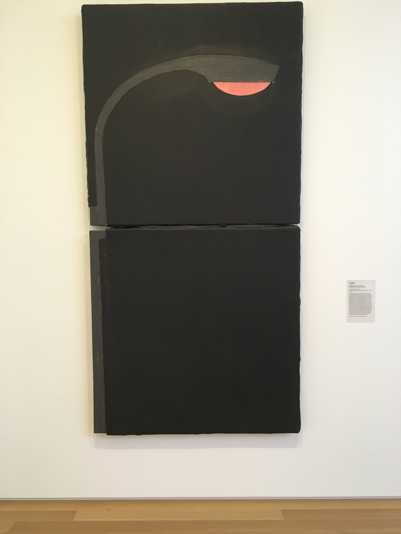 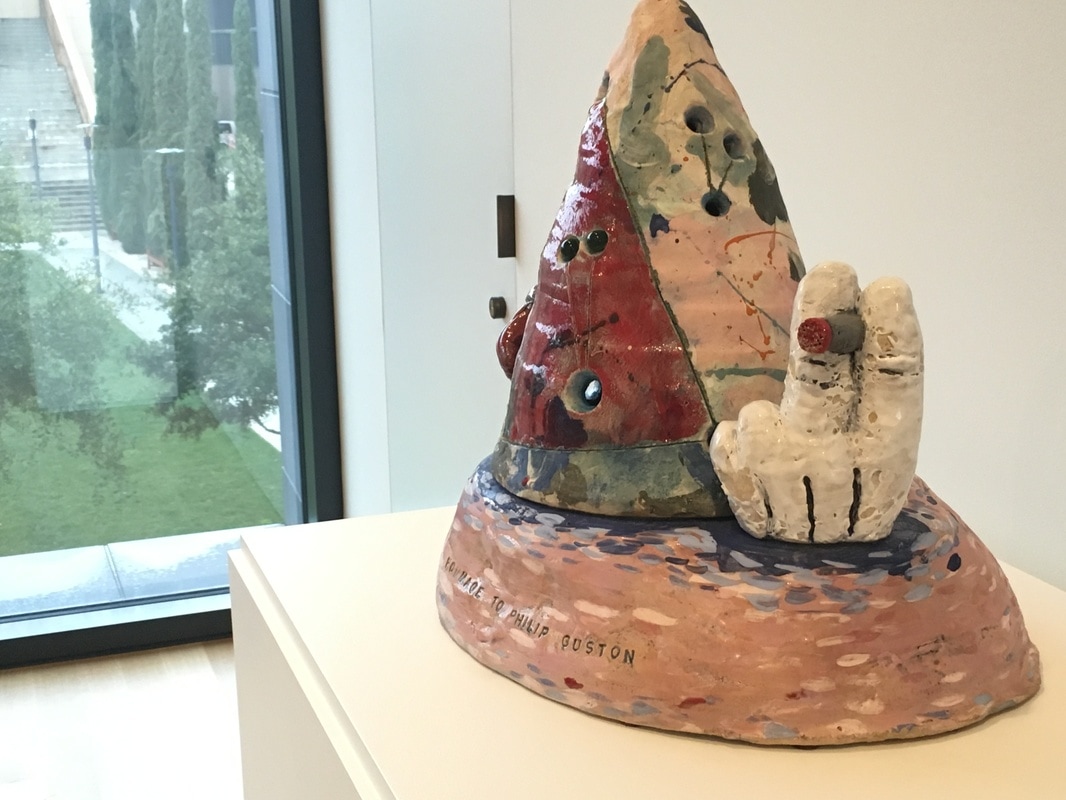 I am learning more and more about ceramics. Between Poncho Jimenez and David Gilhooly, I've come to Jesus on it. Of course, Robert Arneson, the Patron Saint of Three Minute Modernist and father of the Funk Art movement, has helped on that front. The work in the Anderson Collection, Homage to Philip Guston is just about the perfect reaction to the passing of the legendary artist in 1980. Guston, who famously moved away from Abstract Expressionism into a figurative form that folks have called Cartoony, and I tend to consider as a part of Funk. The work by Arneson is the perfect expression of Guston; it shows his AbEx days and his cartoon style in a single 3D piece... along with a cigarette. The two Gustons just around thew way, show how this work is a synthesis of those ideas, and I am so glad it's there!
|
Your HostChristopher J Garcia - Curator, Fan Writer, Podcaster, and a guy who just loves art. Archives
February 2019
|


 RSS Feed
