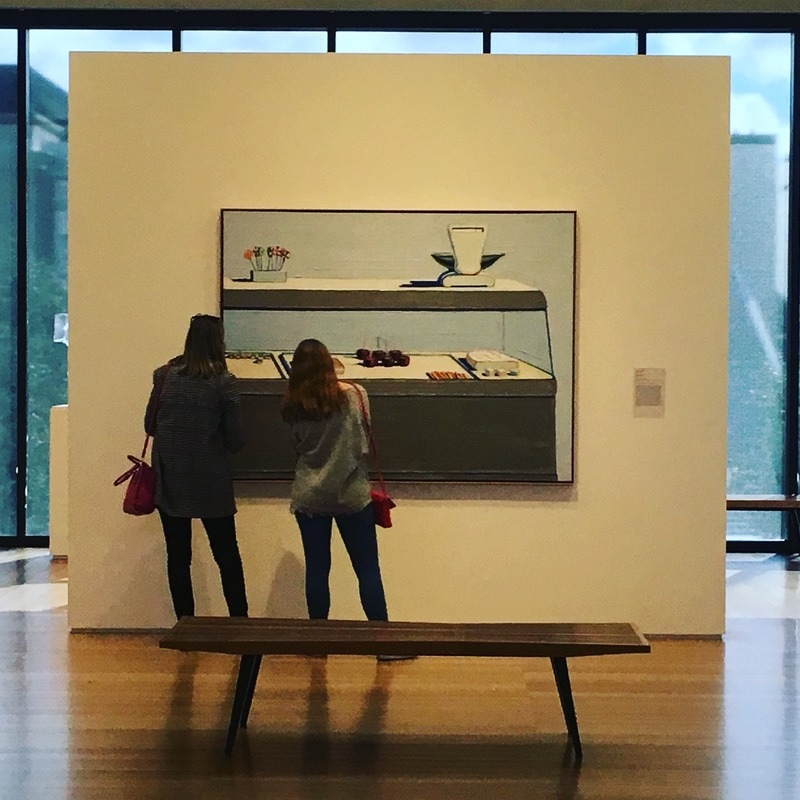
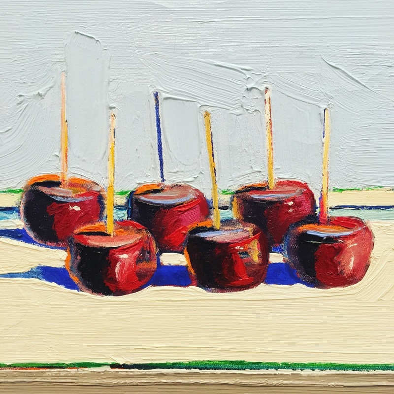
 Pop Art is not well-represented in the Anderson at the moment. You can look at California Funk as a sub-movement, but straight-up Pop Art? Nah. Wayne Thiebaud is either a Pop Artist, or a realist who simply representing common food objects. Fuck that. He's a Pop Artist. The thing about Pop from where I sit is a feeling. It is the feeling that the world of today is a set stage, and the Pop Artists were merely capturing it with all the realism their technique could muster. This is EXACTLY that. Completely. Totally. Thiebaud's Candy Counter is Pop Art, without utilizing what would become known as Pop Art techniques. The painting is realist, closer-related to Thomas Hart Benton and Paul Cadmus than Rauschenberg or Lichtenstein, but it feels like it is capturing a moment that exists, real for a certain location and time and kind of shop, but that is also as artificial as the moment captured is as composed as the painting that Thiebaud has created.
0 Comments
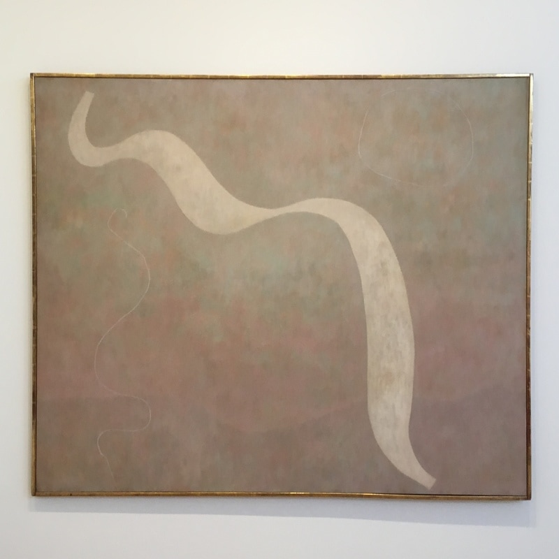
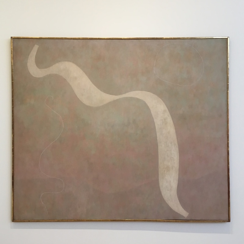
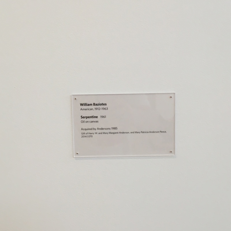
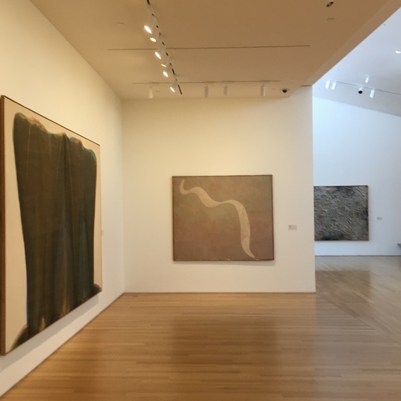
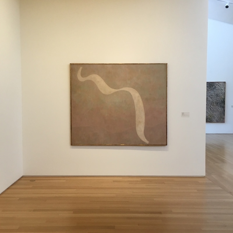
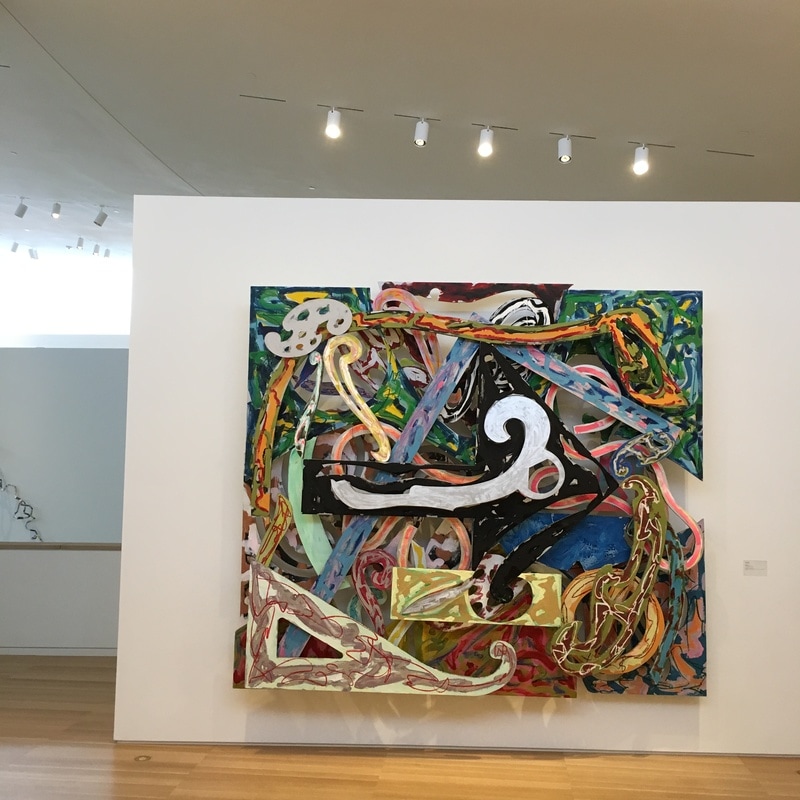
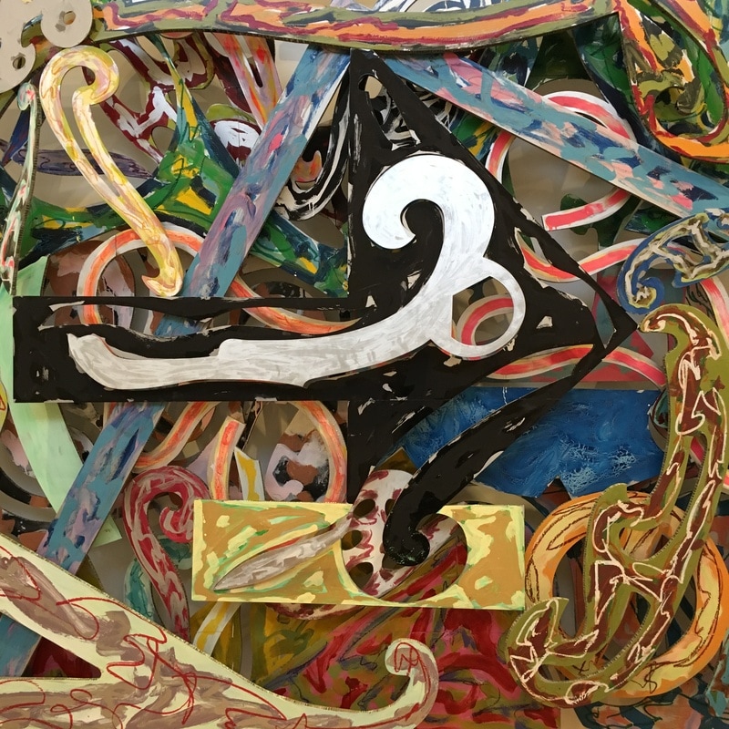
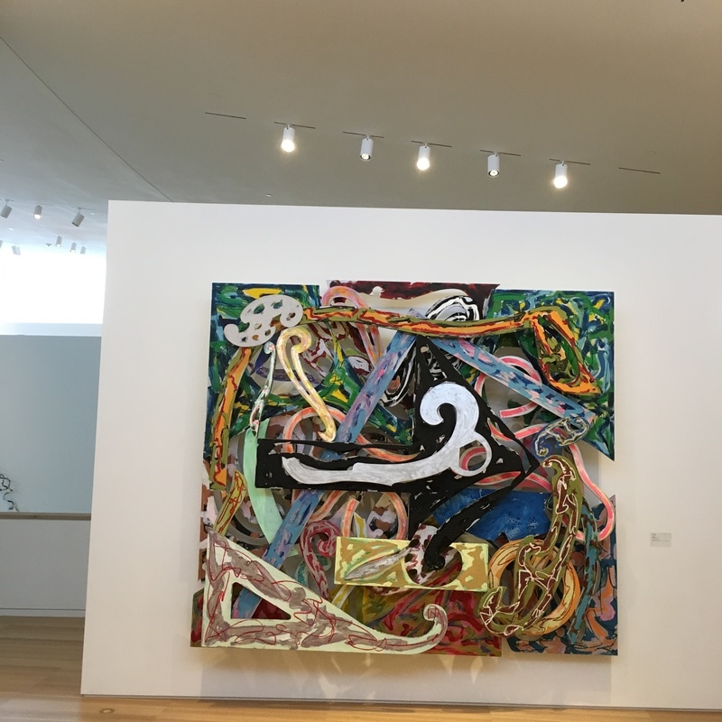
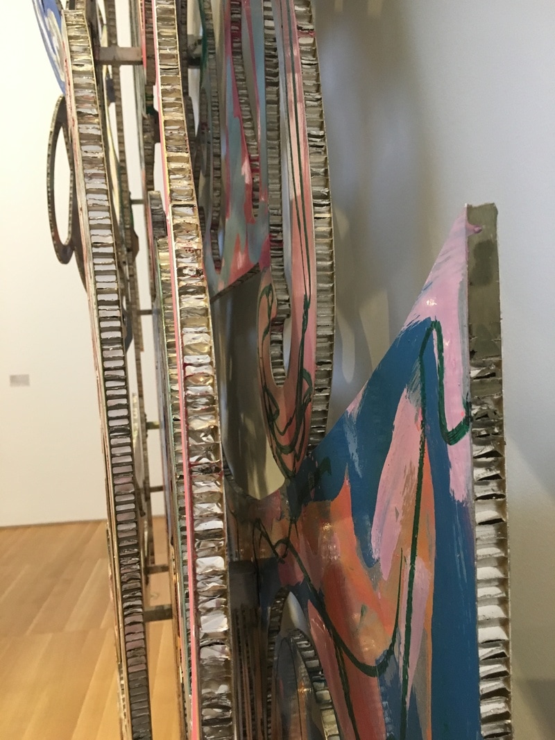
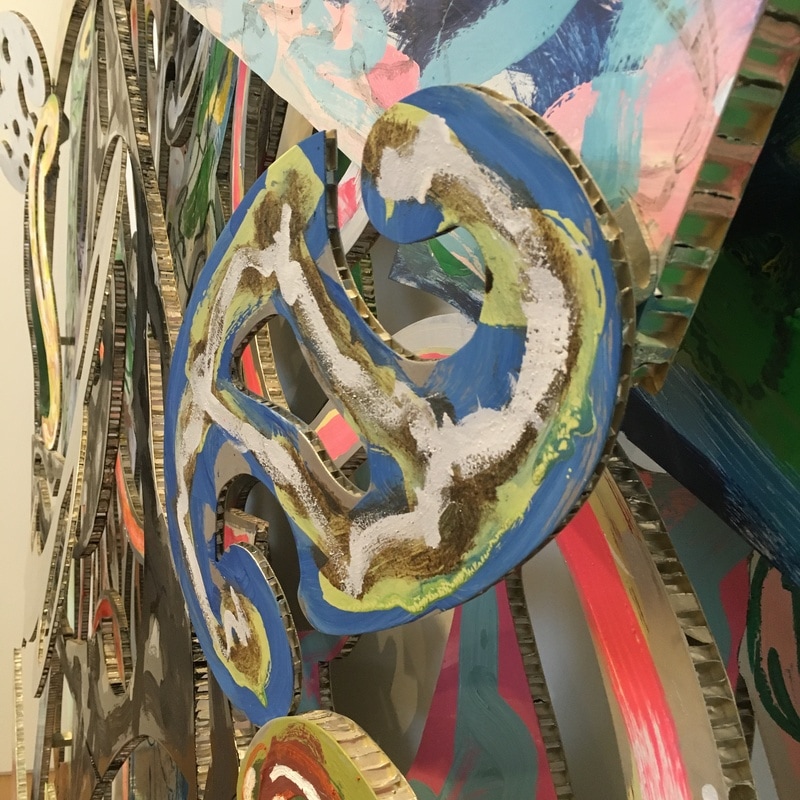
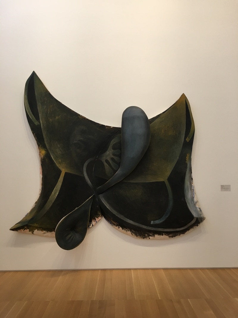
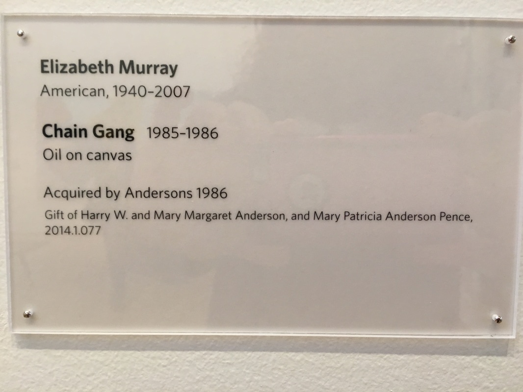
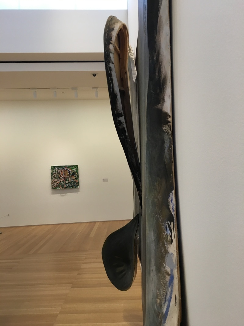
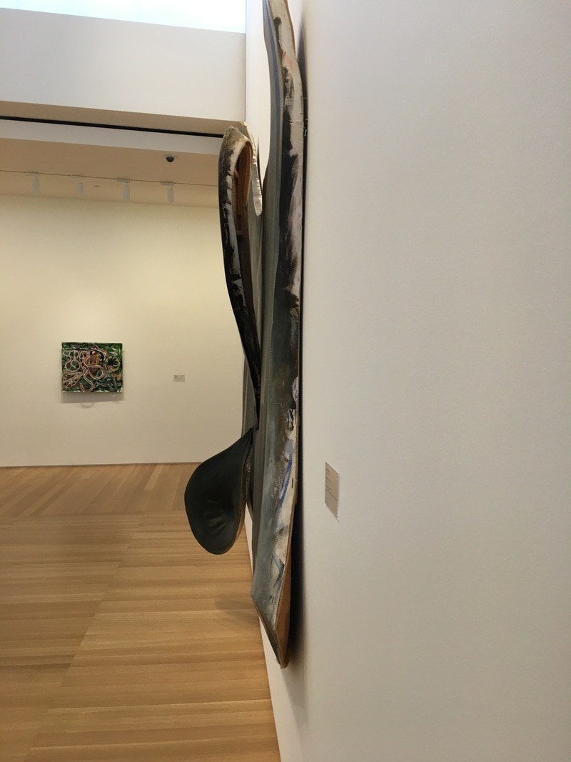
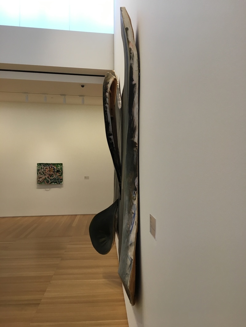
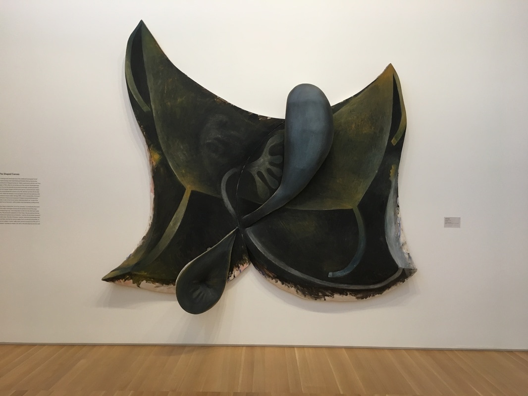
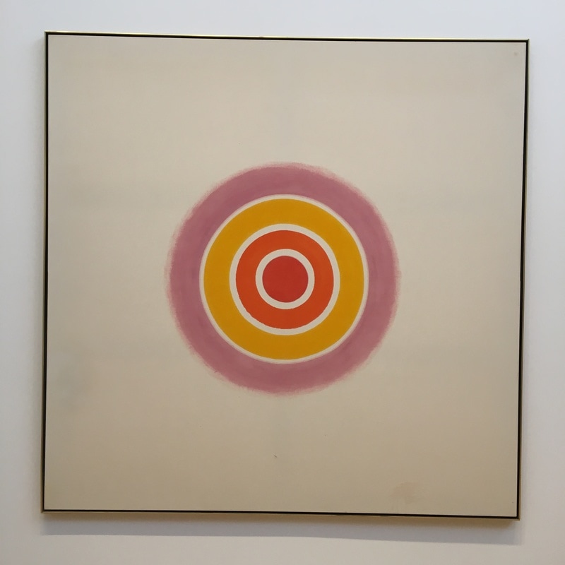
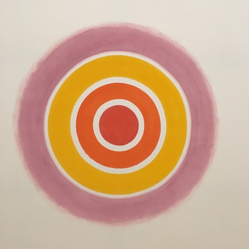
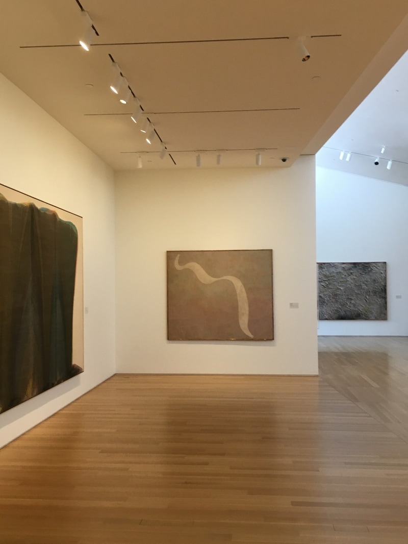 The leading Surrealist who gets lumped in with the Abstract Expressionists, William Baziotes provides a lovely piece here, though it is one that I think more clearly belongs in the realm of Minimalism. It is a single, simple, snake-like ribbon, seemingly floating in space, but without dimension. It is as if it were tossed, photographed, the edges detected, the fields colored. This is very different from his earlier works, and it feels as if it is a transitional work to stuff he never got around to making because he got cancer. Sigh. 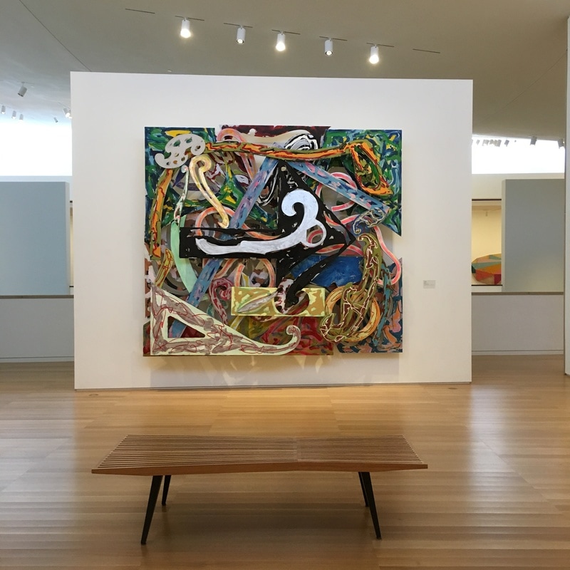 This is the 1980s. It is a 1981 piece, but if ever you wanted to understand the visual life of the 1980s, this is the piece. It is large, brash, striking. The colors are both somehow harsh, but muted, almost pastel. The forms are busy, layered, three-dimensional, though approached as an illusion of flatness. It is Stella at his most overly-complete, while also never missing the fact that Stella is not at all any one thing. He is a minimalist who often overly-packed. He is an abstract expressionist who can not help but to make his works feel as if he is dressing a stage. He is overwhelming in the aspect of size and form, but typically means to give you only enough to allow you to pile on your own experiences on them. In a way, this is an abstract expressionist piece, only deeply staged, much like the Elizabeth Murray work Chain Gang or the Lichtenstein Brushstroke series, it is an exploration of moving away from the gestural and towards the constructed (in this case made of aluminium and enamel) while still using the same markers. Very smart.  What happens when you do what painters do with paint, only instead you do it with canvas? The shaped canvas is an entire room in The Anderson, and Elizabeth Murray's Chain Gang is a really impressive example because it's really an Abstract Expressionist re-conceptualization. When you look at the Frank Stella work right next to it, you can see the influences of his time with the Minimalists mingling with a 1980s sensibility, but with Murray's work, she has created a Morris Louis or a Helen Frankenthaler in three dimensions. It is a easy to dismiss it as a Rorschach test, but more accurately, it is the capturing of that moment when paint is tossed upon a canvas, the spontaneous moment of creation of a mark, only given to us as is would be seen in three-dimensional space-time. In essence, it is not only the capturing of the marks of placing paint on a canvas, it is exposing the encounter between paint and canvas, but it is doing so in a static, and devised, methodology. It is an expression of what would happen with Abstract Expressionism. It is the same expreience being shown, but it is now more weighed, considered, slowed. Lichtenstein's brush stroke paintings are in the same vein, but Murray's work have managed to do the same work without the implications that placing it within POP Art as a form of protest. 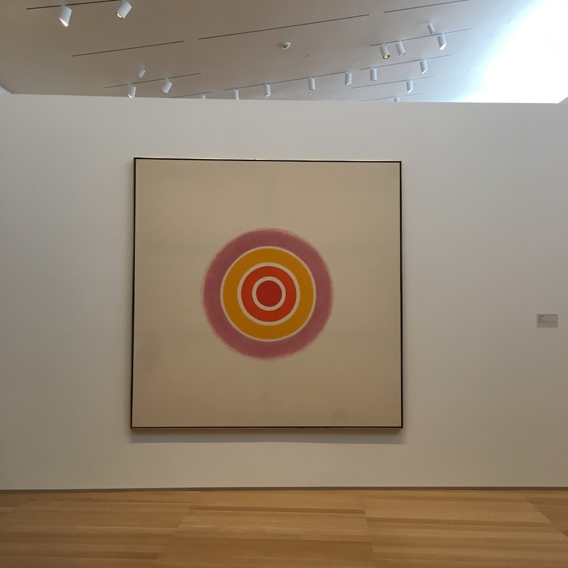 In Noland, abstract expressionism and minimalism have a convergence. Rose is a minimalist piece, at least in my eyes. It is a target painting, where the inner portions are incredibly regular, fine-edged, while the outer-most ring is hazier. Here, it is as if Noland is transistioning from Abstract Expressionist to Minimalist. He would later, much like he co-hort Morris Louis, go fully into Minimalism, which is a shame, as he work that was less about reduction was far more interesting. Video Art. It is difficult to define without resorting to high-minded example-mining, usually resulting in an excess of information with a defined lack of engagement with the material itself. I can't tell you how many 'documentaries' claim to expose a field of art by merely presenting clips they've mined from the bowels of YouTube or Vimeo. It's a tiresome methodology. When we are presented with an illustrative piece such as Robert Combinus' A Dad it brings an impressive sense of accomplishment to the work, and to the definitions being presented.
It is in this tradition that Andre Callot's It's Video Art was created, and within in, Callot himself has created three miniature works to give life to his points of definition. In doing so, he has forced the viewer, or at least this viewer, to hold two different views of the work - the first as a documentary, and the second as an individual work of art within it. As I've tackled the first part over on Klaus at Gunpoint, I will expose my thinking on the latter here. The first thing that is obvious to me is the structure of the work. Callot's chosen to go the direction of Kevin B. Lee in Interface 2.0 and make an example piece instead of a straight documentary piece. Where Lee used editing interface examples to demonstrate the techniques involved in editing, Callot uses video art segments, created specifically for the piece, to provide the examples of video art. In this, he is forcing the viewer back in on themselves. We must be aware that we are seeing examples of video art, and that they are real, actual pieces of video art, not merely references to such. Through this, he has drawn us in deeper to these works. The first work is illustrative of performance video art, the kind of thing you might see from Marina Abromovic or Yoko Ono. It actually reminded me somewhat of Niki Murphy's Hourglass. The way he throws himself into what appears to be a painful process of powdering himself and then activating that powder, is a work that truly impresses, The work seems to be making a statement about the process of creating performance art itself - that to bring about a real change in the state of the work, and thus the viewer of the work, the artist must put themselves through a process that is active, leads to an identifiable degree of change, and most of all, is at least reacted to as if it is painful by the artist themselves. The section on Abstract video art was less compelling as a work in and of itself, but at the same time, was not over-powering to the entirety of the piece, and it actually elevated the work by giving a few that was not outside the realm of a work that could be seen in a gallery. Perhaps it is the brevity of it that took me aback when I looked at it on its own. Again, pieces like Jemery Blake's Winchester or Century 21, are both of the flavor that steeps and then soaks, though perhaps both rather belong to the Appropriation side of things (and the blurring of lines between abstraction and appropriation is a significant point). The Appropriation segment is fascinating in that it is not exactly what I would have thought of. I am more used to the use of existing imagery to create either a new video-driven narrative, or to strip narrative meaning and recontextualize the imagery. The addition technique he used was actually at least vaguely similar, though in a much more figurative, direction than Blake's additions in Century 21, but at the same time, it is also partly a performance piece, and thus, that blurred line is again, blurred. As an individual work, this is incredibly well-done, a post-modernist's view of both modernist and post-modernist material within the context of a medium that is both specifically defined, while at the same time, so broad as to make individual definitions almost meaningless. I liked this as a work in and of itself, and the individual works presented within as being worthy of consideration outside of the work, which is a difficult line to maintain. 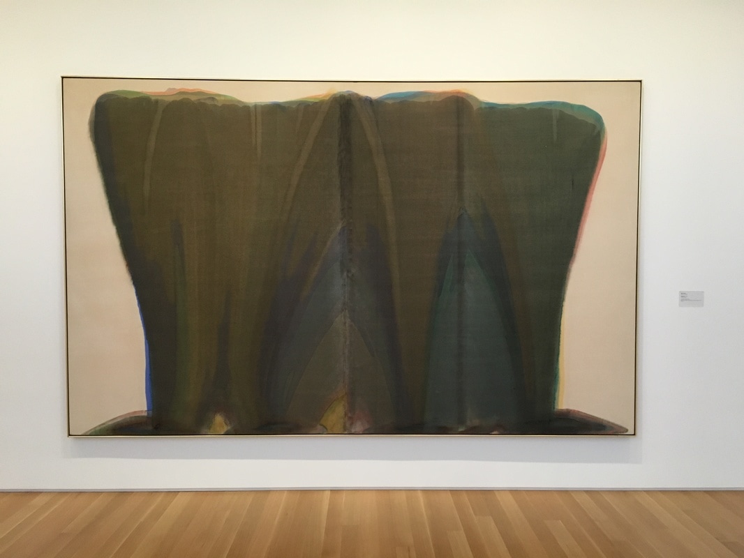 Morris Louis' paint runs down the canvas slowly, and the eye goes with it. That would not be remarkable, except that the eye always starts at the top. He has managed to give the viewer a starting point without explicitly forcing it upon them. It's that thin area of bare canvas that runs along the top. The funneling in this image, draws the eye downwards, to that centerpoint, where the light-green-yellow mass stands beneath what is basically a steeple of darker forms of green.
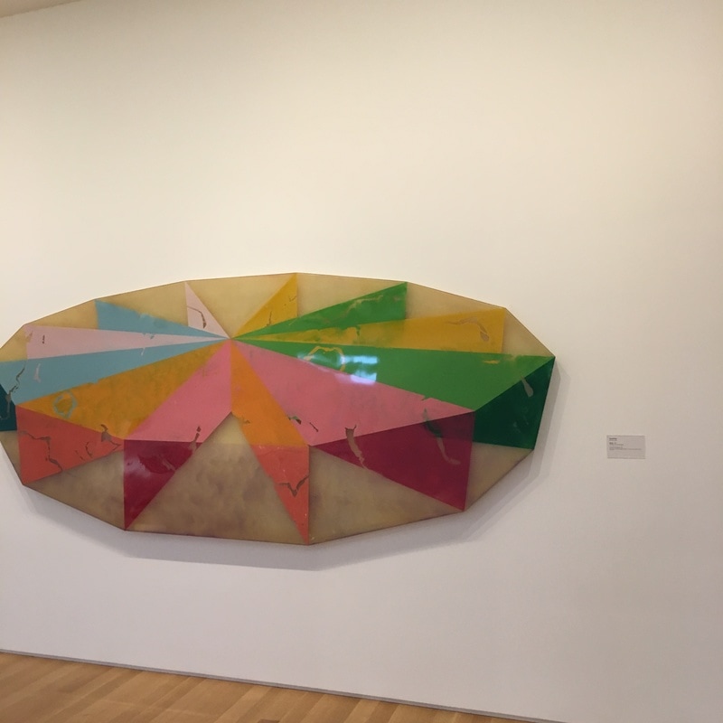
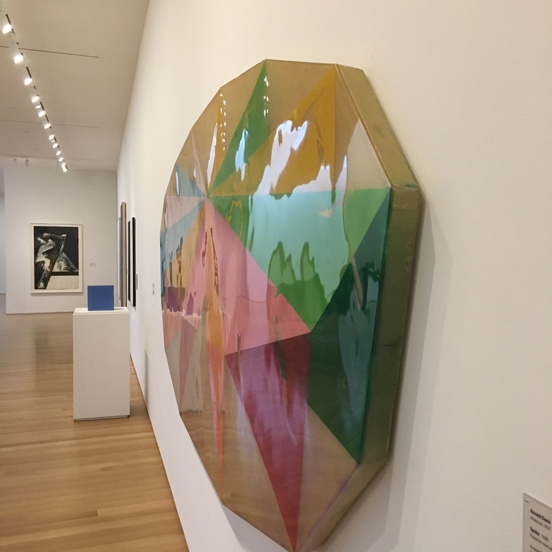
This is one of the single best pieces of work Louis ever created. It's one of his veil paintings, from the period where his AbExing was at its most AbEx. I've seen many many many of his pieces, and after about 1960, he created many pieces that seemed to pre-sage Pop Minimalism, such as the work Alpha-Pi  There is something impressive being said here. This is something really modern. We've been aware that painting is about perspective, about taking the three dimensional and representing it in a two-dimensional world. Ronald Davis has done that here, but in a much more impressive way. He's given us a piece that is the illusion of the illusion of depth. There is no pretending that this is three dimensional, but it is a representation of a two-dimensional representation of a three dimensional object. The depth is illusionary, as it is in all painting, but the incredible flatness is so different than the traditional methods of laying layer after layer of paint upon a canvas.
 There aren't a lot of the first wave of Pop Artists left with us. Yeah, we've got a few around, notably Robert Indiana, Claes Oldenburg, and Jasper Johns, and quite a few of the Hockney/Apple-level Brits, and today we have Tanja Playner making a splash, but the biggest names are all gone. Lichtenstein, Warhol, Rauschenberg, Hamilton, Marisol, all gone. Add to that list James Rosenquist, one of the most impressive of them all, and perhaps the only painter in 1960s POP who really got the whole painting thing. Rosenquist's work is an incredible intersection of photo-realistic imagery and Schwitters-esque composition. He would take images from popular culture and re-create them within a sort of painted collage of images and text that may or may not play off of one another. This technique is ultimately breaking when you try to tie things together, as if the subject of any painting is not the execution of the painting (as it had been in Abstract Expressionism) but in the forcing of perspective. While images may not suffer the same orientation, they are all to be considered within relationship to one another, which means we have to accept that an image 180 degrees opposite another is presenting the same directionality. That aspect of Rosenquist's work is what hits me the hardest; there is no up to many of them, and if you spin them and allow it to randomly come to a single point of reference, there is no difference. Except, perhaps, for F-111. 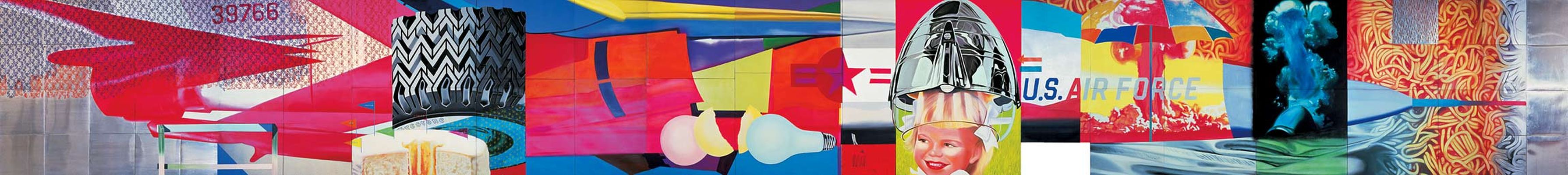 The F-111 fighter was the hot new thing burning up the skies of Vietnam. Here, Rosenquist has painted it, supposedly in near life-sized scale, using so many markers of the POP Art style, from Lichtenstein's Ben Day dots to Warhol's silkscreening, hints of Johns and Indiana. That resulting image is then over-laid with mundanity. A young girl under a conical hairdryer, a tire tread, a mass of spaghetti, light bulbs. These are all placed to give an idea, that the plane is flying through the most bland airspace, as if it were just another product of the basic world, the kind of thing that would be sold in commercials on TV. The amount of soaking in that had happened due to the war dominating the nightly news made the plane another element in the popular culture, and Rosenquist plucked it out of the air, painted it, and hung it in a gallery as an image every bit as imposing as Monet's Waterlillies.
|
Your HostChristopher J Garcia - Curator, Fan Writer, Podcaster, and a guy who just loves art. Archives
February 2019
|


 RSS Feed
