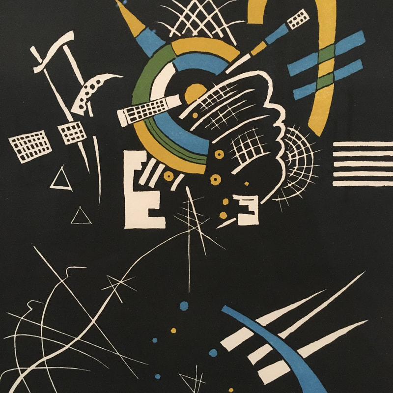
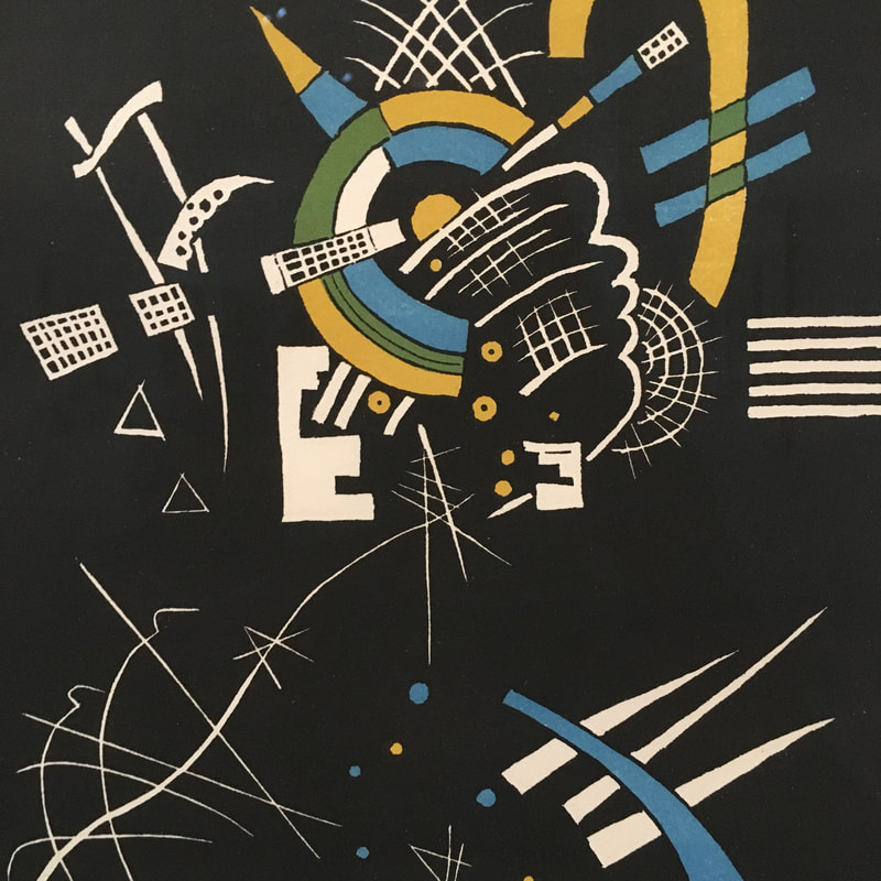
 There was a thing called Graphic Design in the 1920s, but no one really understood how it would evolve. The idea of the Ad Agency being where nearly all the graphic designers would huddle was not formed when Kandinsky created his most important work, and they would become endlessly influential upon the world of graphic design. One of the first artists to go strictly abstract and not be completely dismissed, Kandinsky's work llike the Small World prints would become key elements that were borrowed by graphic designers leading up to World War II, as well as adopted by Soviet Constructivists in the 1940s, 50s, and 60s. The work here was meant to be situated among the art galleries, but its influence would be much more deeply felt in magazines, and especially fashion and set design.
0 Comments
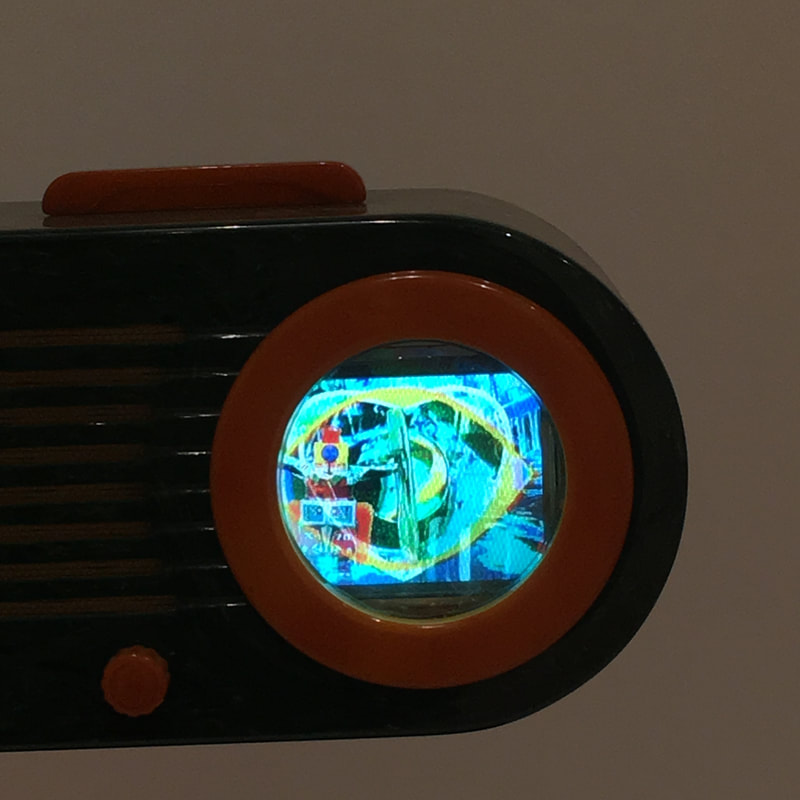
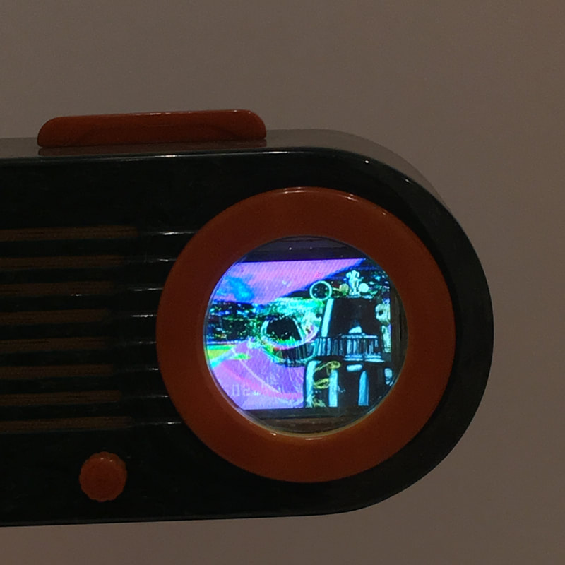
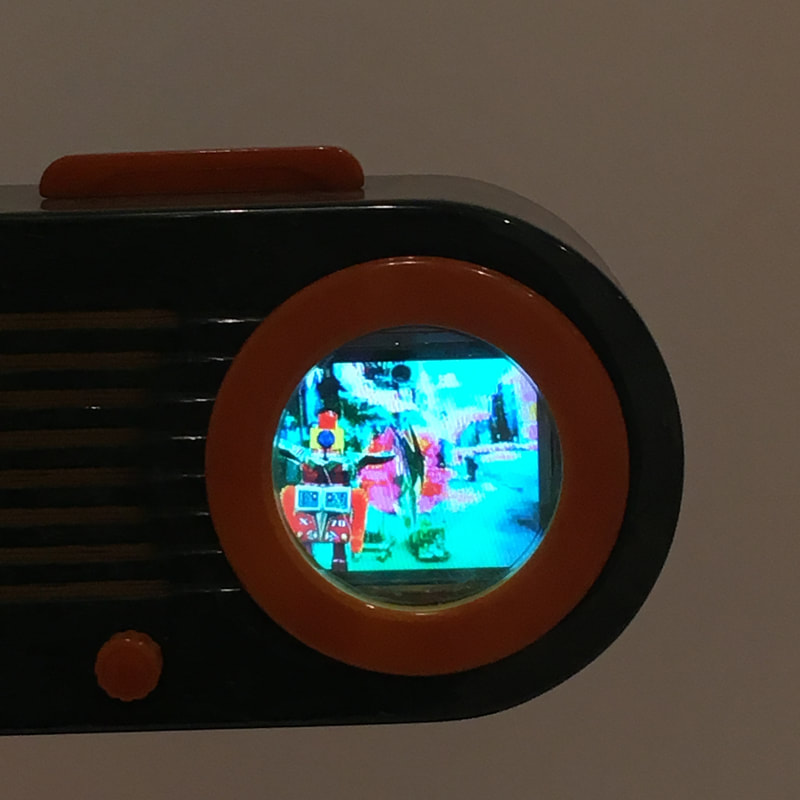
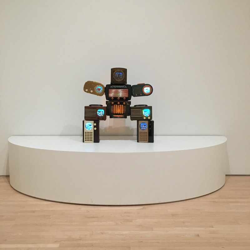
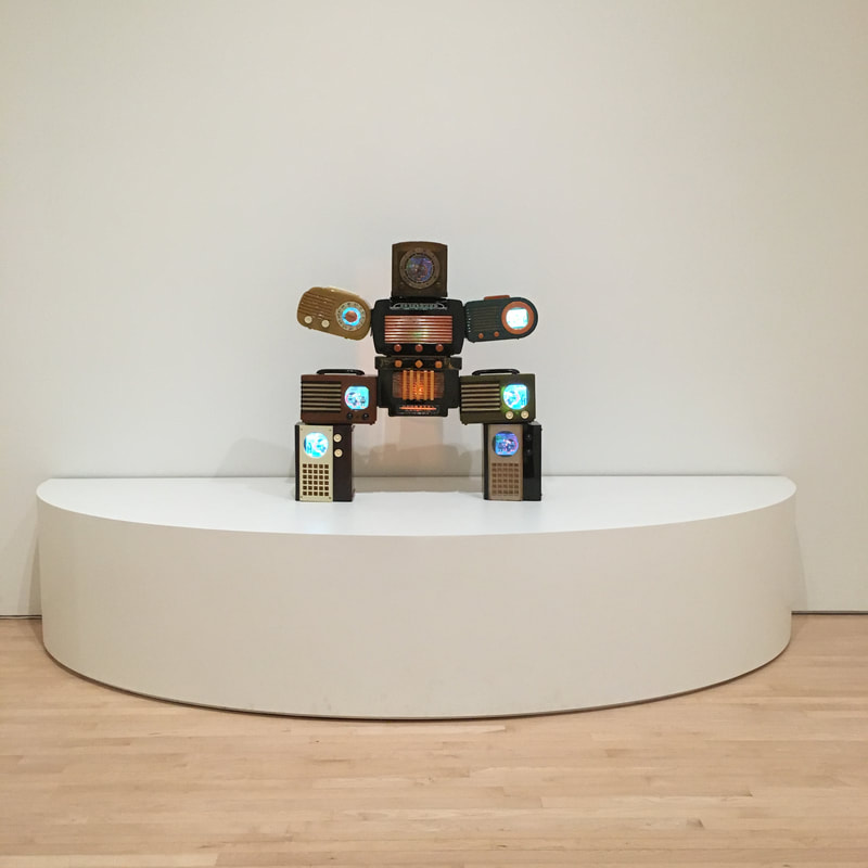
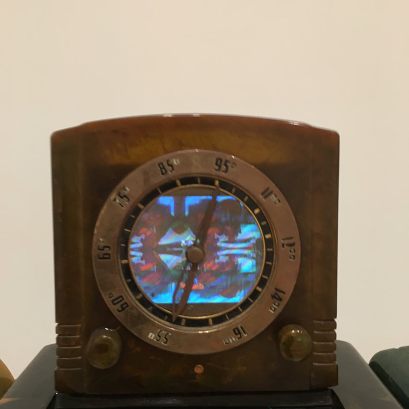
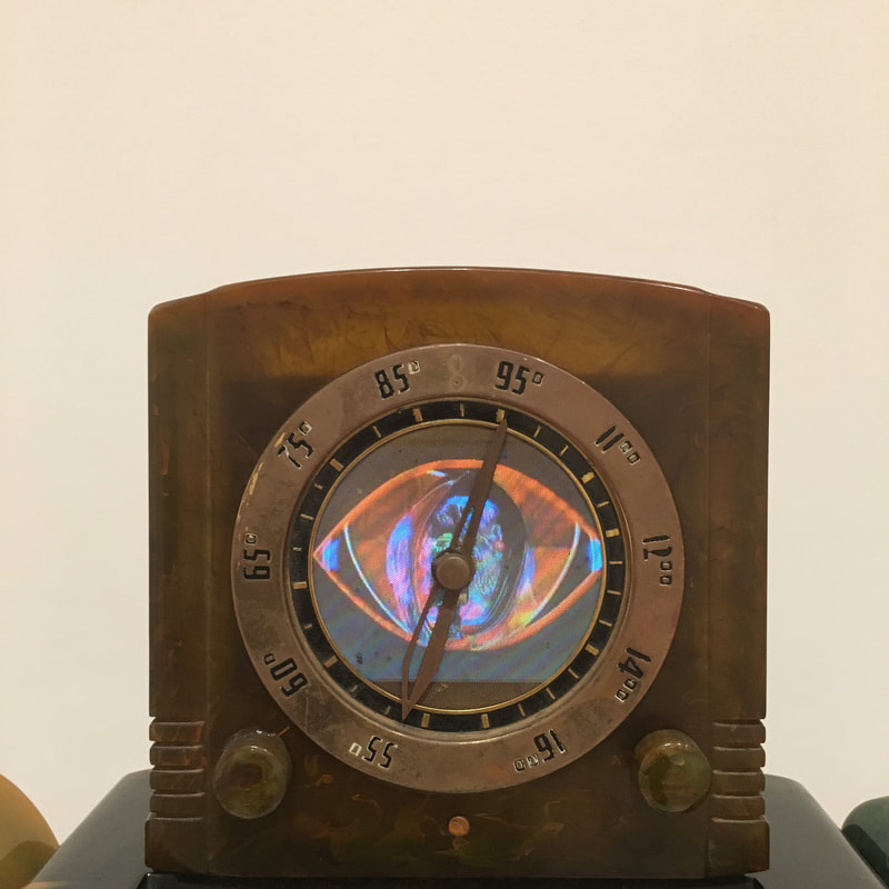
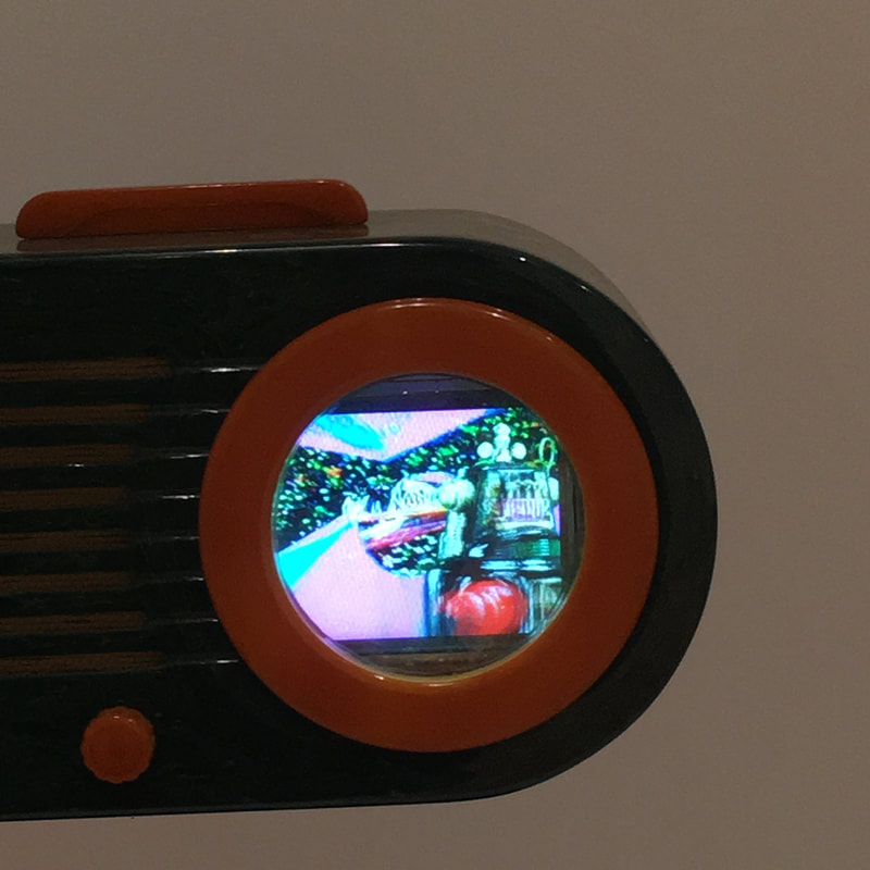
 There's a face.
Isn't there?  Remember that thing where I said that Pop Art, and Thiebaud in specific, was about the staged nature of th eworld and capturing that in paint? Yeah, that's all about Flatland River, now on display at SFMoMA!
 Post-modernism - does it exist? Yes. Does it mean the end of Modernism? Nope. Is it a form of Pop Art? Maybe...
 Devotees will recall that on my wedding day at MoMA, we enjoyed a Sigmar Polke exhibition that was phenomenal, and now I take a look at a piece at SFMoMA of Polke's that hits and hits hard!
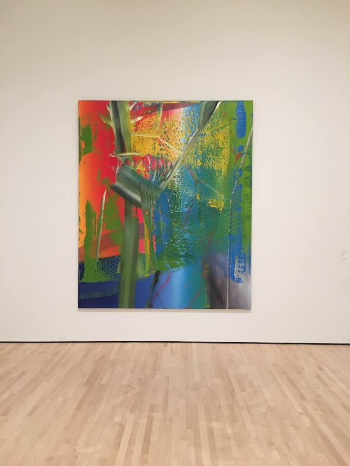
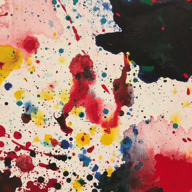
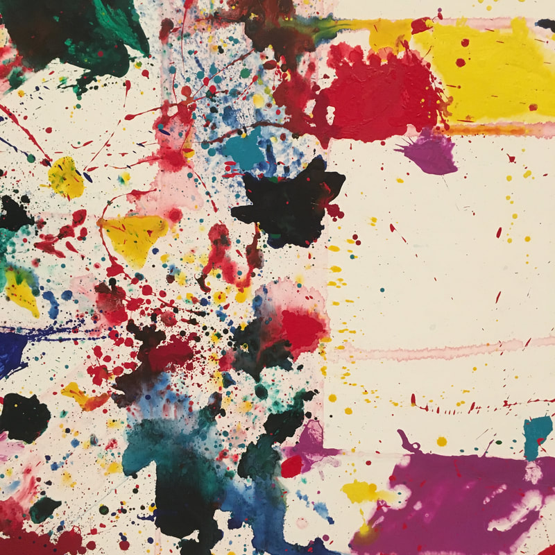
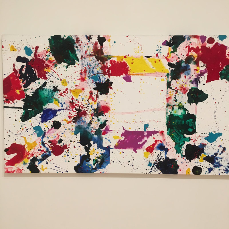
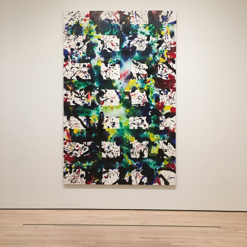
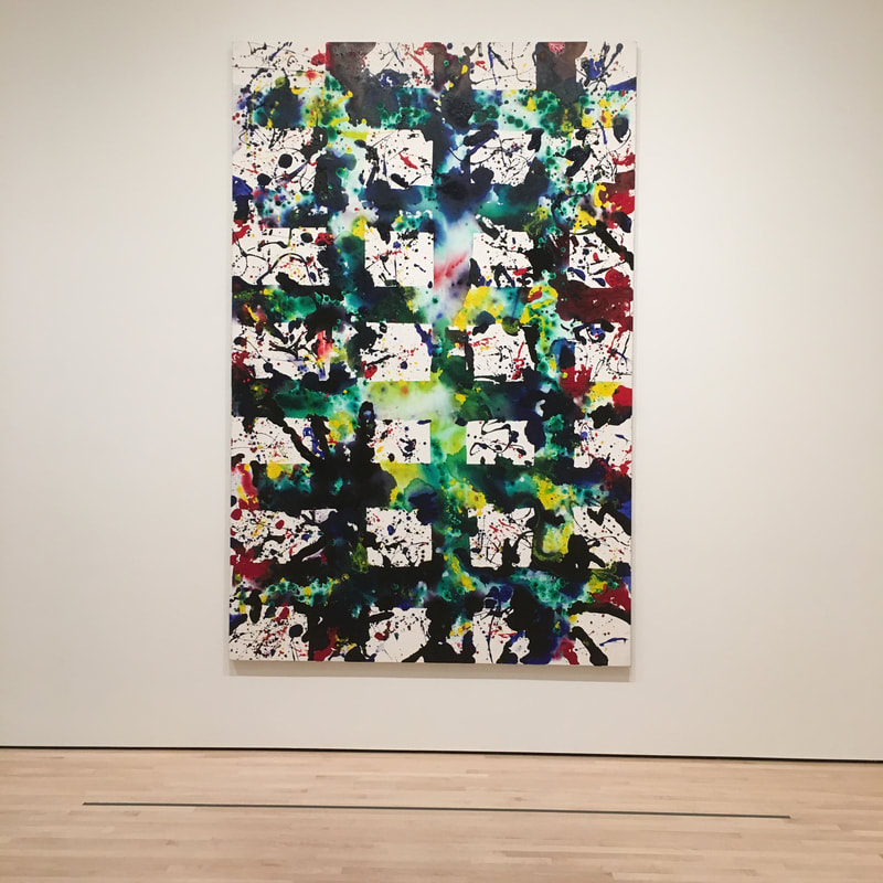
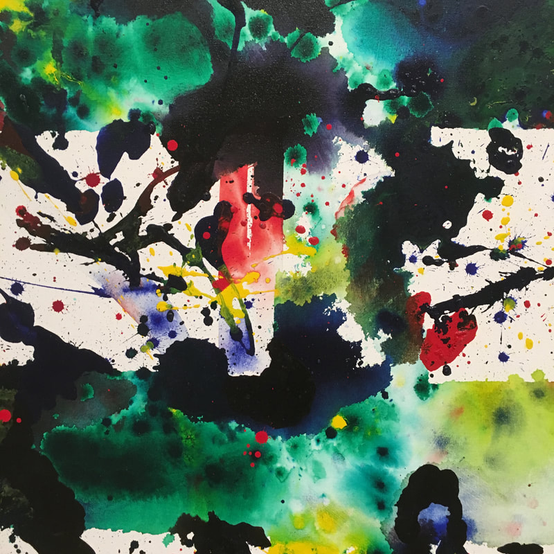
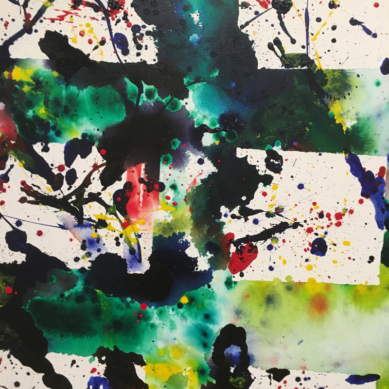
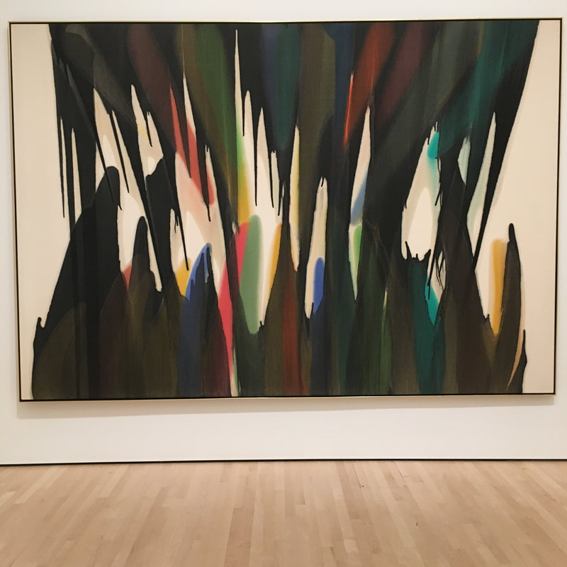
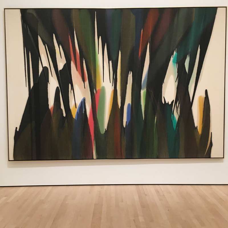
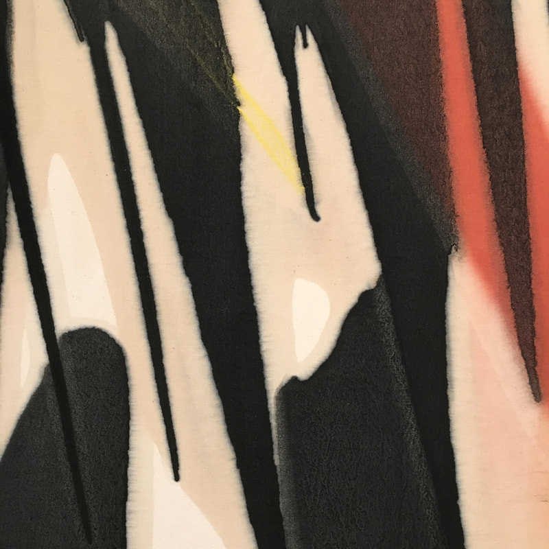
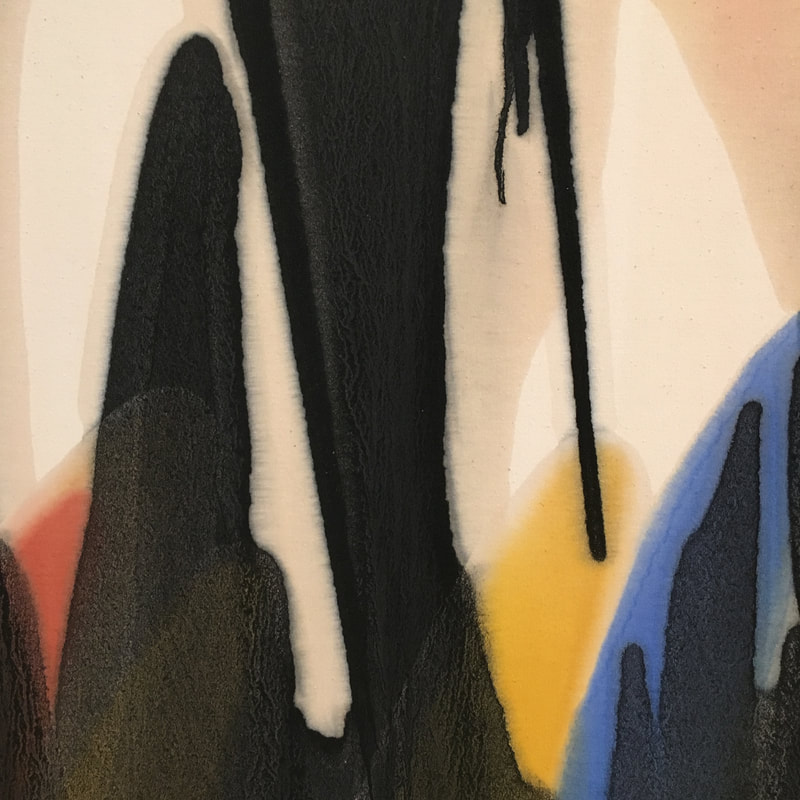
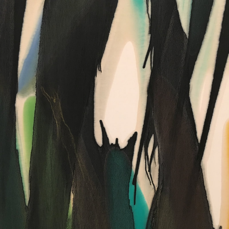
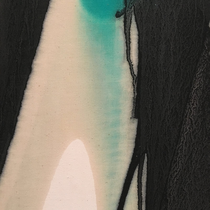
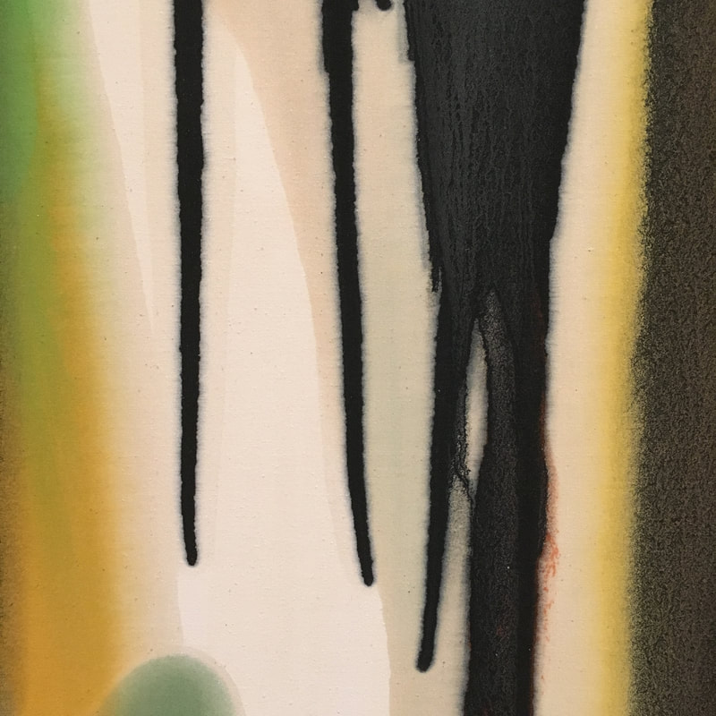
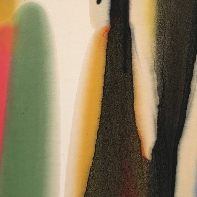
 Sam Francis is an artist in the later Abstract Expressionist vein. He was also th eman whose expressionism wasfar more colorful than Rothko, Pollock, or their ilk. In fact, Francis is more Mitchell, Abbott, Louis, or Frankenthaler than those first 'rounders. The works at SFMoMA are from 1978 and 1980, and they use the structural grid form, but then layers more paint, thin stains of acrylic across the canvas. It is more contained than many AbExers, almost Clyfford Still-esque, but it's color, my ghod the colours! The fact is his palette here is undeniably of the 1980s. It'/s not just the pastel sensation of a lot of his work, but the abutting of teals and reds, yellows and hot blues. It is the feeling of the 1980s, defined before the decade actually started. These works would help define what the 1980s would look like, moving beyond the fine arts space into graphic design, fashion, MTV. 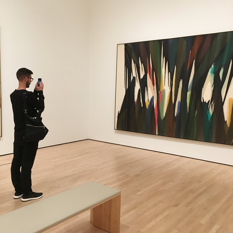 Of all the Morris Louis works out there, this one is the most powerful, and frankly, terrifying. It is an Ambi, instead of his allowing the thinned paint to slide down in one direction, here it goes in two directions towards the centre, but that is not what's the scary thing here. The scary thing is that the outermost coating is black, as if they are teeth closing, holding us in the mouth, preparing to chew us to oblivion. I feel as if the colours, the blues, yellows, red, greens, they are living on the outside, as if they were being used to draw us towards them, to allow us to be chomped upon. It is a terrifying work, and certainly my favorite Louis work in any museum. |
Your HostChristopher J Garcia - Curator, Fan Writer, Podcaster, and a guy who just loves art. Archives
February 2019
|


 RSS Feed
