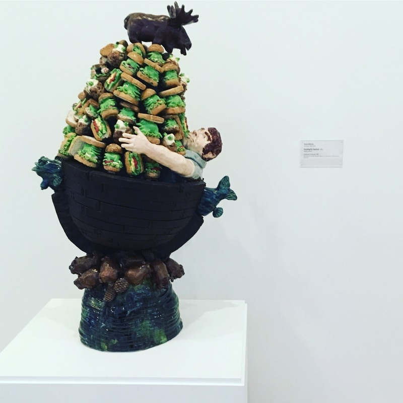
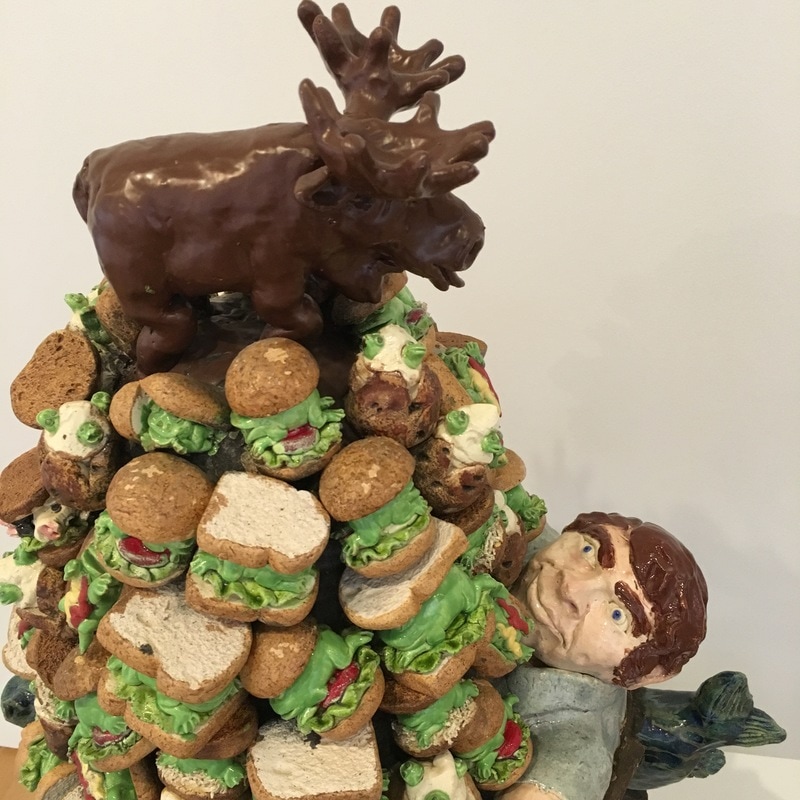
 David Gilhooly is an artist who plays with, well, just about everything. Meaning within imagery, titling, materials. His donut cart in the Stanford Hospital's cafeteria is wonderfully ironic, and this work in the Anderson is hilarious. It's a call out of American food ideas. It's about gluttony, about the precarious balance of American food production and consumption. The moose at the top is an interesting touch, and maybe it's just me that makes it into a sign of Canada, but maybe not. Ultimately, Gilhooly played with everything here to make a sort of sensical non-sense. There's a ton of stuff here, some of it makes sense, and the signs are obviously pointing to things, but there's so much more that we need to try and put into the mold that just doesn't seem to fit in with a logical image. If you've seen the brilliant and underrated film L.A. Story, there's a scene where the brilliant Harris K. Telemacher gives a massive disection of a large solid pink painting where so much is just in his head, but there IS something that sets Harris off, that takes him towards that diatribe. That painting has meaning, and so does Gilhooly's work. Or maybe not...
2 Comments
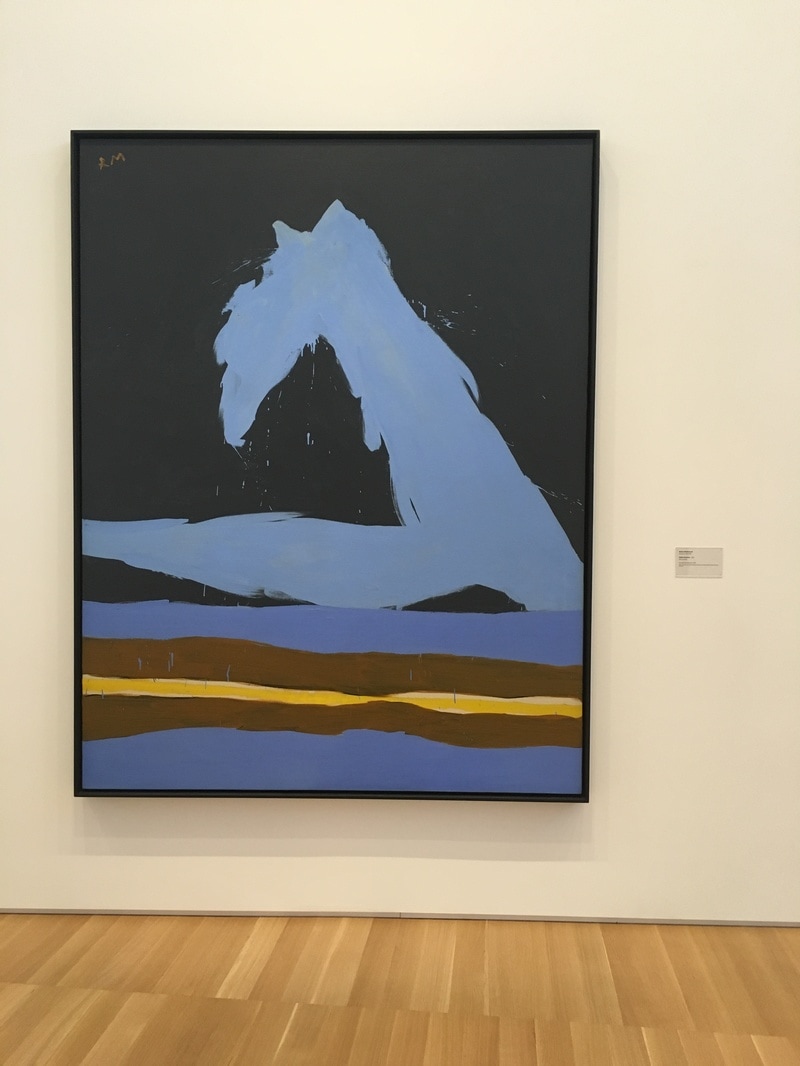
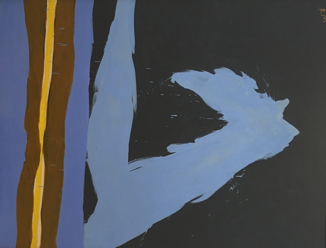
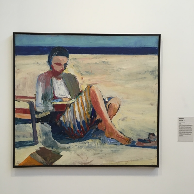
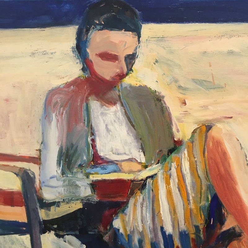
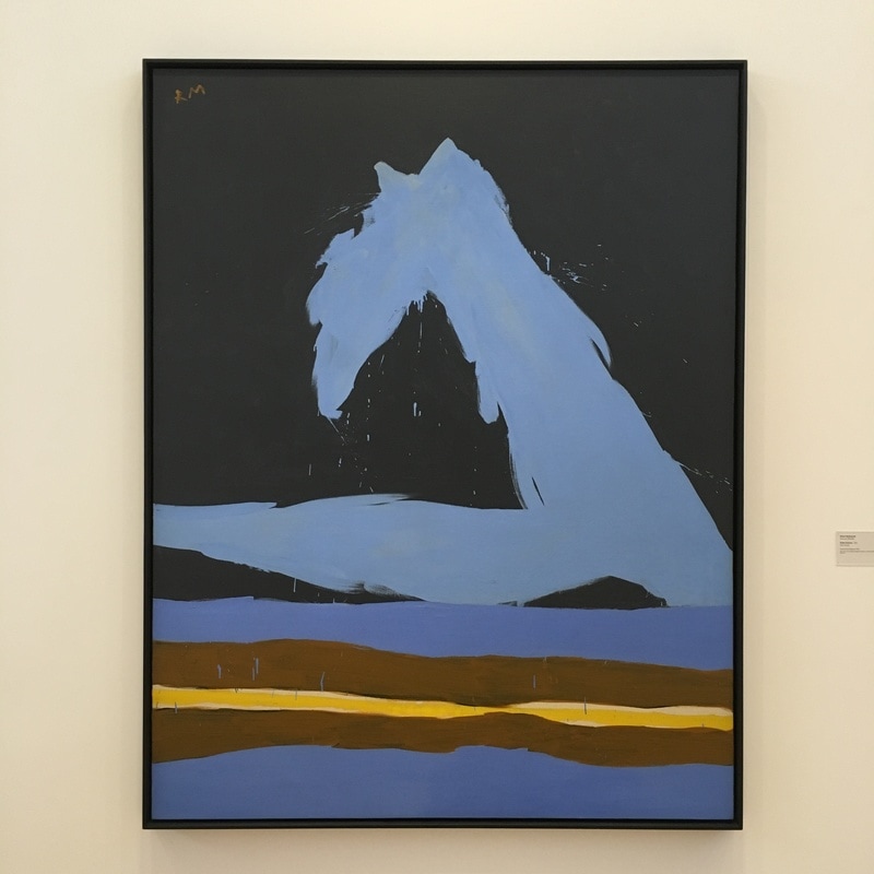 I once owned a Motherwell. It was a work on paper, so it wasn't exactly enough to buy a house, but I sold it to pay a couple of months rent. This work, Italian Summer was painted based on his time in Provincetown and the views of the waves crashing on the beach outside his studio window. It is basically a representational work, at least for Motherwell, but to me, it says something amazingly important. This, viewed at Landscape instead of portrait, it is a Motherwell as recogniseable as an Elergy for the Spanish Repubic. It is a fine example of the ability for the natural world to be as abstract as the visions of the Abstract Expressionists. 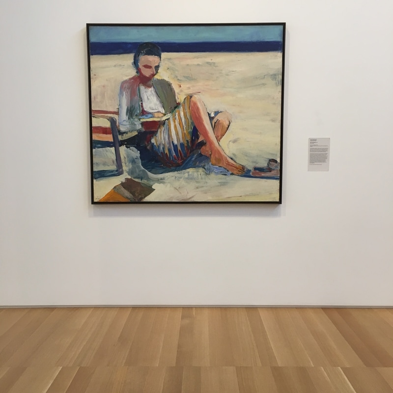 There is a long long long history of paintings about women reading. From Fragonard to Picasso, it's a subject that never seems to get old. Here, Richard Diebenkorn takes on the subject in, perhaps, the most California way possible, by setting our bookworm at the beach, shoes kicked off, her butt directly in the sand instead of on the chair at her elbow. I always have problems with artists who turn from Abstract Expressionism. In 1955 or so, Diebenkorn moved away from his AbEx work into a more figurative, comparatively literalist, period. While his color palette is still not natural, and his brushstrokes show like Van Gogh and Monet before him, he is representing something in a way that expresses a situation, a scenario. This is a traditional subject painted in a semi-traditional way within a non-traditional tone expression. That makes this work a wonder to behold! 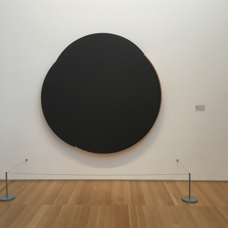 Sometimes, I get caught in the same trap a lot of folks who hate Modern Art get caught in - THAT'S NOT ART!!! It happens, from time to time, and usually it's me applying my own sense of artistic values to pieces that exist outside of them. In fact, at that point, I'm doing what critics did to the Impressionists, failing to realise that the artist is saying something more. At that same time, I'm completely and totally guilty of the opposite. Not everyone who hates the things I love hates Art; they just have a different set of values. While I have no interest in paintings that depict the world faithfully (for the most part), I need to be reminded that there are others to whom that is all that art is. To me, that's craft, and craft nearly universally bores me. When I look at early Warhol commercial work (and anyone who doubts his talents in drawing and drafting need only seek them out and see how amazing he was) I'm bored; but give me a silkscreen, something that takes a tiny fraction of the craft that those drawings would have, and I applaud knowing that I'm witnessing something with real depth.
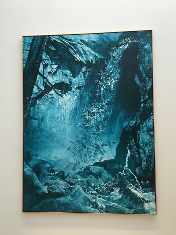
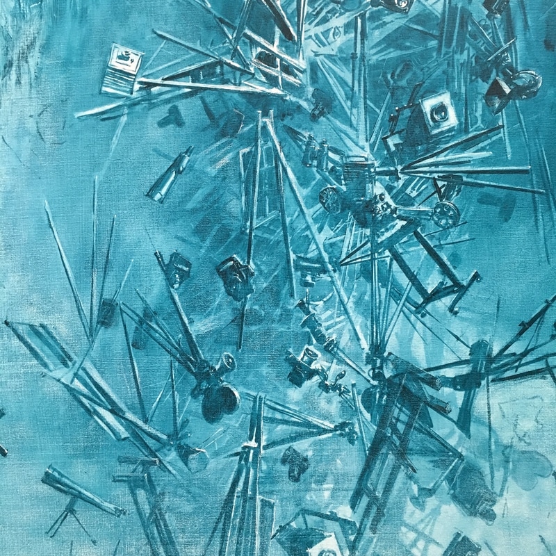
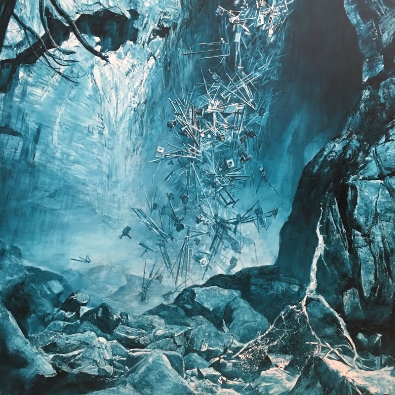
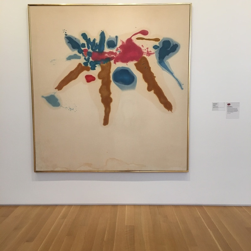
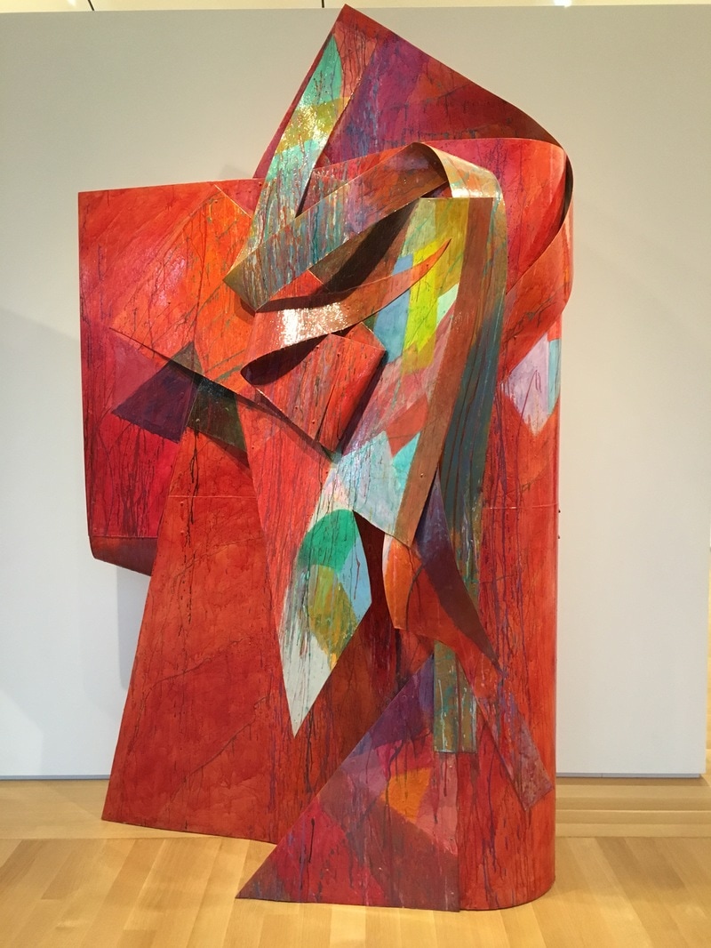
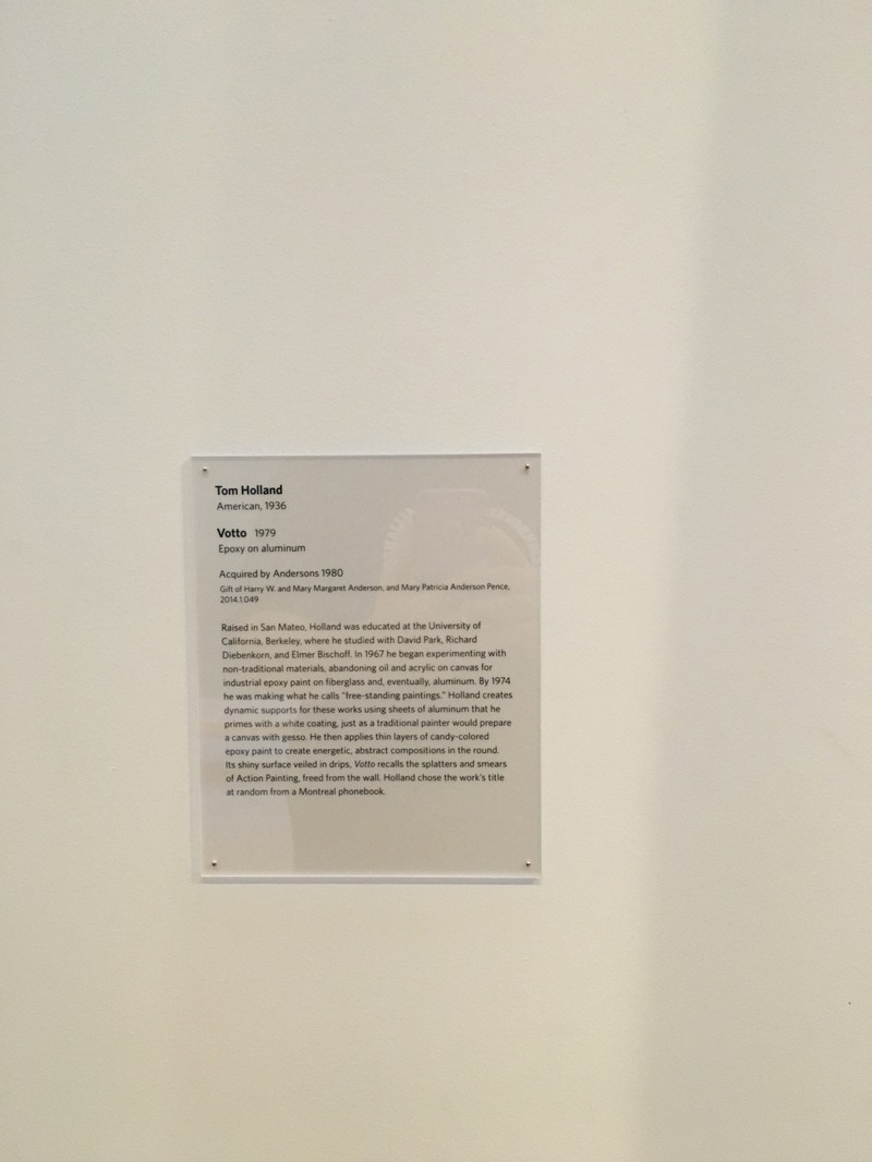
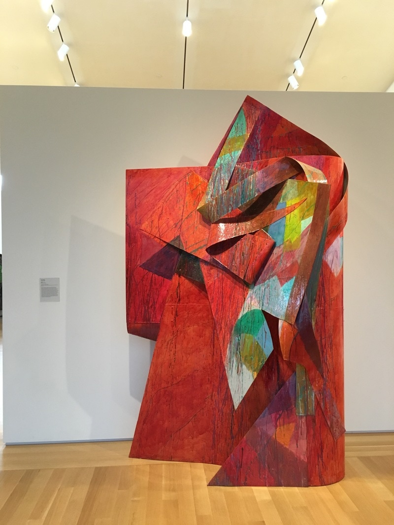
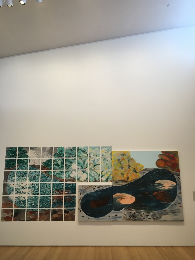
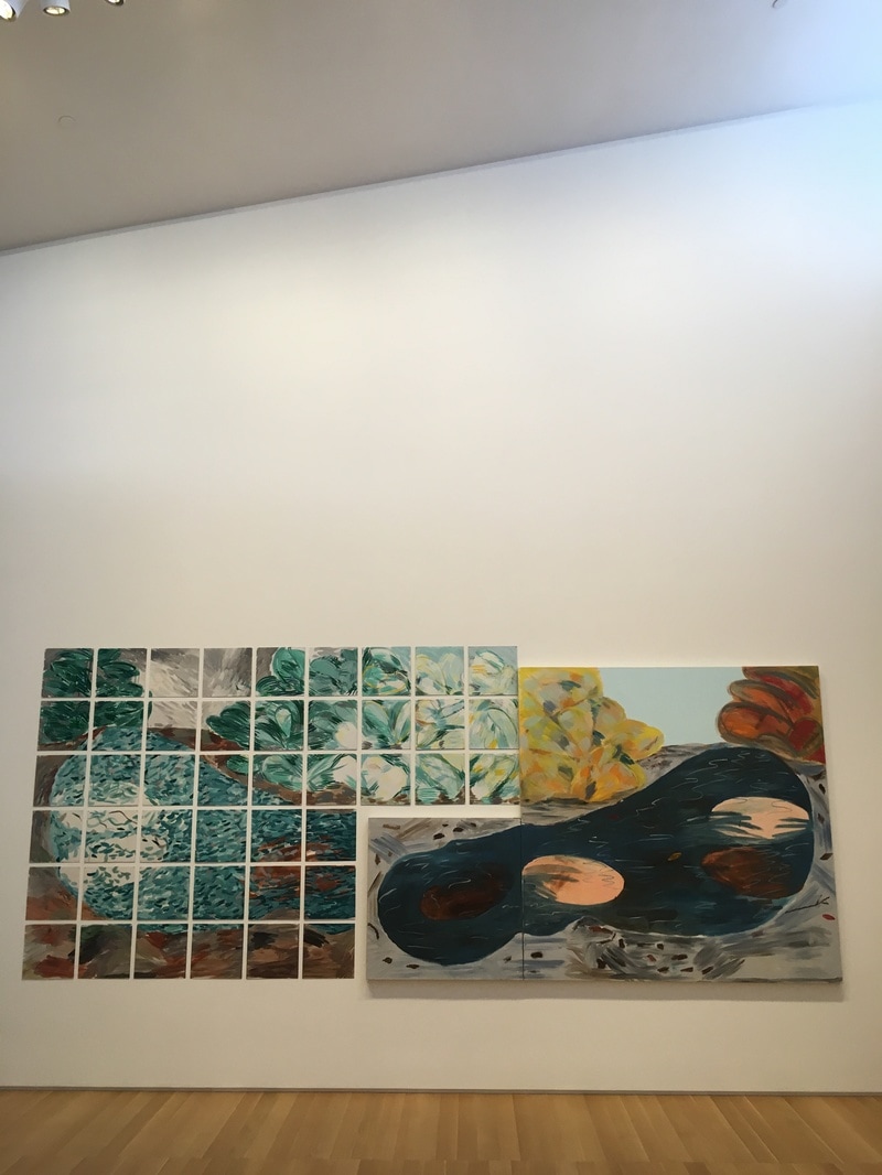
That said, I hate Erdnase by Tony DeLap. I hate, hate, hate it. It is a black painting, which in the right context can be fine with me, but it is on a canvas that is mostly round with a bulge. Earth-Nose is what Erdnase means when you translate it from the German, and in fact, the earth is not a perfect sphere, but has several bulges. The canvas has what appear to be two bulges, but that second one towards the top may be a trick of the eye. This is a shaped canvas work, though not nearly in the same league as the ones in the section across the way populated with folks like Frank Stella. The canvas' shape is all there is, and maybe that's the point of giving us only the matte black of the paint on the misshapen canvas. but that's all there is. There is nothing for me to grab on to other than the fact that I speak a little German and get that aspect. Still, to me, this ain't Art, but I also understand that it's in a museum, has been curated, judged to be Art, and I need to accept that. Doesn't mean I have to like it, though; all art ain't for everyone. 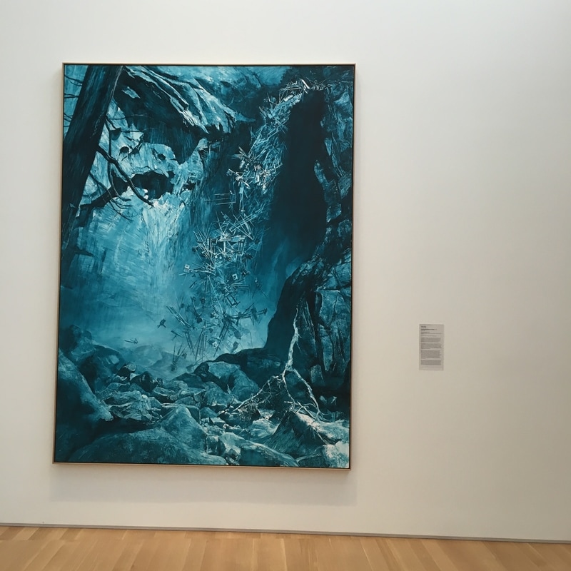 I love Yosemite. I've been more times than I can count, and this summer, we're taking my twins there for the first time and it will be the moment I really feel like I've given my kids something that was given to me when I was young that actually meant something. This is one of the most playful pieces in The Anderson. It is a dark, overly blue version of Carleton Watkin's photo of Yosemite Falls. The funny bit here is that the falls are entirely composed of old-timey cameras. Yosemite is one of the most photographed places on Earth. It's natural beauty is unrivaled, and the work of Watkins, and later Ansel Adams (who I once did a class with when I was 5 or so, which was the cool thing about that guy is that he used to do those things!) helped to spread Yosemite's popularity, which led to the tourists taking their pictures, assuming that the subject of Yosemite was enough to make them Watkins or Ansel with their instamatics or Brownies. 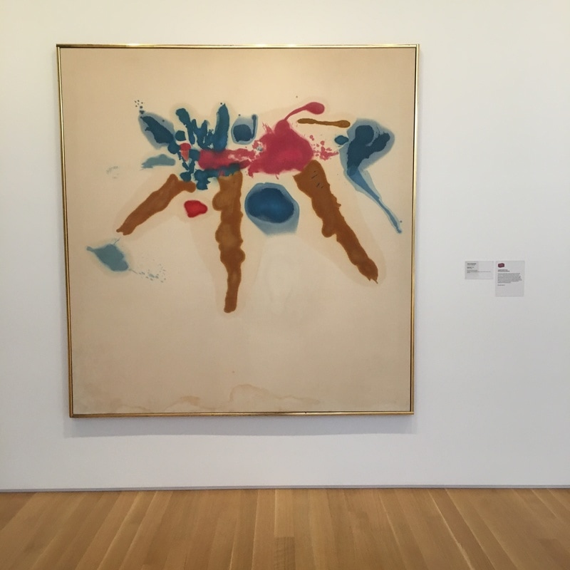 When I think of the Abstract Expressionists who aren't Pollock, Helen Frankenthaler is the one. Her works, which feel more ike lcontained stains than paintings, haunt me. Haunt me in that these colours do not exist. It is not the blue paint that matters; it is the seeping weeping auras that encircle the blue that matter. She is painting not in negative, but neither is she painting in the positive - she is painting in the suggestive, The atains are the work, and the actual paint is merely the vehicle to make them happen. This is likely my favorite painting in the Anderson. It's beauty is in the depth, in the bleed. I love it.  Aluminum sheets Covered in paint Abstraction Expression Folded Space As if Painting in three dimensios Holland Delivering A stripped experience Epoxy topping Three foot jutting Warning us in bright epoxy That we are so soon trapped 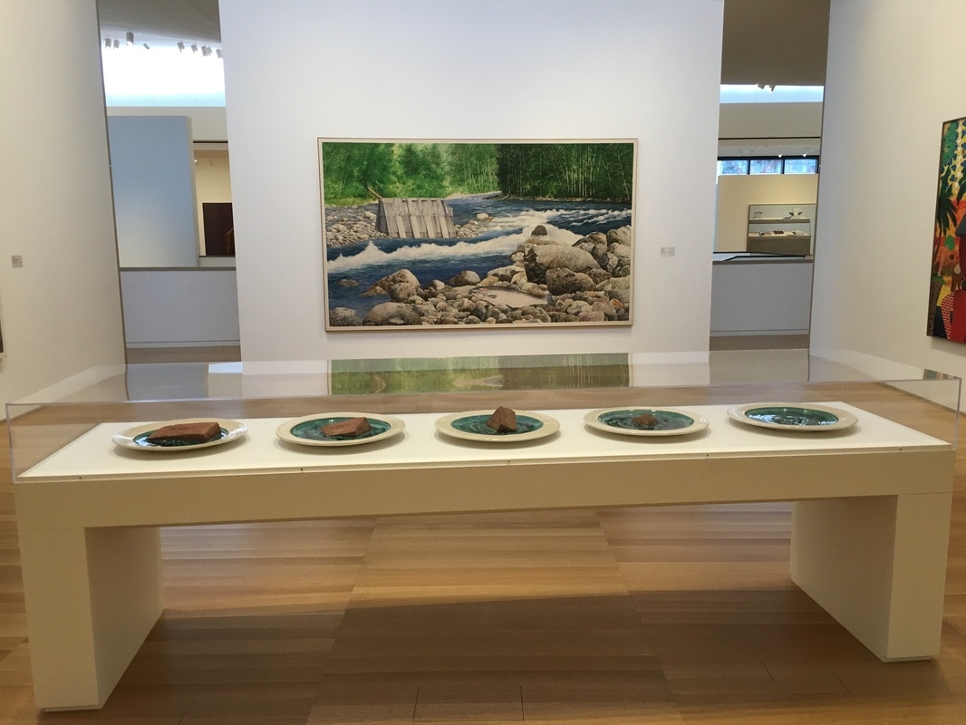 When I think about puns, I think about paintings. Apparently, that's the best place for 'em! William Allan's Half a Dam is a visual and a word pun, all rolled into one! 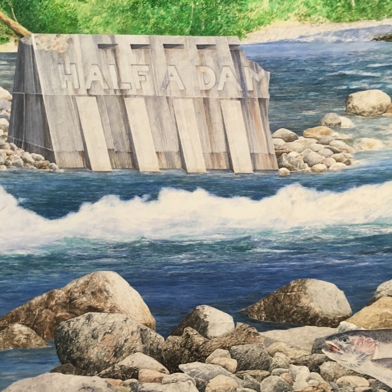  I love this gallery, but am not thrilled with this piece personally, though I completely get why it's one of the most important in the Anderson Collection, and absolutely adore how they've positioned it as a focal point, a defining aspect of the most important room of the museum!  This multi-panel painting is one of my least favorite in the Anderson Collection. Bartlett, an artist I usually enjoy, seems to be doing something that I can not quite figure here, and at the same time, I can't deny that there IS something here, some figurative moment that appears to be working as a work of biomorphic abstraction within a a straight-forward, if disjointed, pair of landscapes. And then it hit me - this is only a pair of landscapes because my brain stitches is together as one. This is a work of forms, a series of completely abstract works that are then placed within proximity of one another, and my brain does the rest, but take this as an installation piece indtead of as a painting, and there's something here. Or, at least I think there is... |
Your HostChristopher J Garcia - Curator, Fan Writer, Podcaster, and a guy who just loves art. Archives
February 2019
|


 RSS Feed
