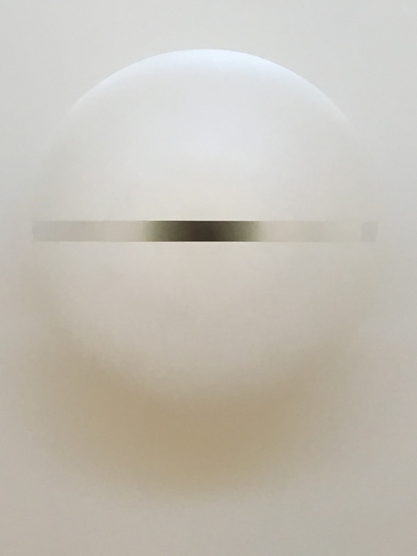
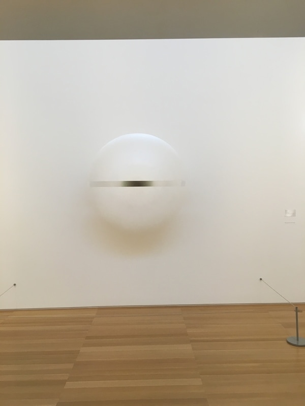
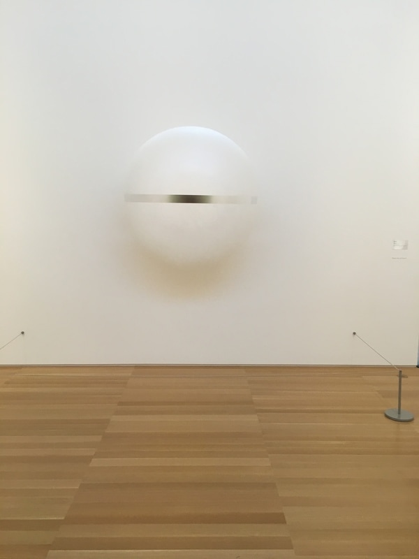
 This is the piece that frightens me. It does not make sense to me how it works. It appears to be some sort of floating orb, as if it were painted to show the hint of an orb where the painter took a dry brush to the edges. Of course, it is actually a sculpture. I have no idea how it works, but to me, it's frightening. It is a three dimensional piece that appears to float within a two dimensional world. It has the appearance of an all-seeing eye, and appears to be looming off the floor of the museum. There is a menacing presence in this piece, far beyond those that actually depict menace. Somehow, this haunts me, and quite rightly, I think.
1 Comment
 In late 2015, when I started thinking about putting together a program dedicated to the Arts. Not all docs, not all narratives, not all live action, not all animation. Something that took Art as the focus and played within it. It worked! I thought it was a real fun program last year, and like a studio exec with a solid film on his hands, I thought I'd try it again this year, since there were a lot of films with Art as a focus.
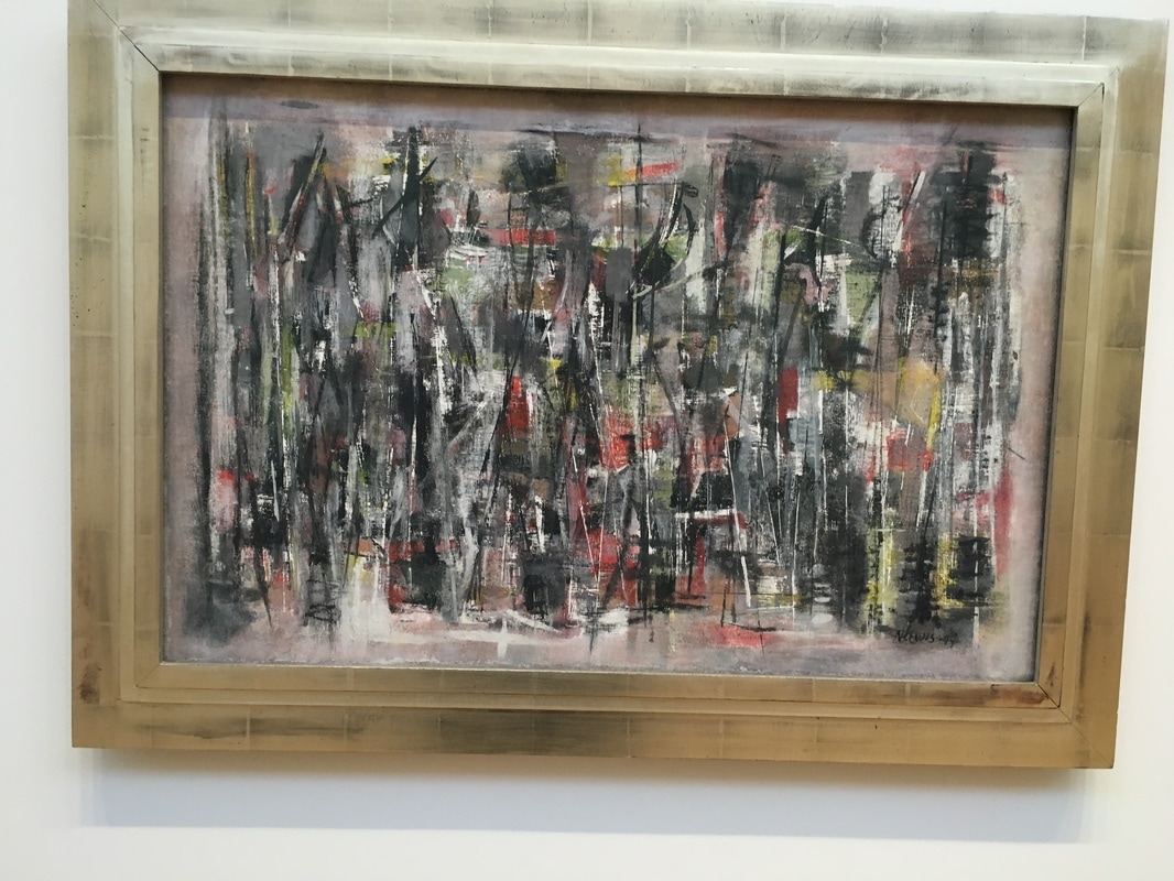
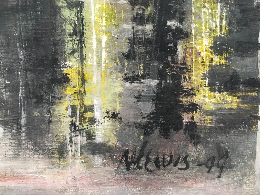
I had no idea who much win this would produce. The 2017 program The Truth in Art is not only the best program concept I've ever had, and we discovered an amazing array of films that just flat-out work. Roughly half docs and half narrative films, they all play within the realm of the Arts, and one that deserves special mention is Real Artists. Sophia is a filmmaker. She's good. Really good. Anne is working hard to get her to join Semaphore Studios. Anne lets her in on a secret - the secret of all Semaphore's success is based on an illusion of creativity. I'll leave you there. I know it's not fair to compare new works to existing works, but I'm going to any way. Real Artists is based on a Ken Liu short story. I love Ken Liu, a fellow Hugo-winner! I like him a LOT! The story is so great, and here, director and writer Cameo Wood rises to the source material, and using the perfect level of CGI and precise and wonderful cinematography, she establishes a visual styling that brings her work up to a level that is unbelievable. The acting is so smart, not showy nor staid, and the script is taut. Is it better than the story? A fool would answer that question not realising that they are two very different worlds and it is nigh-impossible to compare, but within their realms, they are on the same level within my view. The other thing this brought to mind is the wonderful short animation Technological Threat that I wrote about here. There is a very similar thread between them, though the animation takes it into comedy and Real Artists into drama. I can't stress enough how wonderfully they both are in their arenas, and if I was programming a shorts section for a festival or museum around the theme of "Workers & Technology - Fear & Loathing" I would include both. This is a magnificent film, and one that I am certain will bring much thought, not only about what you see on the screen in this film, but in every film you encounter from here forward... Real Artists shows as a part of the Shorts Program 3 - The Truth in Art showing at the Century Redwood City on Thursday March 2nd at 330pm, Saturday March 4th at 1030am and Monday March 6th at 930pm. It also shows at the Hammer Theatre in Downtown San Jose on Friday, March 10th at 145pm. 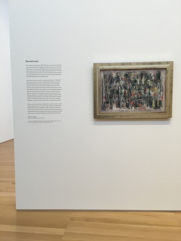 Norman Lewis is one of the very few African-Americans you read about when looking into the art of the era that brought us Abstract Expressionism. He was often exhibited alongside the works of the rest of the New York School. He was a master, but after being considered a major figure at the time, he was shunted to the side in the following decades, which is a shame as I find his work to be incredibly engaging. The inclusion of three of Lewis' work as a temporary exhibition is a very nice touch, especially since the three works are hung on the free-standing wall that has the Pollock work Lucifer on the other side. The piece Untitled from 1949 is a joy. I had only once seen a Lewis painting, and it was far more like the larger canvas, also Untitled. Here, Lewis is working in rough-hewn geometry, seeming to create a series of somewhat hazy intersecting and interlocking triangles. The effect is impressive, as it brings the eye not to the pinnacle of the forms, but to the splashes of color that are present at random intervals. Those alone made me wonder what was the idea here - to create an image which celebrated the colors presented by giving them room to land thoroughly, or was it to show them being consumed by the black and grey, as if they had once ruled the canvas and now the darkness was seeping in from all side.
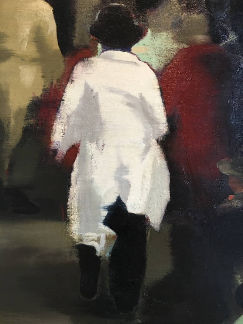
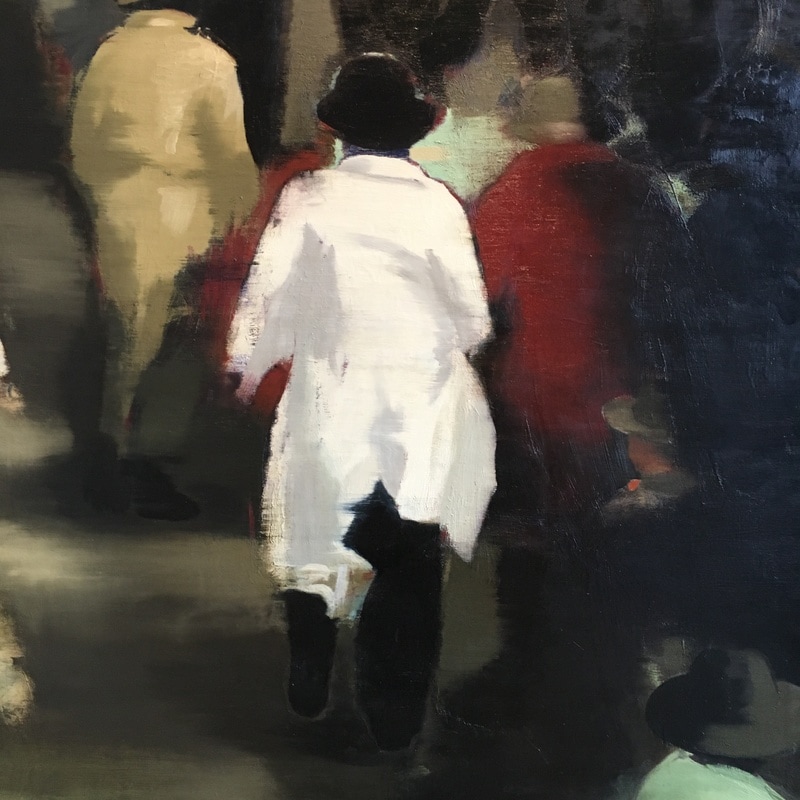
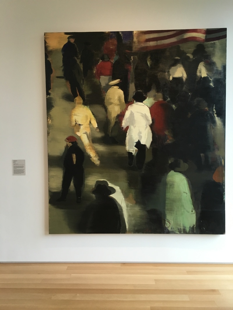
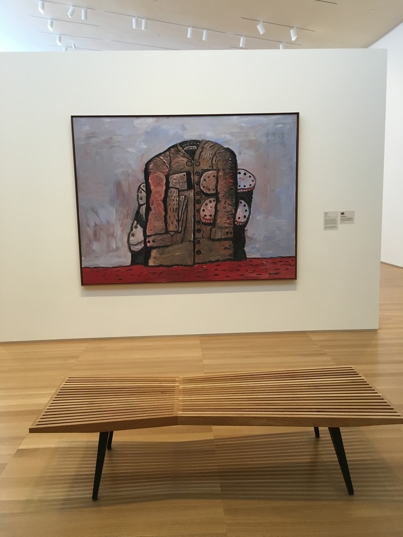
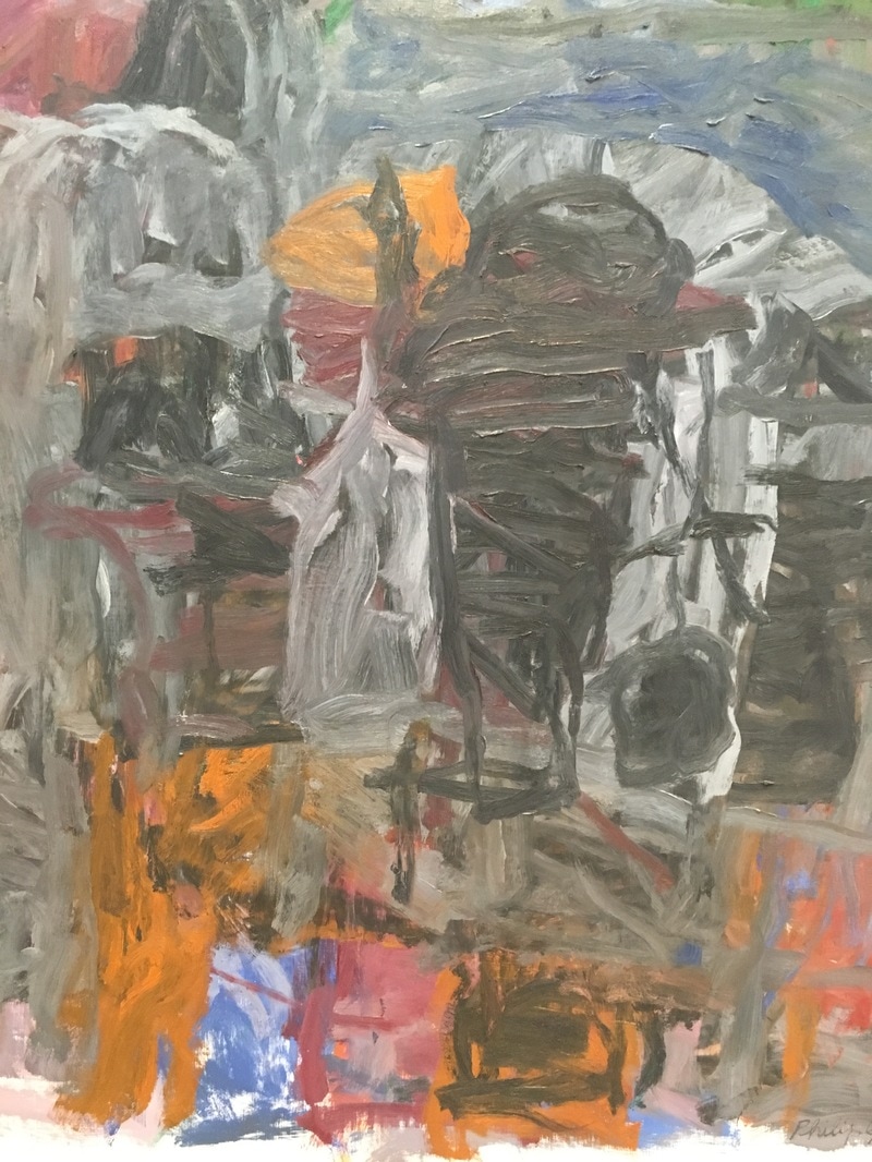
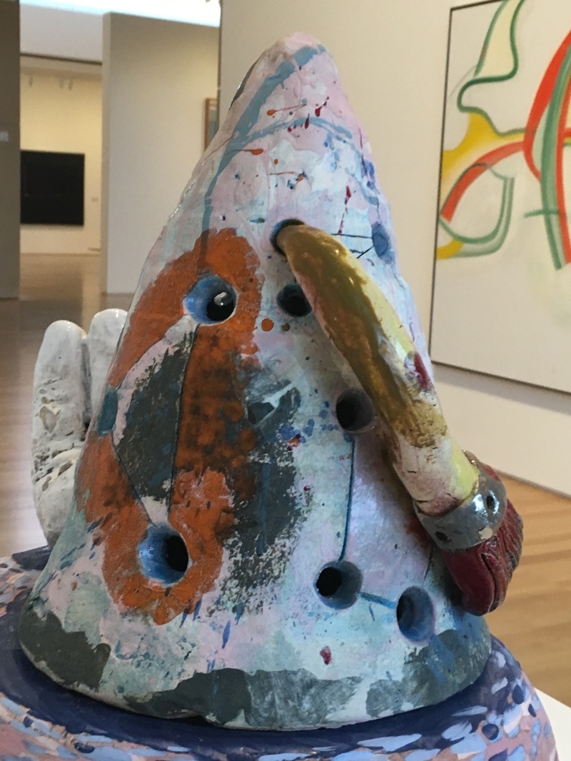
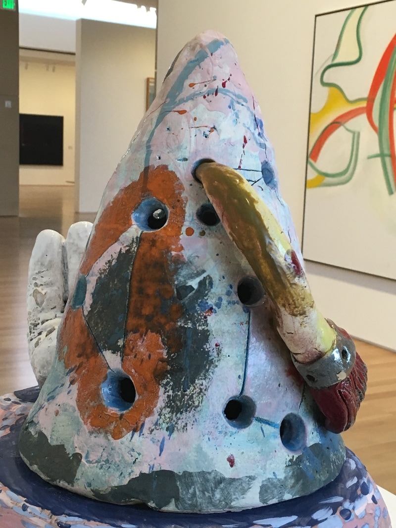
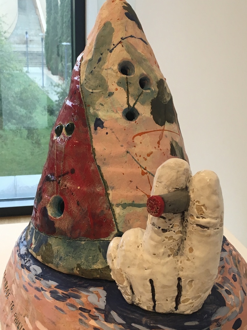
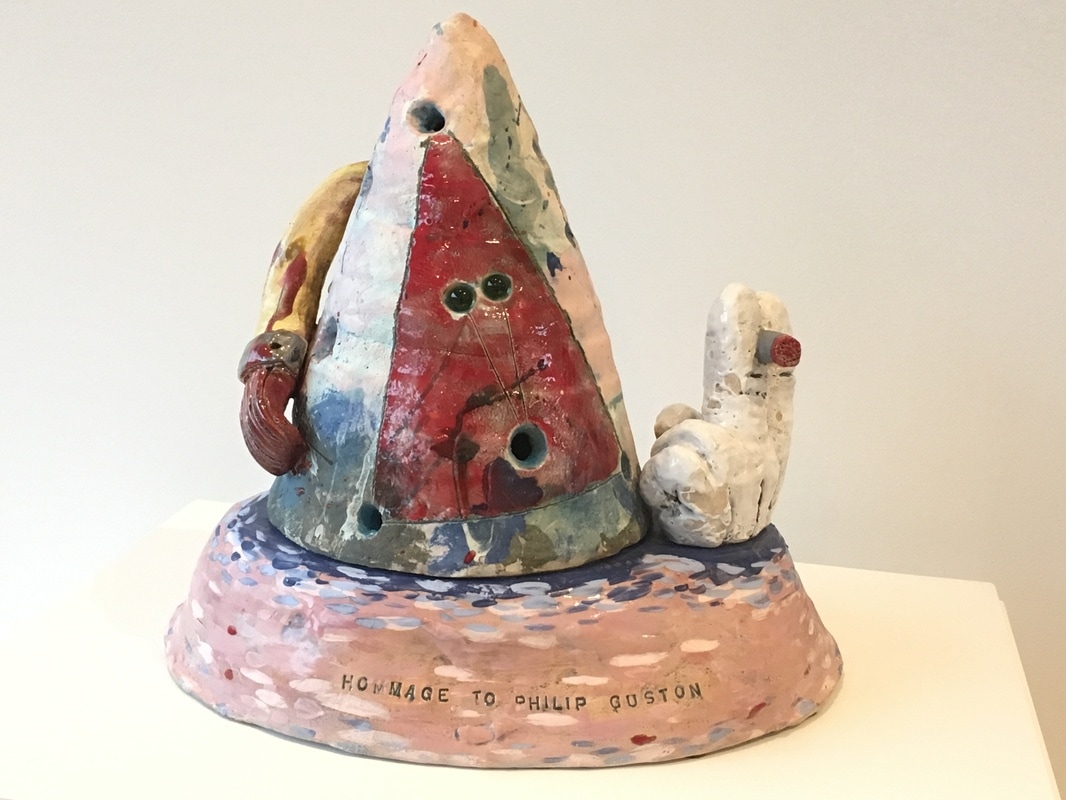
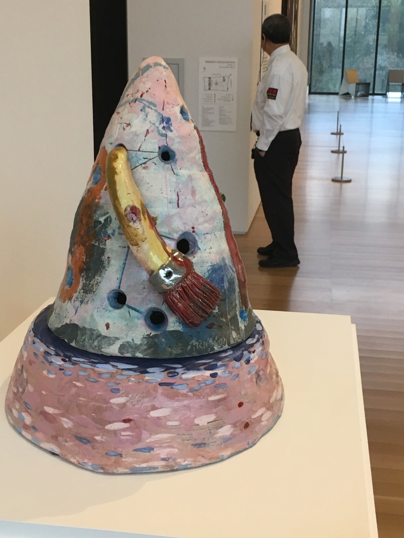
This work was not my favorite of the Lewis pieces, but it was the one I spent the most time with on two of my visits. 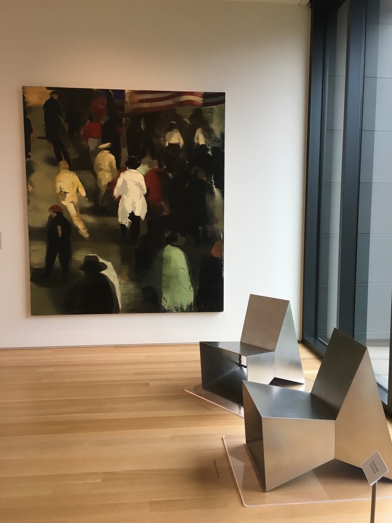 This is a painting of post-war America, moving forward, busy, hustling, streaming into the future. The flag shows that we were the winners, we had beaten back Japan, gone over and kicked Uncle Fritz right in the monocle! We were getting ready for the boom, the best years of our lives, of all lives, ever. And yet, here, no one is looking at you. Every back is towards you, as if you didn't matter. As if you were the one being left behind. This one hurts. It really does. It is a painful reminder that not everyone goes on to the bigger and the better and the best. Some of us watch the backs of those with ambition or connection or innovation or whatever. We are at the back of the pack, watching as the stream flows away from us, while we are the stones the creek flows over, maybe making a ripple, but often not even that. Christopher Brown is a helluva painter. This work was created, then sanded, then re-painted, and thus it makes it feel imprecise, or perhaps more accurately, like a memory fading. By the time he painted it in 1992, the memory was fading, we were no longer that America of 1946, fresh off the bomb and V-E and every other cliche. We were still moving away, still reaching for a new tomorrow, but it was nothing like what those Pamplonaing away from us would recognise. The painting of 1992 would be the same idea, different clothing, different timing, but the same idea; not every one moves ahead. 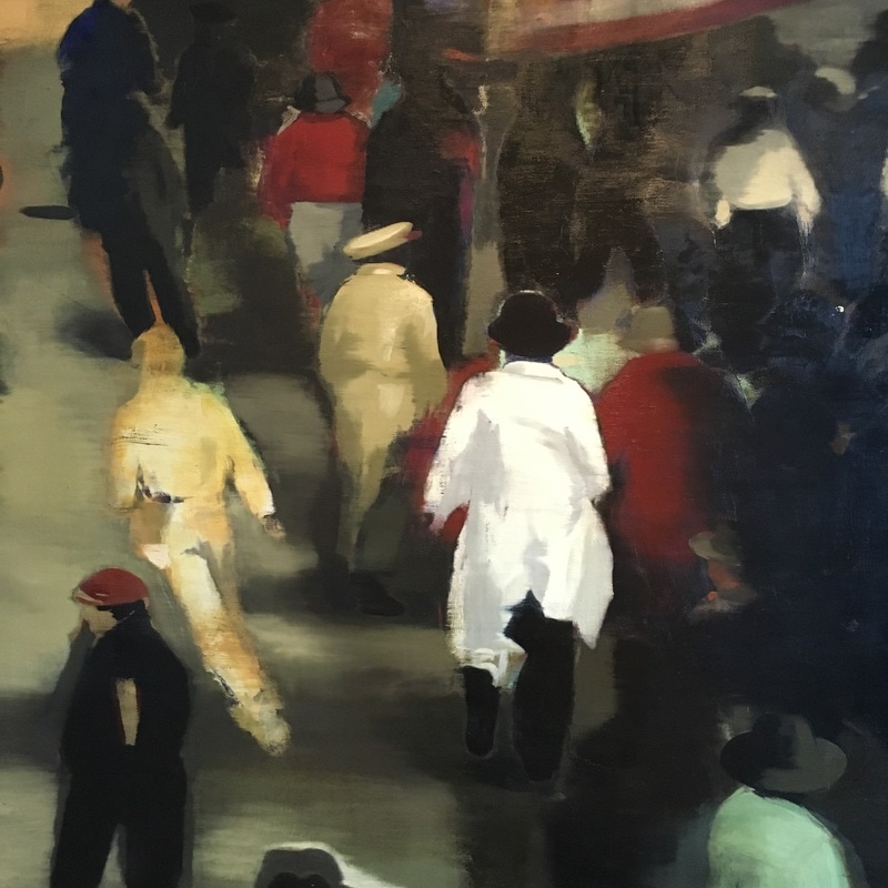 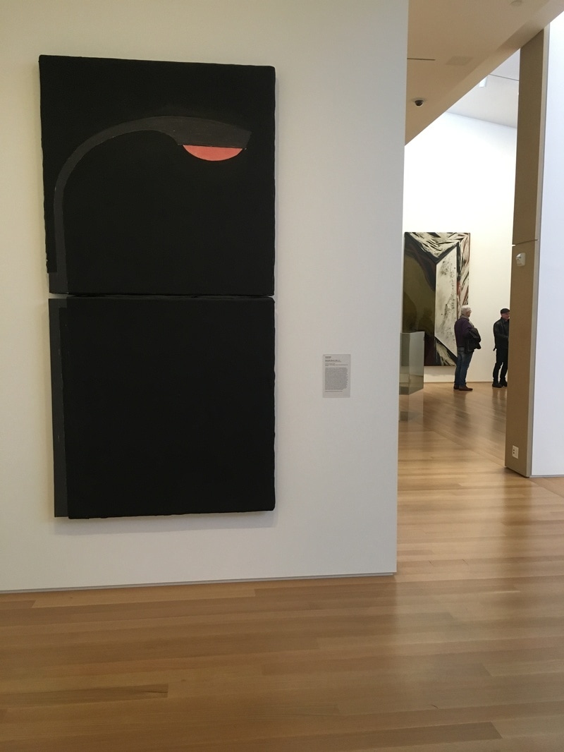 If I have one complaint about what is on view in the Stanford's Anderson Collection, it is the last of Pop Art. Yeah, there are a few pieces, but no Rauschenberg, Warhol, or Lichtenstein, though I know that some of it is on display at SFMoMA. It happens, though I know there are several of each of those folks in the collection. The piece on the floor as I visited that most was a Donald Sultan work depicting a streetlight. Why is it Pop Art? I mean, wasn't Pop mostly a 1960s thing and this is from the 80s? Yeah, true, but art movements don't so much as have edges as they do areas as fuzzy as the boundries of Rothko squares. Sultan chose a simple recogniseable image and gave it to us against a simple black background. There is nothing about the subject that would give us any idea as to the importance of it in the world. It's a street light, that's all. Like Warhol's soup cans or Lichtenstein's comic book images, it's not important what the subject is; it is important that it is being presented on a wall in a museum. It is a lovely piece, and the way it is presented in the space is what made it for me. It is on the end of a short wall. When you are facing it, you're looking down what I think of as the left-side hall. It is as if it is illuminating the way, marking a point in the trip where you can stand and know you're under light, and sometimes when it comes to contemporary art, that's a blessing. 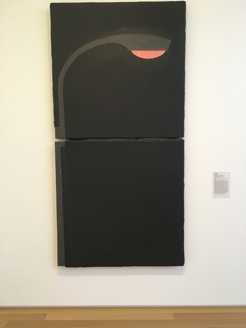 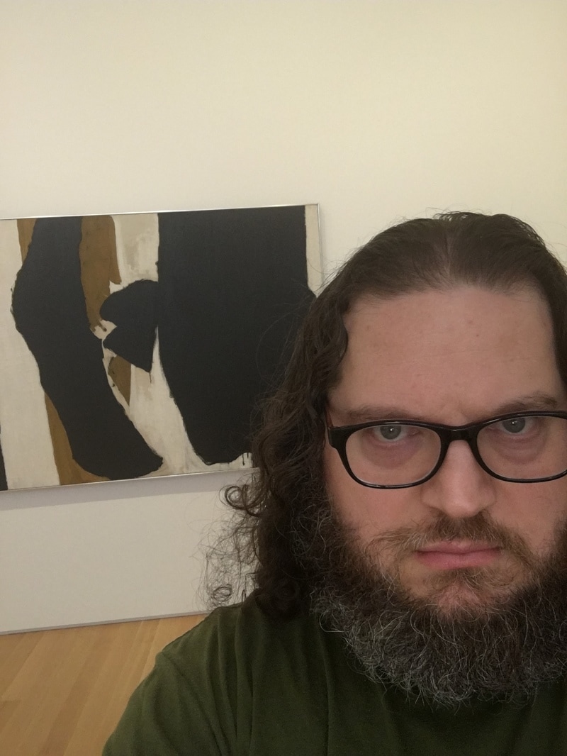 What of Robert Motherwell, his great black swatches in the center of the canvas, his quick globs of depth seeming to fester, infecting with other colors present? What did he mean by this, this haunting of a painting that seems more suited to the rambling than of any sort of conversation. I love Motherwell for his distance, his inability to allow you in. Even his series of Elegy for the Spanish Republic, a title worthy of mournful celebration, is nothing more than a collection designed to serve paint as sticking place. This work, where the black is front, the taupe behind, the white still further away, is worthy of inclusion in his best, but it is not so easily defined. It is neither map nor tombstone nor milemarker nor invitation. it is, instead, a work that feels like a work, and not one to be taken overly lightly. 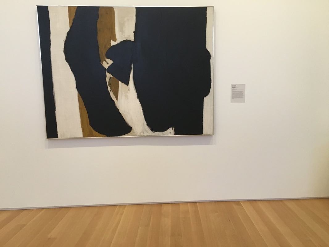 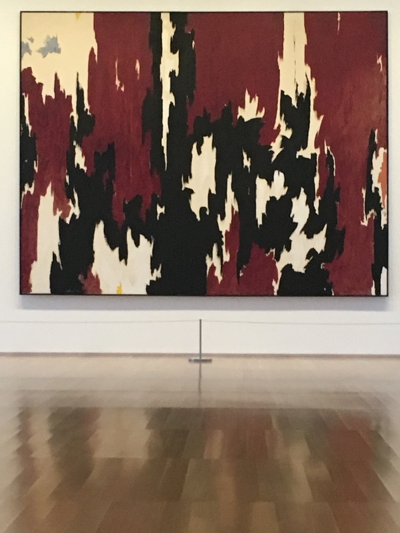 There is a set of stairs in the Anderson. It takes visitors from the first floor to the second where the vast majority of the art sleeps. As a rule, whatever you experience when you come to the top of the stairs is the focal point. At the top, on the wall facing you, is a Clyfford Still. Clyfford Still is going through a resurgance. He is one of the featured artists in the major Abstract Expressionist exhibit in London. While Pollock, Rothko, Motherwell, and deKooning have all become household names, Still was the one who came to abstraction first. The piece in the Anderson is large, and to my eyes, one of the most beautiful pieces in the entire collection. The contrast between the reds, blacks, and whites allows the mind to go from edge to edge of the surface, making it impossible to travel the distance in a straight line. The borders formed contain nations, zones, territories of pure colors, but they are full of weight. It is not a light piece, not like the MItchell around the corner, but it is also not nearly the AbEx impression as is given off by the Pollock, Rothko, or Frankenthaler in the collection. The feeling is something new, different, and when I first saw it, I could not place what I was experiencing.   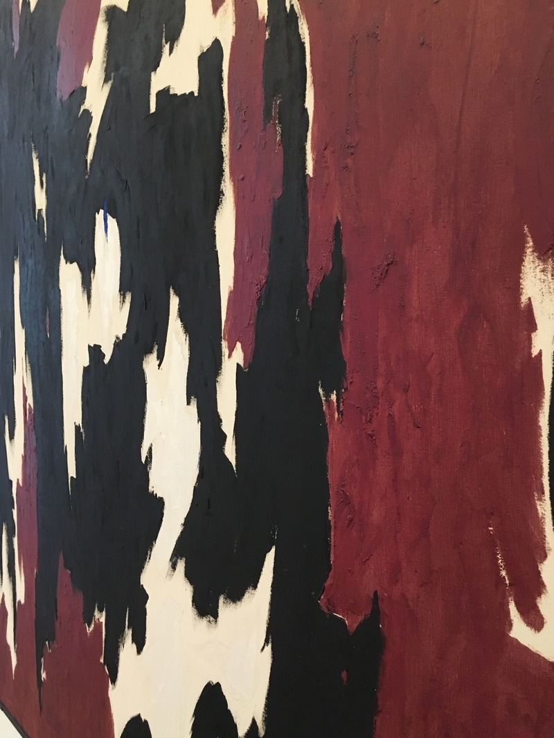 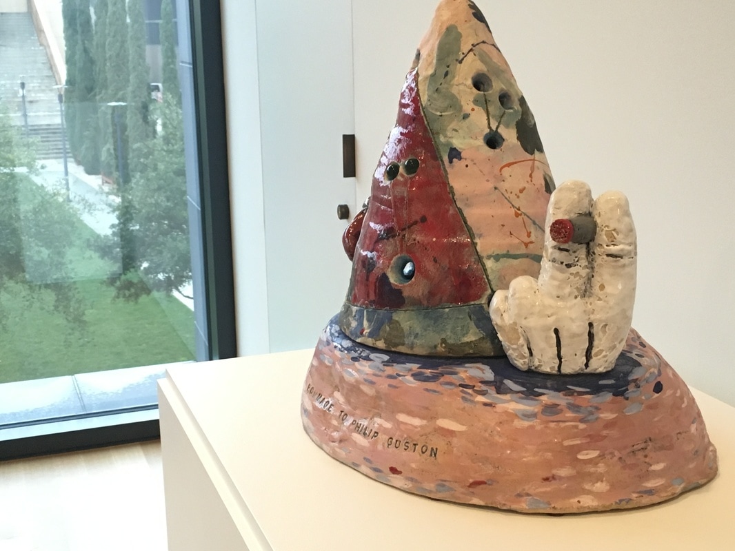 I am learning more and more about ceramics. Between Poncho Jimenez and David Gilhooly, I've come to Jesus on it. Of course, Robert Arneson, the Patron Saint of Three Minute Modernist and father of the Funk Art movement, has helped on that front. The work in the Anderson Collection, Homage to Philip Guston is just about the perfect reaction to the passing of the legendary artist in 1980. Guston, who famously moved away from Abstract Expressionism into a figurative form that folks have called Cartoony, and I tend to consider as a part of Funk. The work by Arneson is the perfect expression of Guston; it shows his AbEx days and his cartoon style in a single 3D piece... along with a cigarette. The two Gustons just around thew way, show how this work is a synthesis of those ideas, and I am so glad it's there!
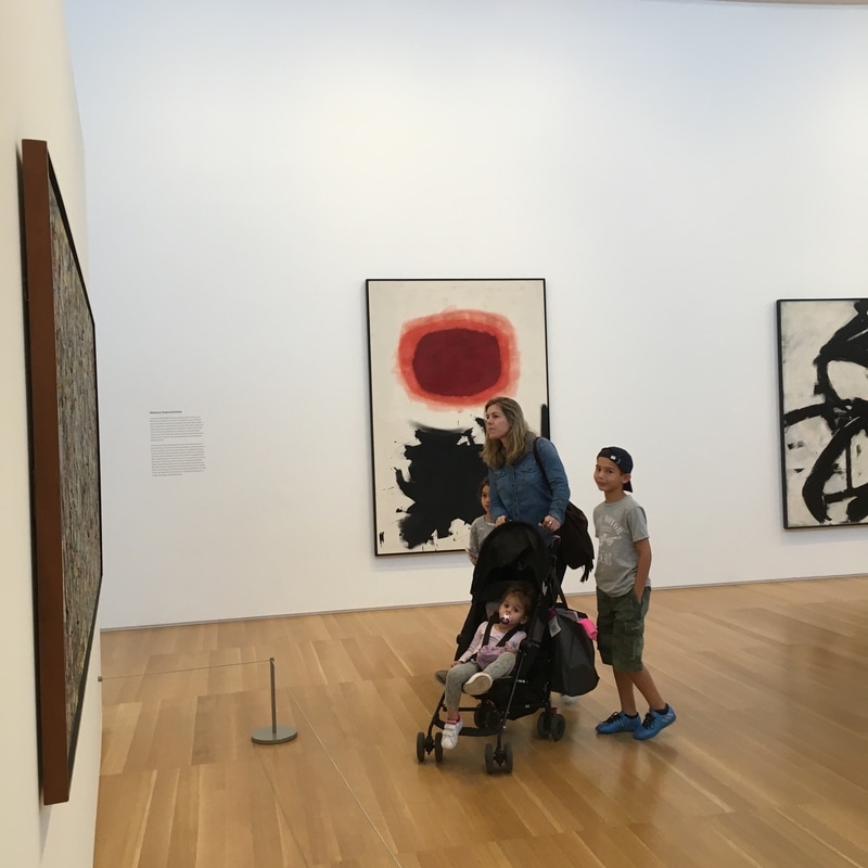 Adolph Gottlieb (1903 - 1974) oil on canvas 90 x 60 1/8 in. Bursts Gottlieb's grand unification theorem for Abstract Expressionism Developed within Unrelenting layers of twinned ill-defined shapes. 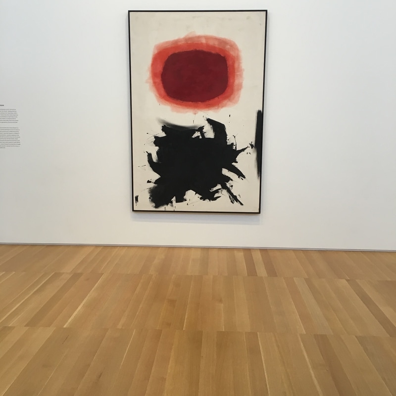 |
Your HostChristopher J Garcia - Curator, Fan Writer, Podcaster, and a guy who just loves art. Archives
February 2019
|


 RSS Feed
