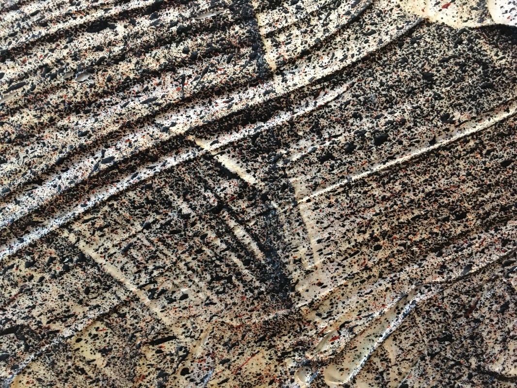
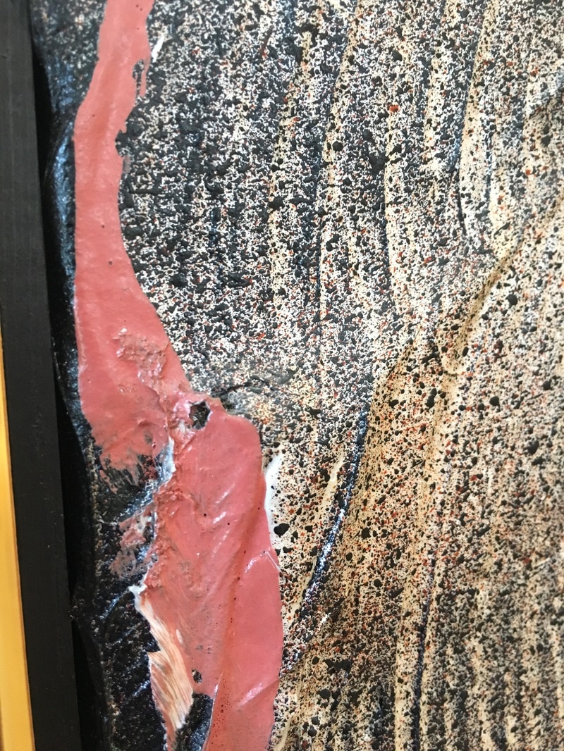
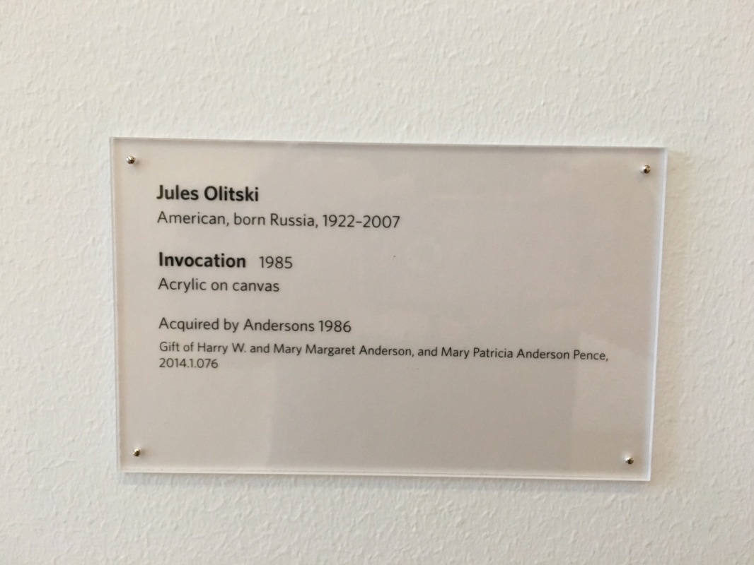
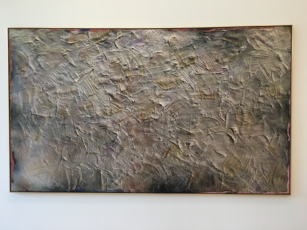
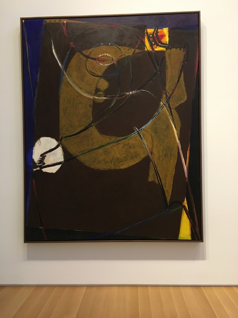
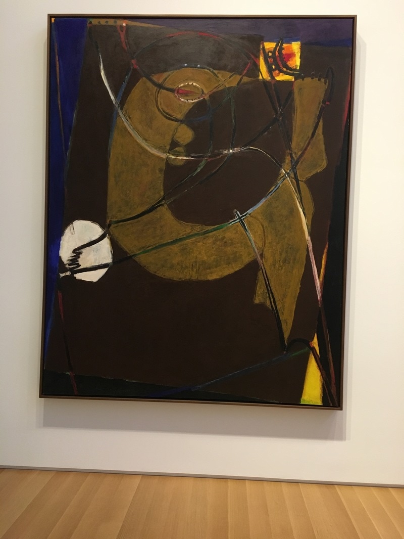
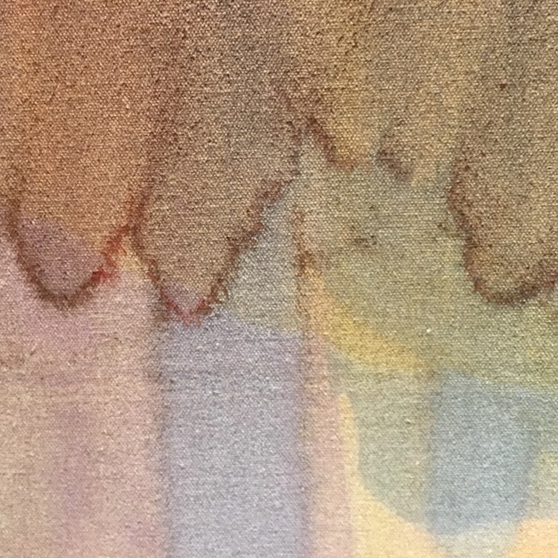
 There are pictures that fool you. Jon Singer Sargeant was a most of those, but the one that gets me is Invocation by Jules Olitski. There is no way I could tell this wasn't a photograph unless I got close enough to make a museum guard uncomfortable. The way Olitski used the acrylics, and heavy swish and almost trowel-like application makes it nearly indistinguishable from a photo at more than 2 or 3 paces. It is reminiscent of the lunar surface, but perhaps it is the most Abstract Expressionist of all the Abstract Expressionist works. It is nothing but brush stroke, clear, visible, undeniable. There is a little color, but it is not applied; it is mingled. This is a work that has become a marking, a painting that has become about the fact that it is painted. I find that powerful.
0 Comments
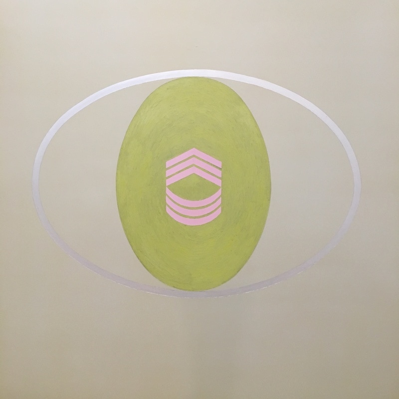
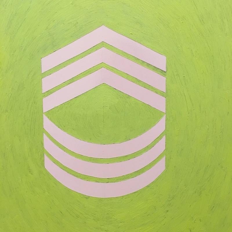
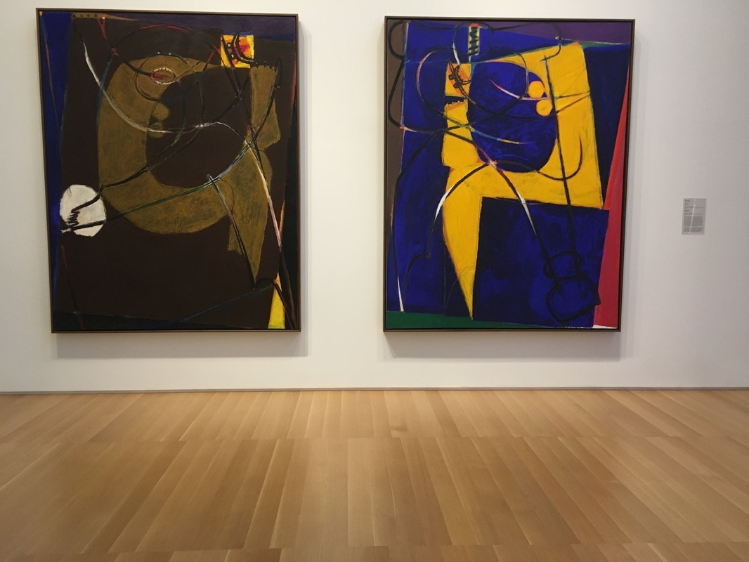
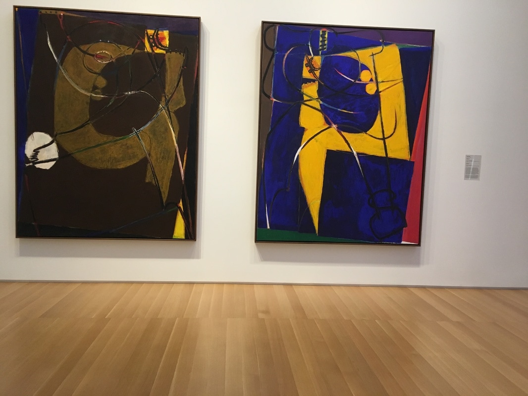
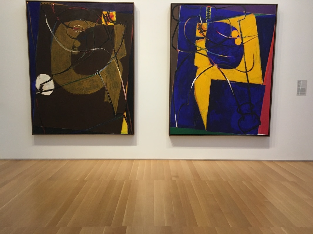
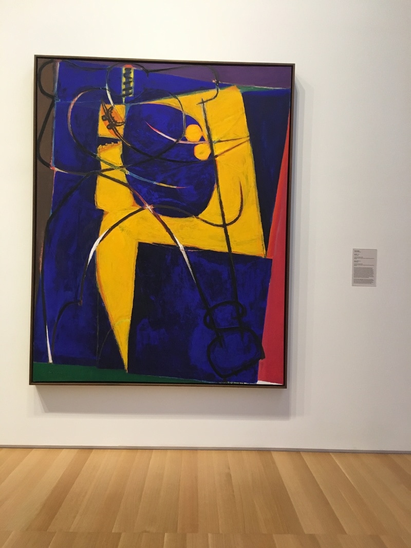
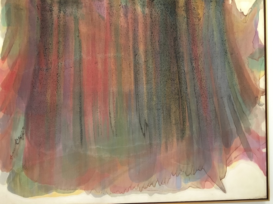
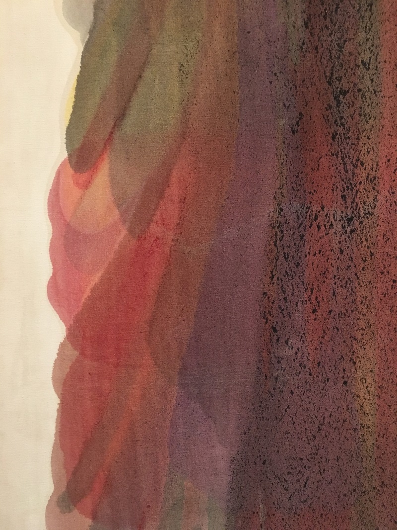
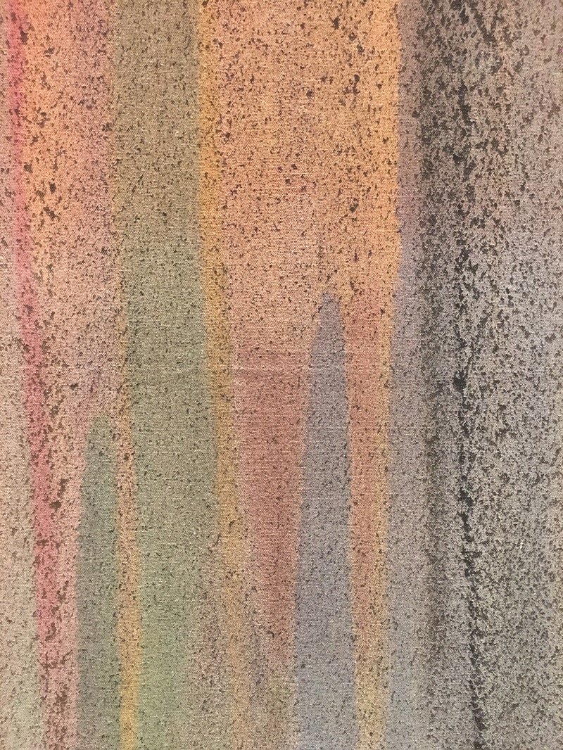
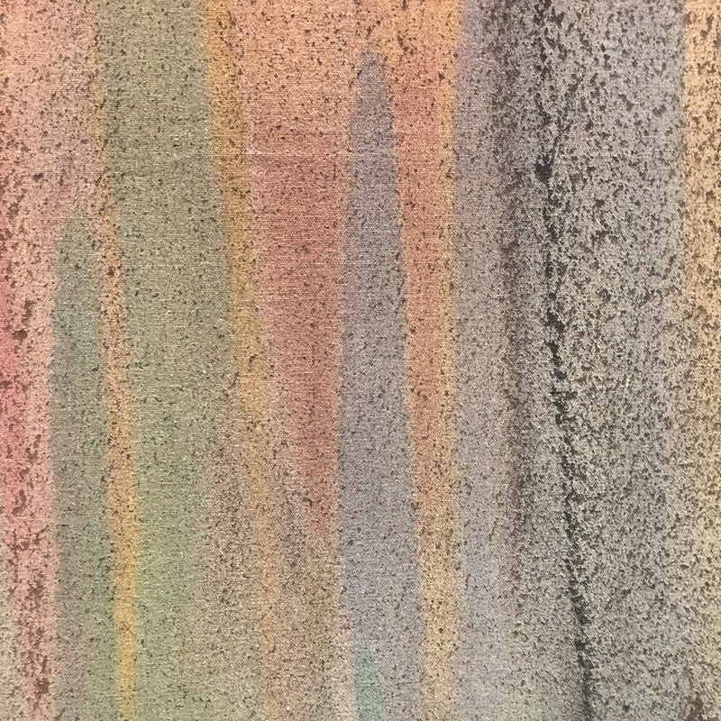
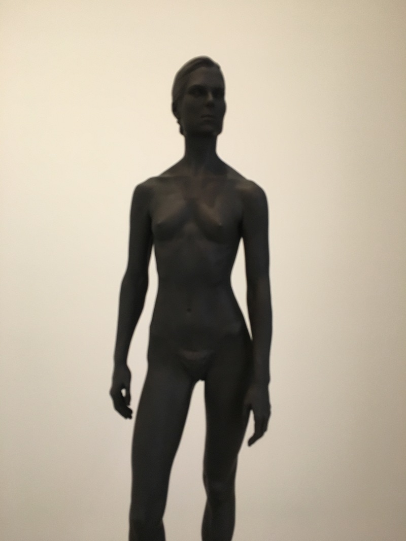
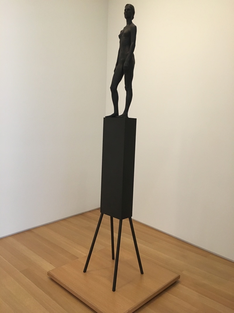
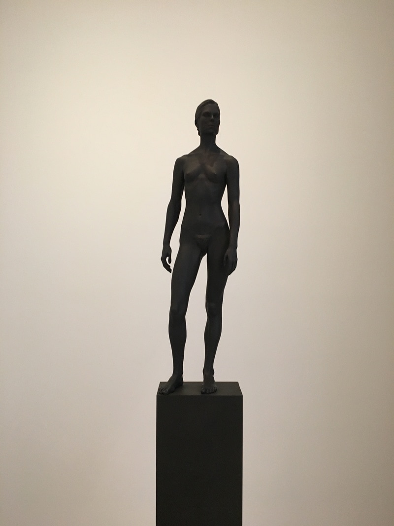
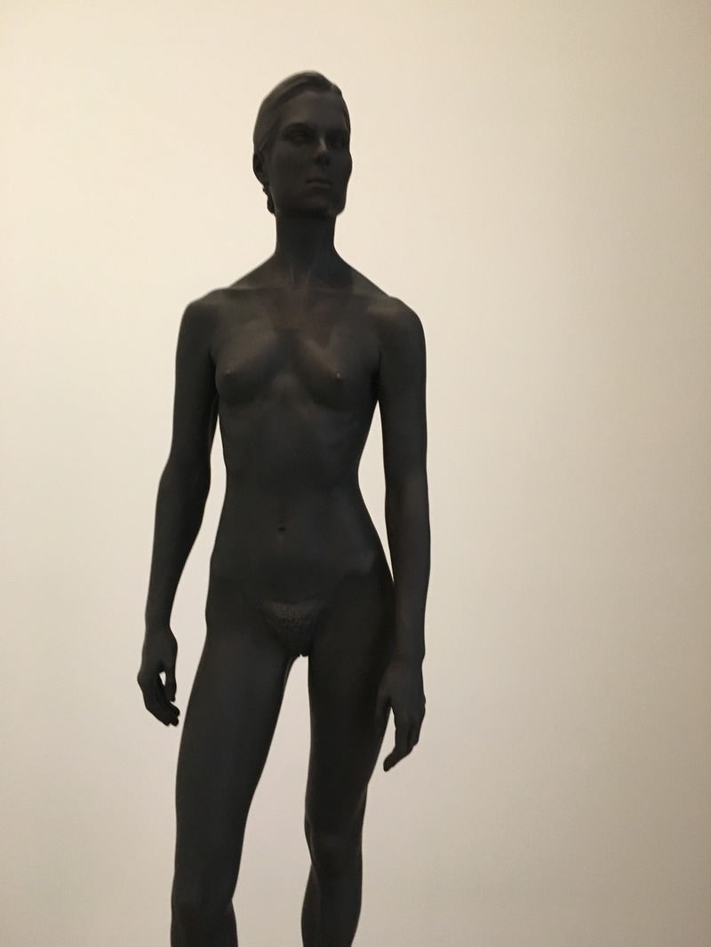
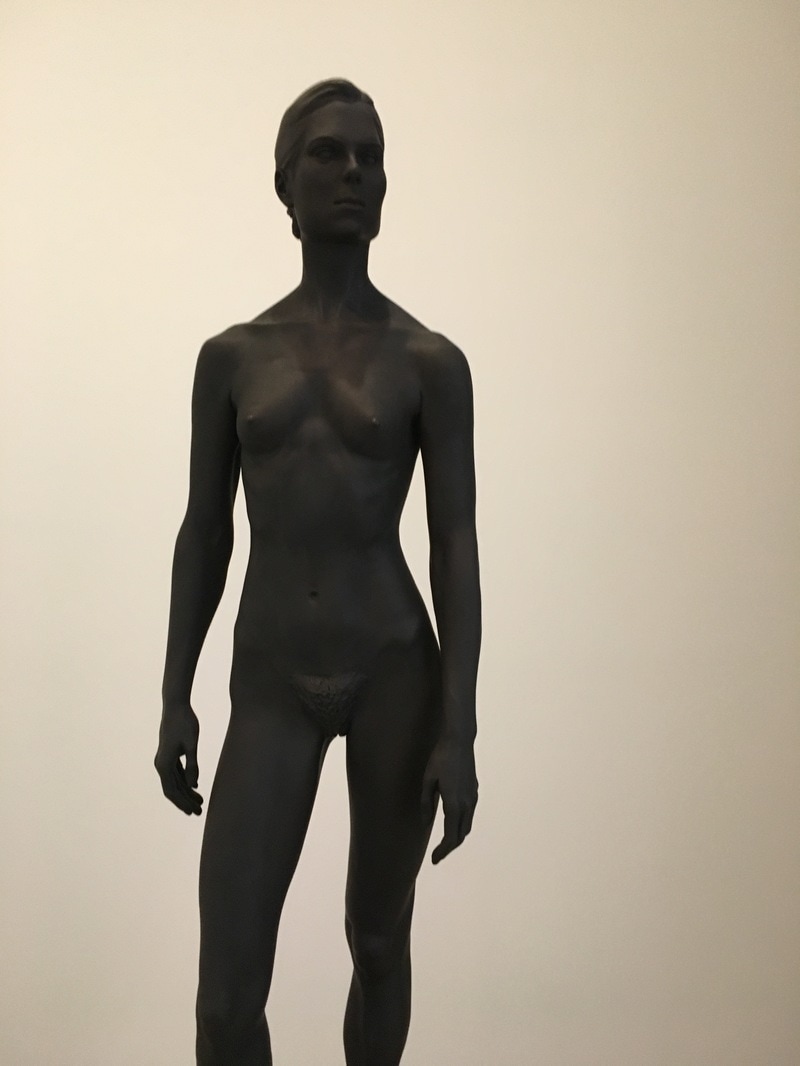
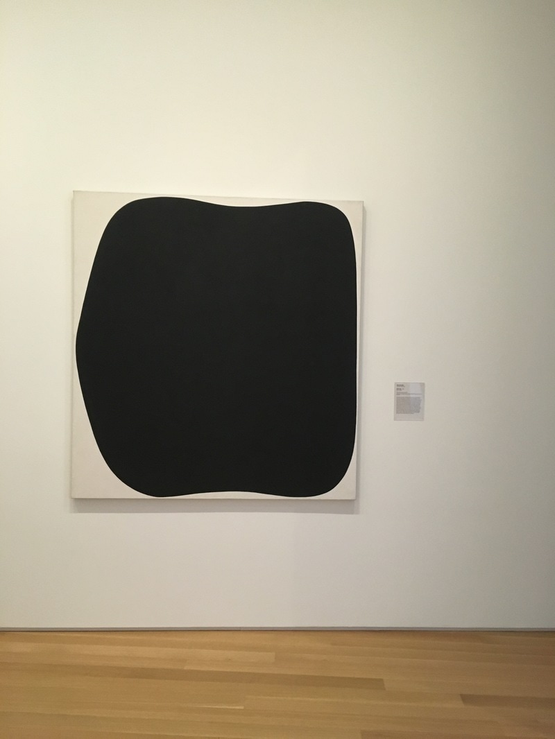
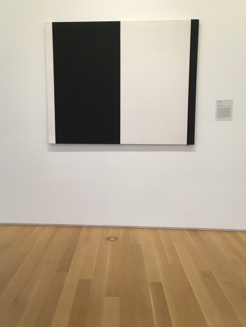
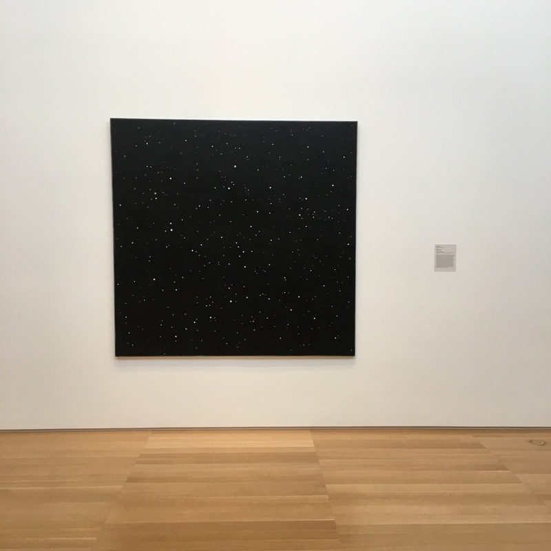
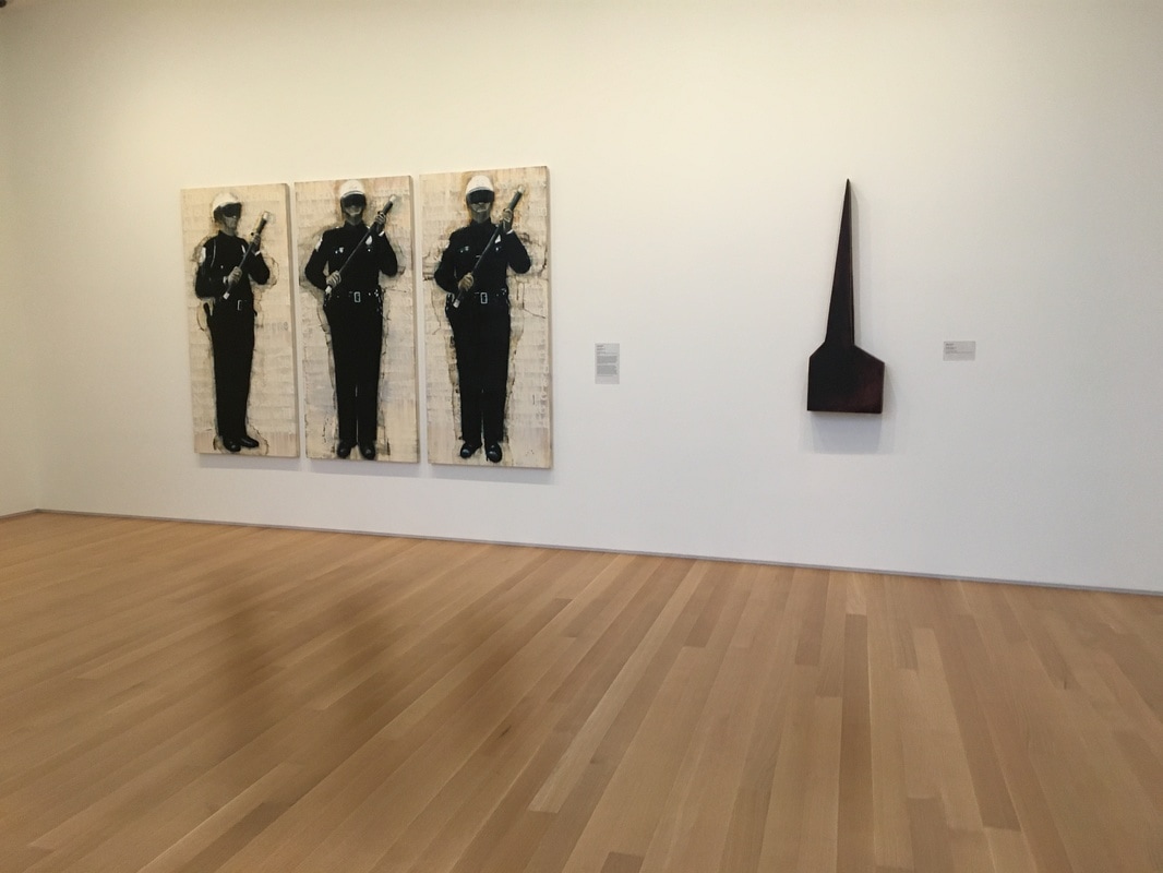
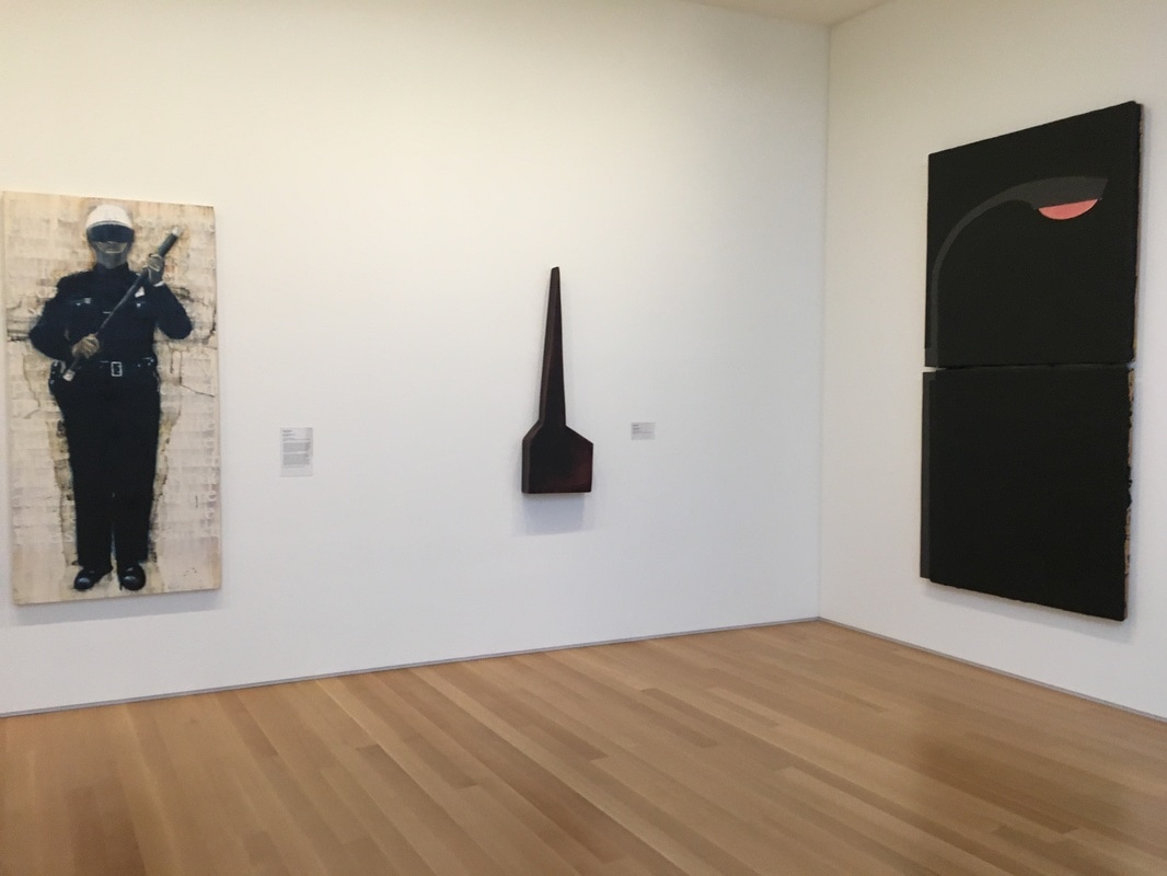
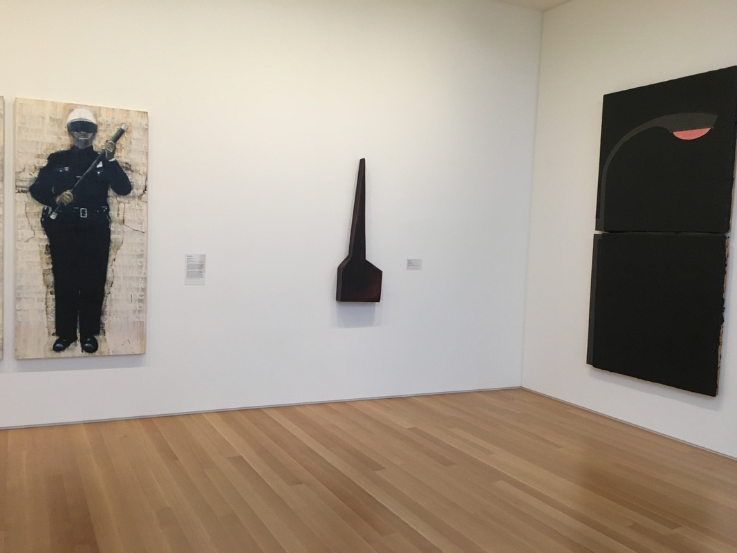
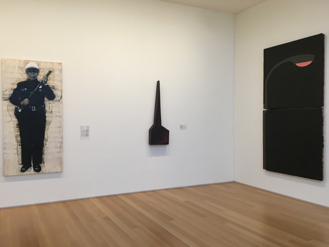
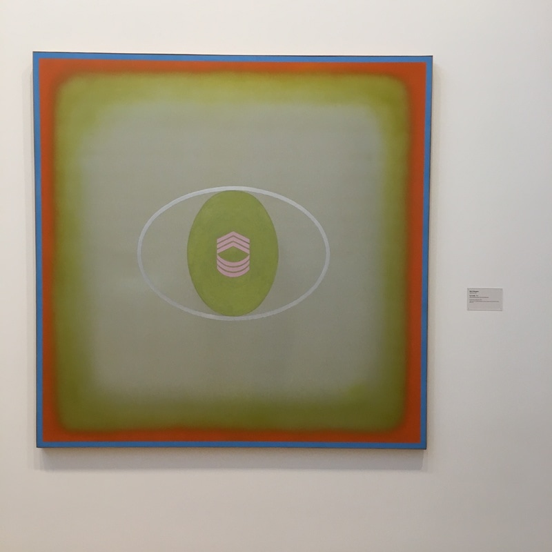 I have nothing to say. This is as nearly as blank a canvas as I could imagine. It feels as if there is less content here than in a black painting. It seems as if there should be something here - the sargeant's insignia, the soft-edged square that surrounds it, but alas, I've got nothing. 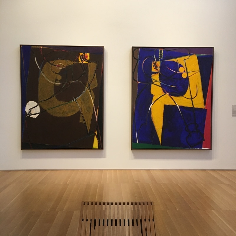 Of the Bay Area abstract Expressionists, Lobdell is just about the most interesting of them. His work sorta straddles the line between early AbEx biomorphism and surrealism. Looking at the works here, they are amazing pieces of semi-figurative abstraction. These pieces are less related to the works of folks like Diebenkorn and more in the vein of Visily Kandinsky, with forms that are representitive in some form, but of which there is no certain representation. 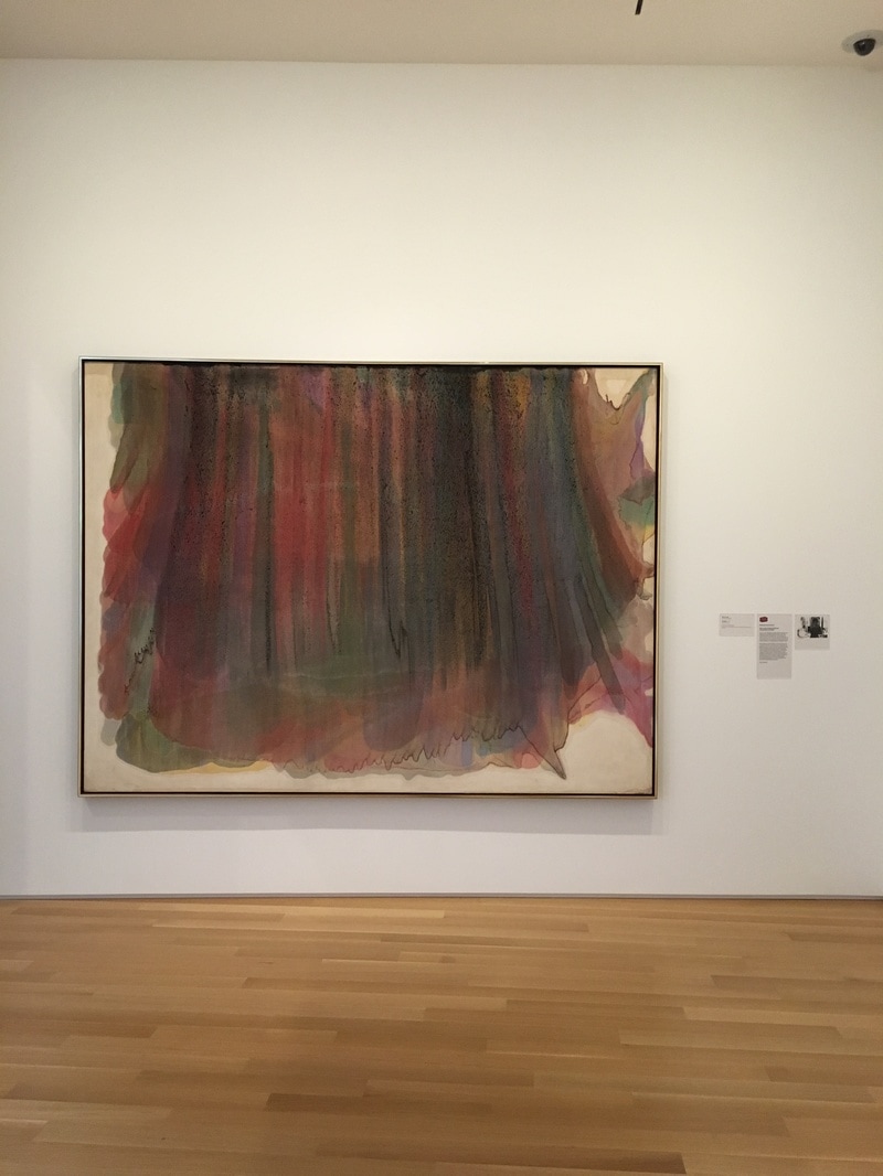 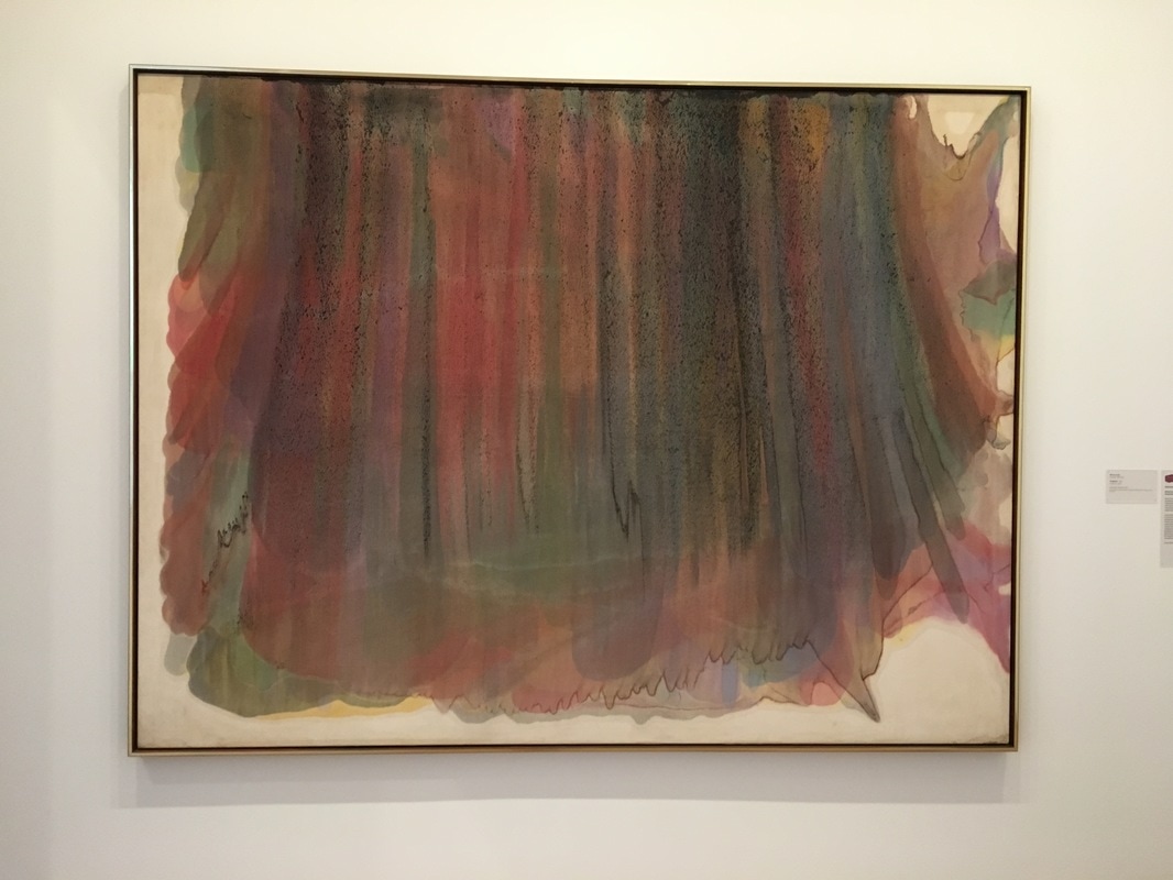 Morris Louis had a method - thinned out paint, a tilted canvas, stains running across the surface. Seen in their entirety, they are strange and a bit distancing, but upclose, tight, they are fascinating.  This work is out of place. It's so naturalistic, and at the same time, it is merely a study, it seems, for an actual statue. It does not feel like a piece that I would expect to find in this collection, until you look at the hallway it lives in from her point of view. She is look along the far right hallway, her gaze seemingly intersecting the top of the Christopher Brown painting 1946. That gaze, comfortable, is encountering the other work that seems so natural, and from that distance, it seems as if it might be a faded photograph. Realism is staring at impressionism, and at the distant she stands, it seems real, true. 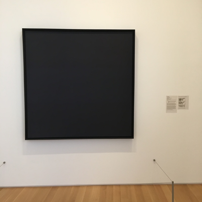 I am not a fan of the idea that a single color painting is a painting. I get it, they are because they are something that a painter put on a canvas and that a curator put on the wall of a gallery or an editor put on a leaf in a book, and thus, a painting. I have encountered a few that, in conjunction with how they were hung and lit, were actually kinda moving, but mostly, they are annoying.
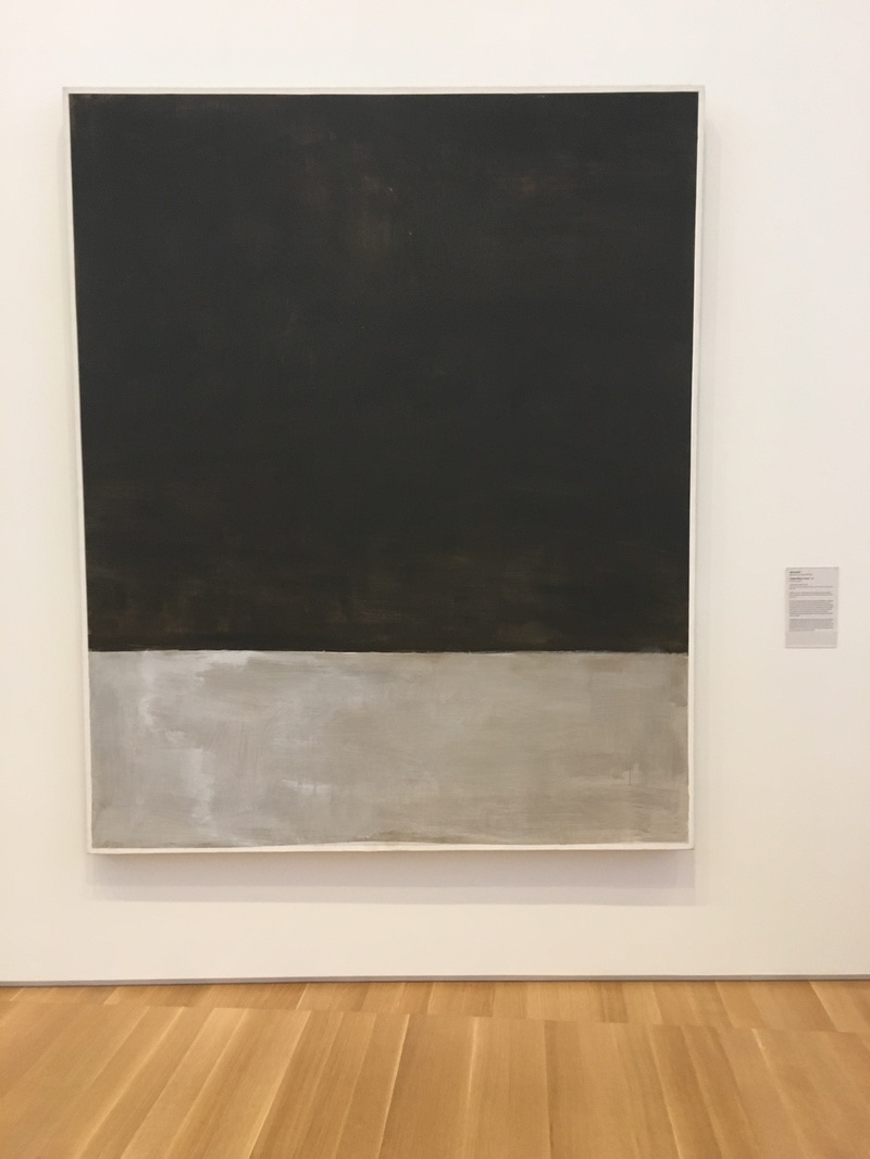
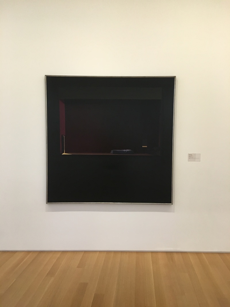
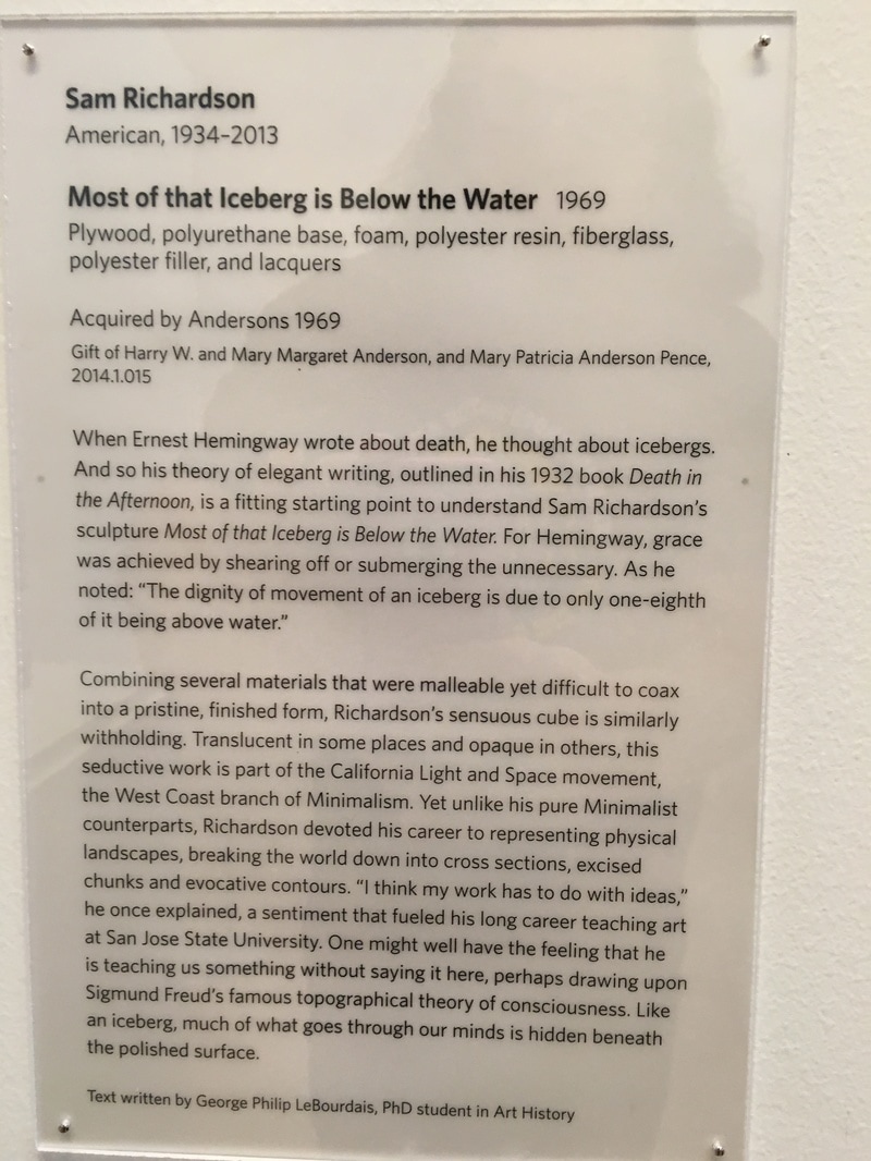
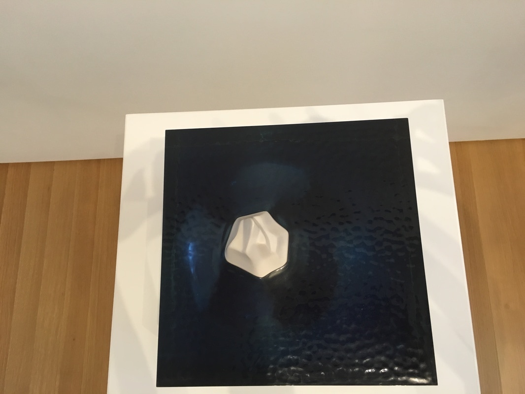
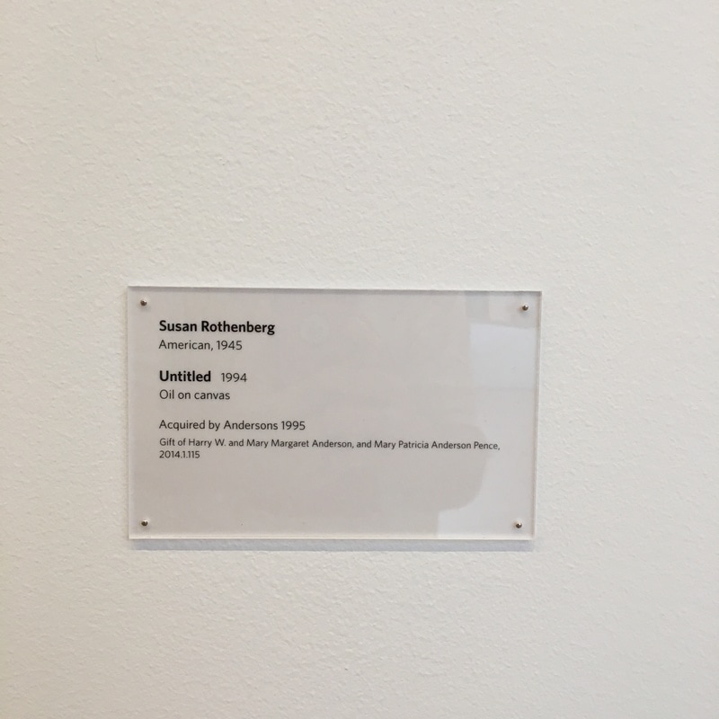
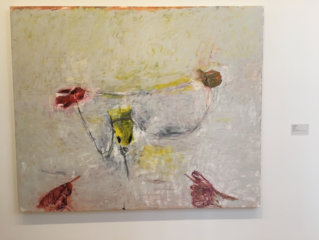
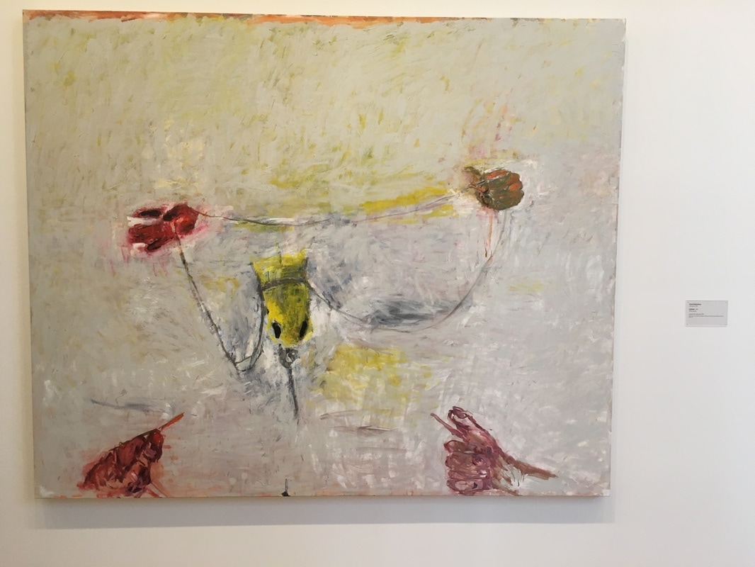
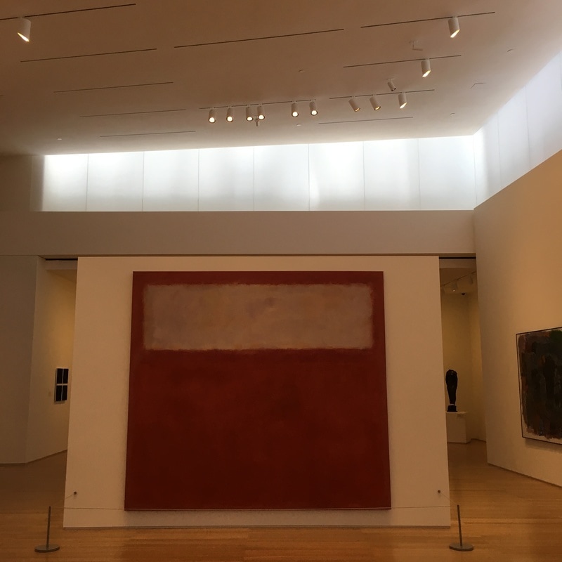
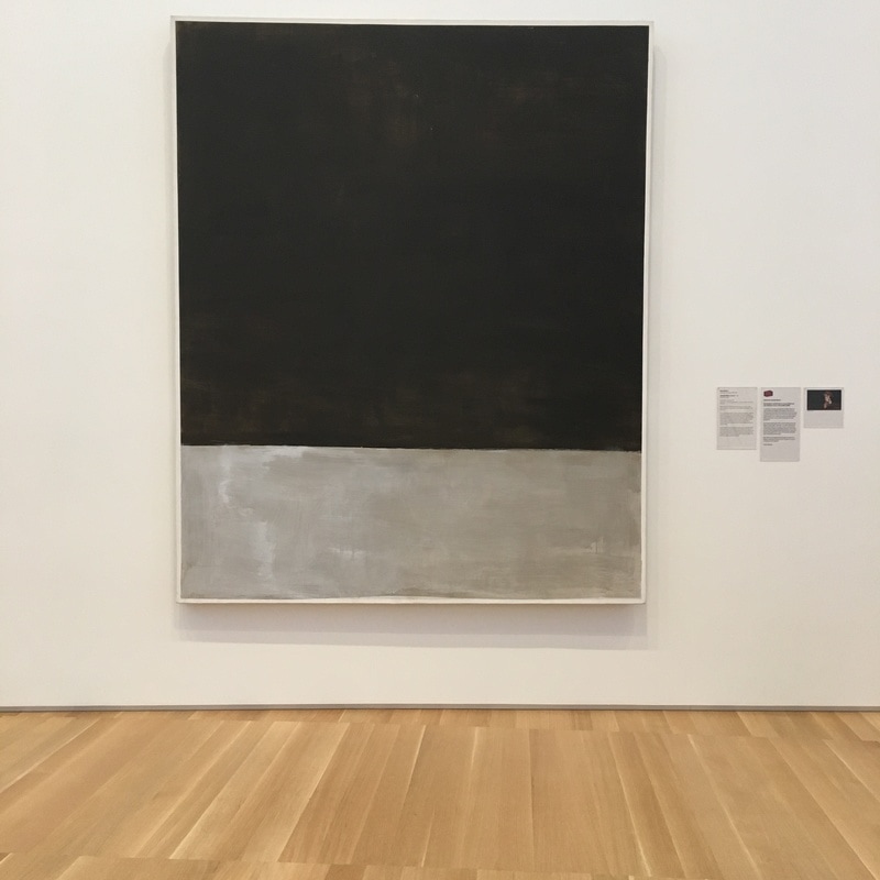
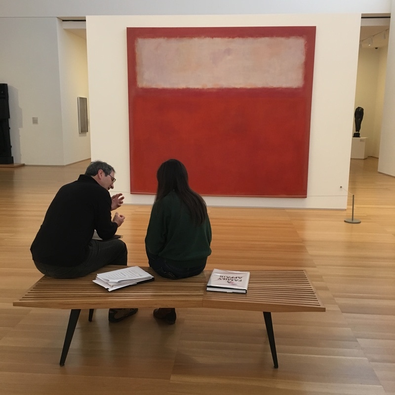
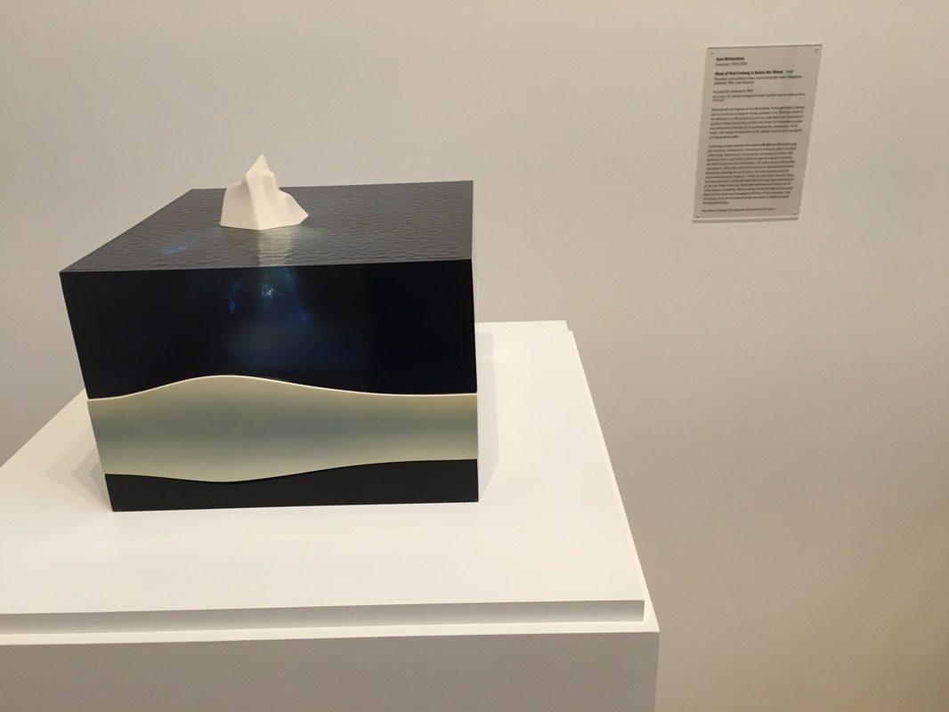 Sam Richardson hit the nail on the head with this one. It's about process, and it's observation. We only get the little piece, but there is much beneath, the majority. This is a total denial of a formalist analysis of art. It is not what's in the work; it is what's beneath it, hiding, waiting. The thing that happens in my mind about this is that I understand something about icebergs. They are islands of ice, floating, untethered. If you climb on to a small, or even a medium one, it is highly possible that you could tip, slide, even roll completely over, into the frigid waters, trapped beneath its weight. Delving into art analysis can be just that dangerous. 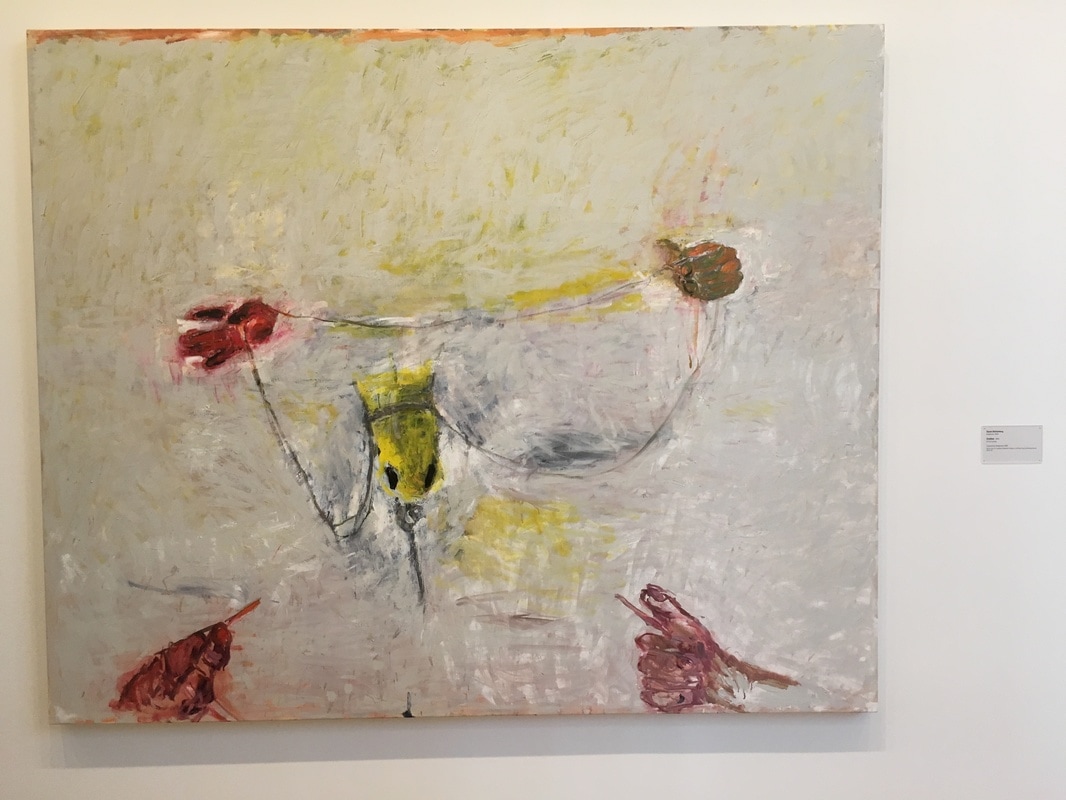 This one is dark, though it is so light. It feels as if Rotenberg is saying something heavier than the brushstrokes would indicate. The problem for me - I don't feel anything. It's as if it's being held away from me. I try it from various angles, seeing it as an overhead of a displatched lobster, or as a diagram of a female anatomy. I have no idea, because it doesn't come to me... 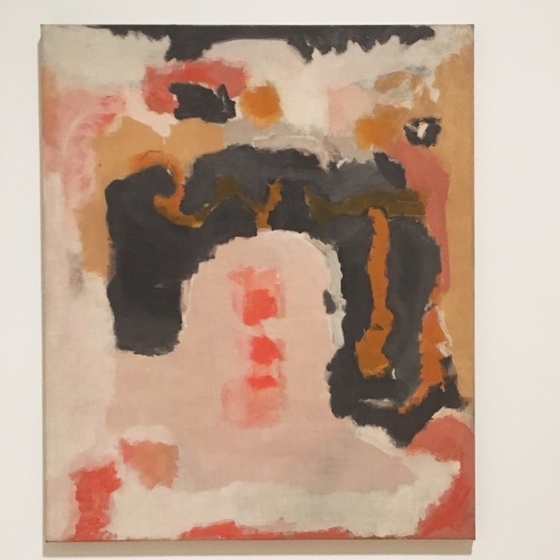 I am not the biggest fan of Mark Rothko. It's one of the reasons I haven't written about the Rothkos in the Anderson yet. There are a lot of Abstract Expressionists who get called Color Field painters, like Morris and Frankenthaler and Barnett Newman, but Rothko. Man, Rothko. It's not that his stuff isn't interesting, but the fact is, it just doesn't move me the way the Frankenthaler across the way, or that awesome Louis, or even an average Motherwell does. To me, the only time previous to my last visit to the SFMoMA relied on the power of lighting, as the pieces, about a dozen of them, were hung off the walls via wires, and lit with a single spot from the floor, making them epic, with a highlight. That moved me, even though they were the simple hazy-edged canvases that you could see in MoMA. Then there was the untitled piece above, from 1947. I discovered it on my last trip to the SFMoMA and can not help but love it. This would be post biomorphic Rothko, but pre-true color field work. It's a large canvas, but there is a sense of weight in this that is unnerving, as if the heaviest portion is rising, ready to crash down at any moment. There is a sense of Clyfford Still, of that controlled chaos defining a sort of map, that each color zone is an autonomous entity. This one, this moved me. 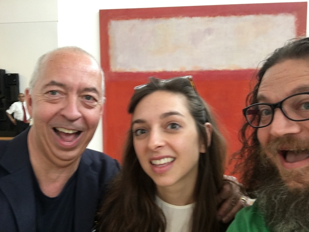 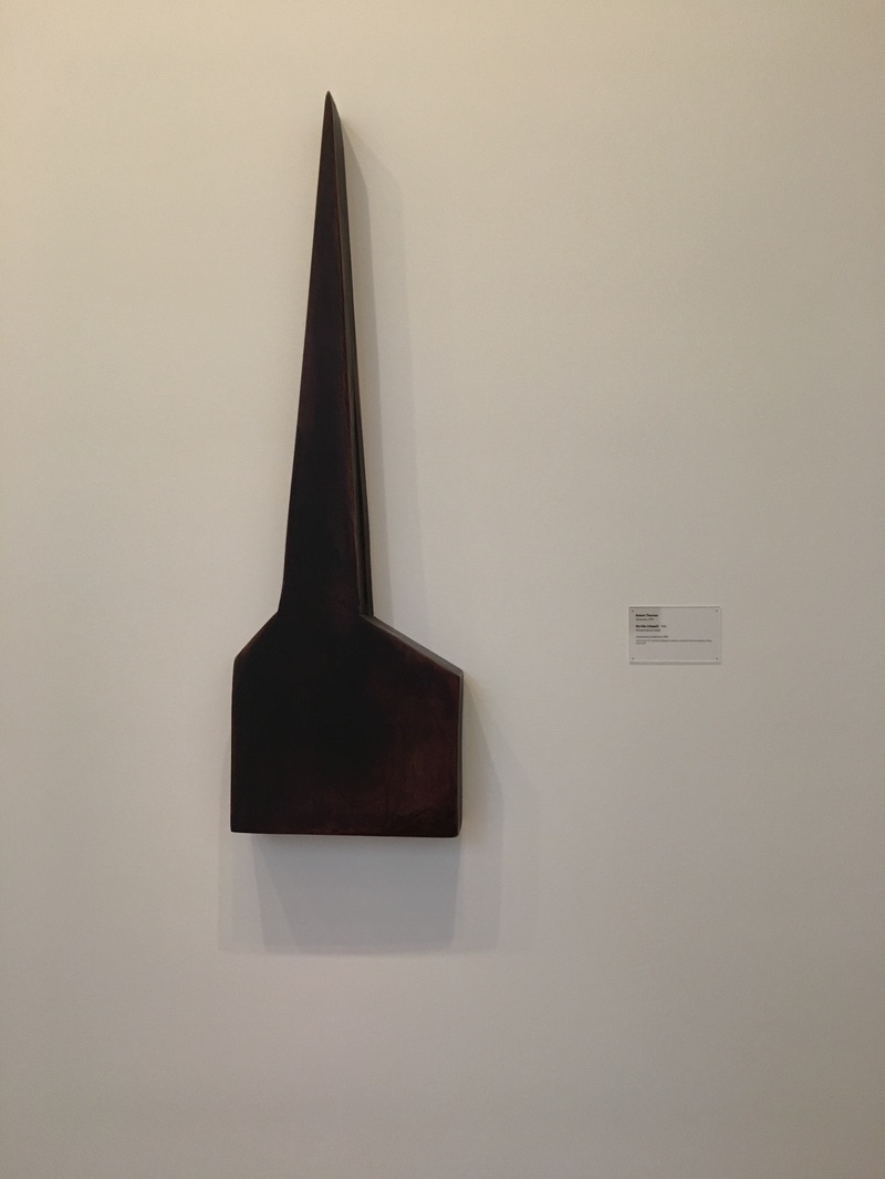 I do not understand what you are showing me, Robert. This is supposed to be a chapel, but it does not want to lead me to worship. No. It seems to be a yardarm, nautical, some piece of block-and-tackle, something meant to pass a rope, or perhaps, slot into some other essential piece. But then I look at where it is, and perhaps it is chapel for a slightly heavier reason.  |
Your HostChristopher J Garcia - Curator, Fan Writer, Podcaster, and a guy who just loves art. Archives
February 2019
|


 RSS Feed
