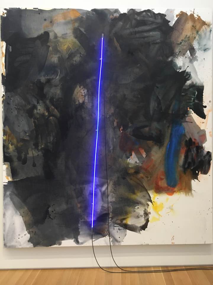
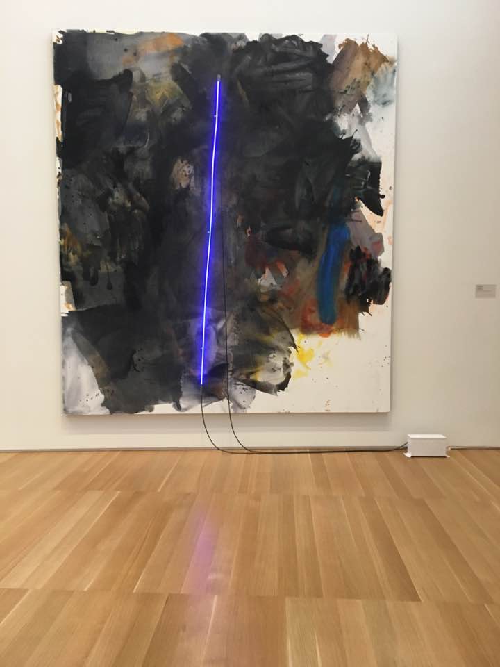
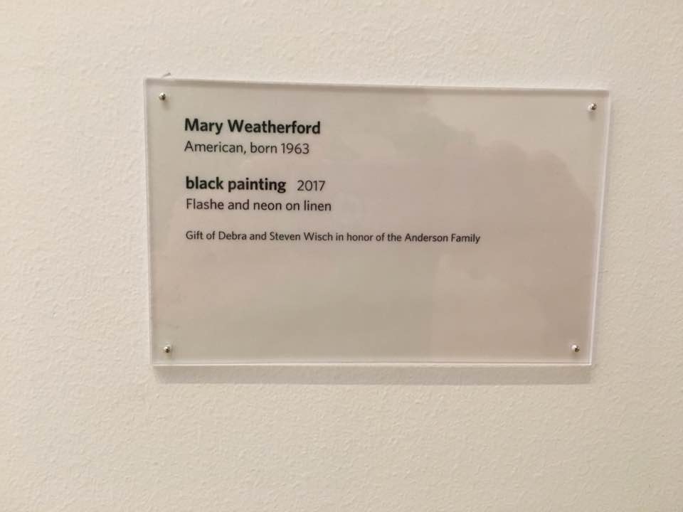
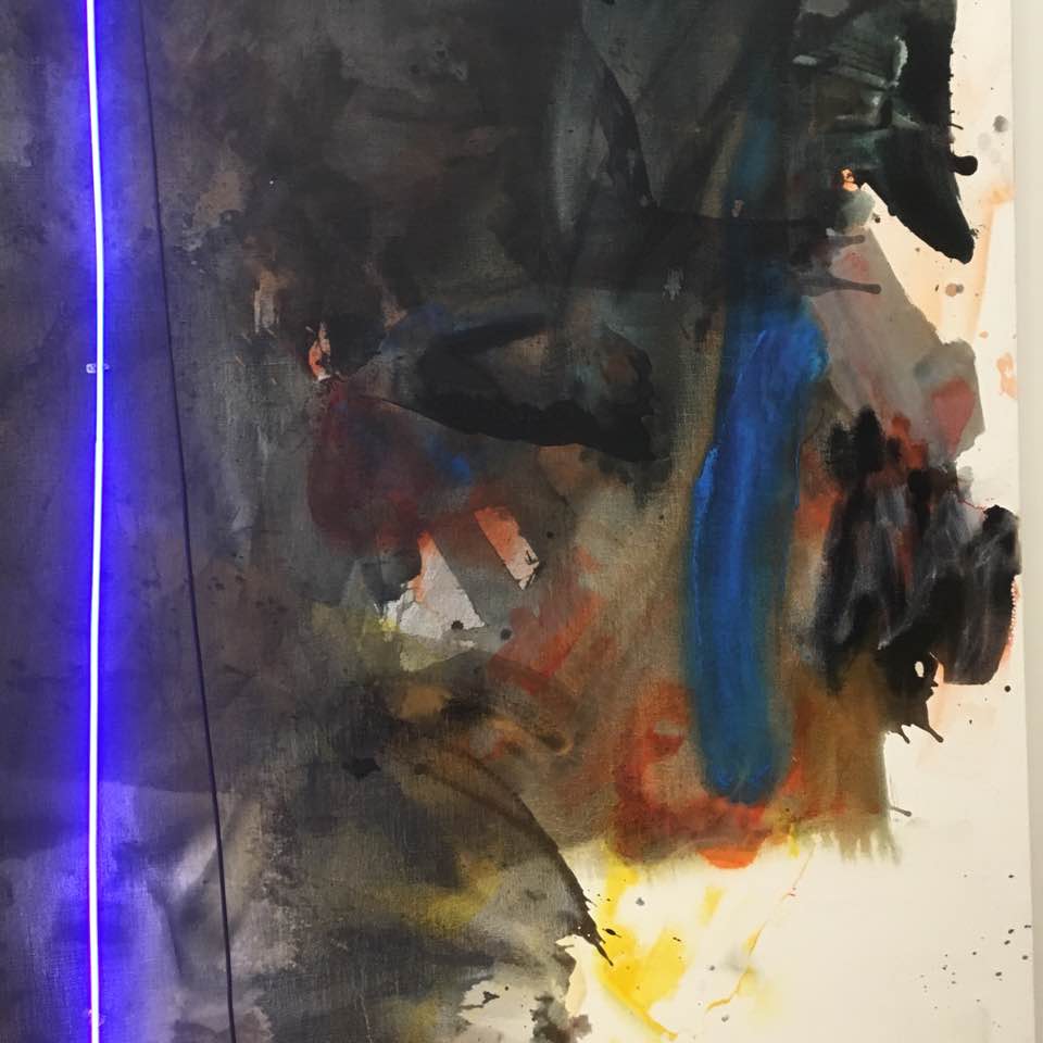
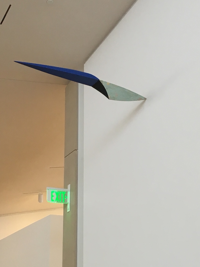
 Mary Abstract Expressionism was not killed by Pop Art. In fact, it continued in a fascinating direction, and has bubbled up from time to time into the popular art discourse. Mary Weatherford is one of those Abstract Expressionists who happened to have been born after the deaths of Pollack, Kline, and Ryan. Her work is in the vein of Joan Mitchell, Morris Louis, and the de Koonings, and though this is hte first piece of hers I've witnessed in the flesh, I was incredibly moved by experiencing it. it is a piece that comes to me with an impact of Joan Mitchel's 1970s and 80s work or early Philip Guston abstract pieces, but then there's the neon, a single stripe of neao buzzing blue through teh center, immediately bringing the power of Barnett Newman to the party. In a sense, this is a synthesis of the great Abstract Expressionist work of the 1950s, but using the neon tube seems to push the idea that this is a piece of technology as well, and since neon signage is the way I see the 1950s, it all ties togehter. The fact that this is a piece of 2017 is so impressive. The Anderson Collection is so smart with this piece. It is placed across from the Frankenthaler, between a Morris Louis, a Robert Motherwell, nest to the alcove where slumbers Lucifer, the Kline, the David Smith, the Gottleib, and the Rothkos. It is set among the Abstract Expressionist master that is seems to be speaking of, or perhaps speaking to, and that makes it a heavy punch.
0 Comments
 HAving experienced the Matisse-Diebenkorn exhibit at SFMoMA, I can say I'm a fan. I'm not big into Diebenkorn, though I appreciate him on several levels, and I really tend towards dislike of Matisse, but the combination played so perfectly off one another, and it exposed Diebenkorn in a way that I absolutely appreciated.
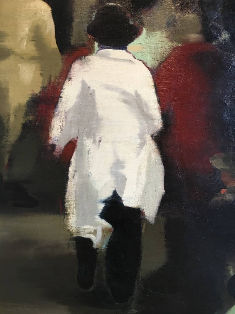
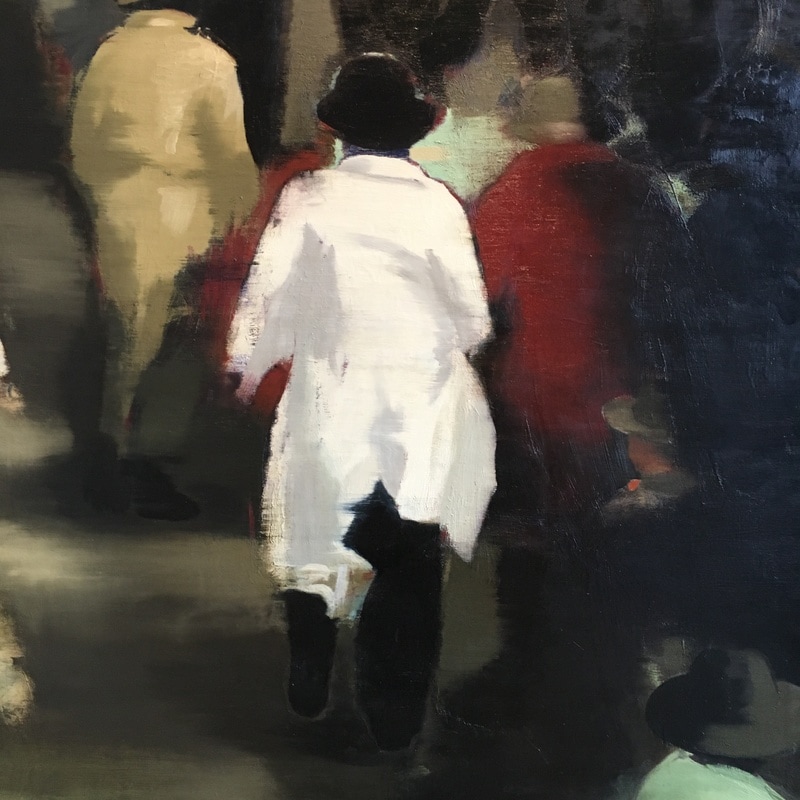
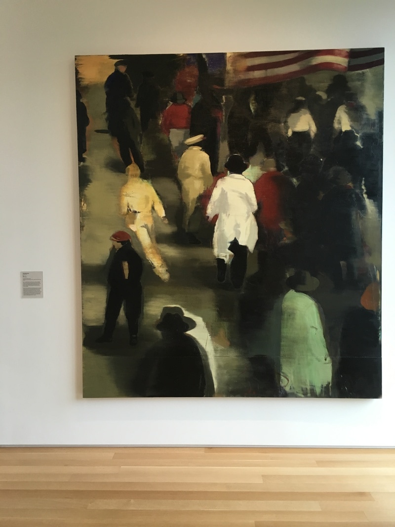
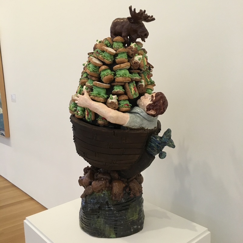
The work currently hanging at the Anderson that I have the most love for is Ocean Park #60 and it is a wonderful work. Not a color field painting, though certainly influenced by Motherwell and Rothko, and not a minimalist painting, and it almost feels like a Mondrian painting executed freehand. It is the colors, the marine sensation, the fact I feel as if I am being washed over, that takes me. The Ocean Park paintings in the SFMoMA exhibition are wonderful, and at least somewhat interchangeable, but this one, this one feels different, as if Diebenkorn was working out something. This was a middle work in the long series of Ocean Park paintings, but it not only feels as if it is a part of a fully-formed definition of the series, but it feels as if it is breaking away, giving us something both more and less meaningful to the entirety of the series. The firm geometric encounter is powerful, but it is left with a hazy feeling, and one that made me look deeper into it, to find where the perfection gave way to the sfumato. There is no point, both exist, quantum-entangled, waiting for a viewer to make the decision whether or not the method to Diebenkorn's madness is alive or dead. To me, it is the Ocean Park series that is alive, and the definitions of how Diebenkorn's work that die with this piece, and it does both of them at the same time.  A look at a piece in the Anderson that I completely over-looked... I mean saw beneath... Comments? [email protected] 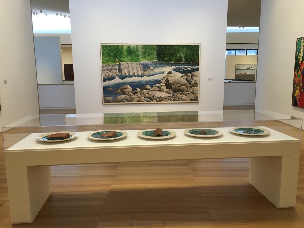 When I think about puns, I think about paintings. Apparently, that's the best place for 'em! William Allan's Half a Dam is a visual and a word pun, all rolled into one! 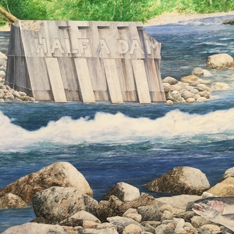  This is a painting of post-war America, moving forward, busy, hustling, streaming into the future. The flag shows that we were the winners, we had beaten back Japan, gone over and kicked Uncle Fritz right in the monocle! We were getting ready for the boom, the best years of our lives, of all lives, ever. And yet, here, no one is looking at you. Every back is towards you, as if you didn't matter. As if you were the one being left behind. This one hurts. It really does. It is a painful reminder that not everyone goes on to the bigger and the better and the best. Some of us watch the backs of those with ambition or connection or innovation or whatever. We are at the back of the pack, watching as the stream flows away from us, while we are the stones the creek flows over, maybe making a ripple, but often not even that. Christopher Brown is a helluva painter. This work was created, then sanded, then re-painted, and thus it makes it feel imprecise, or perhaps more accurately, like a memory fading. By the time he painted it in 1992, the memory was fading, we were no longer that America of 1946, fresh off the bomb and V-E and every other cliche. We were still moving away, still reaching for a new tomorrow, but it was nothing like what those Pamplonaing away from us would recognise. The painting of 1992 would be the same idea, different clothing, different timing, but the same idea; not every one moves ahead. 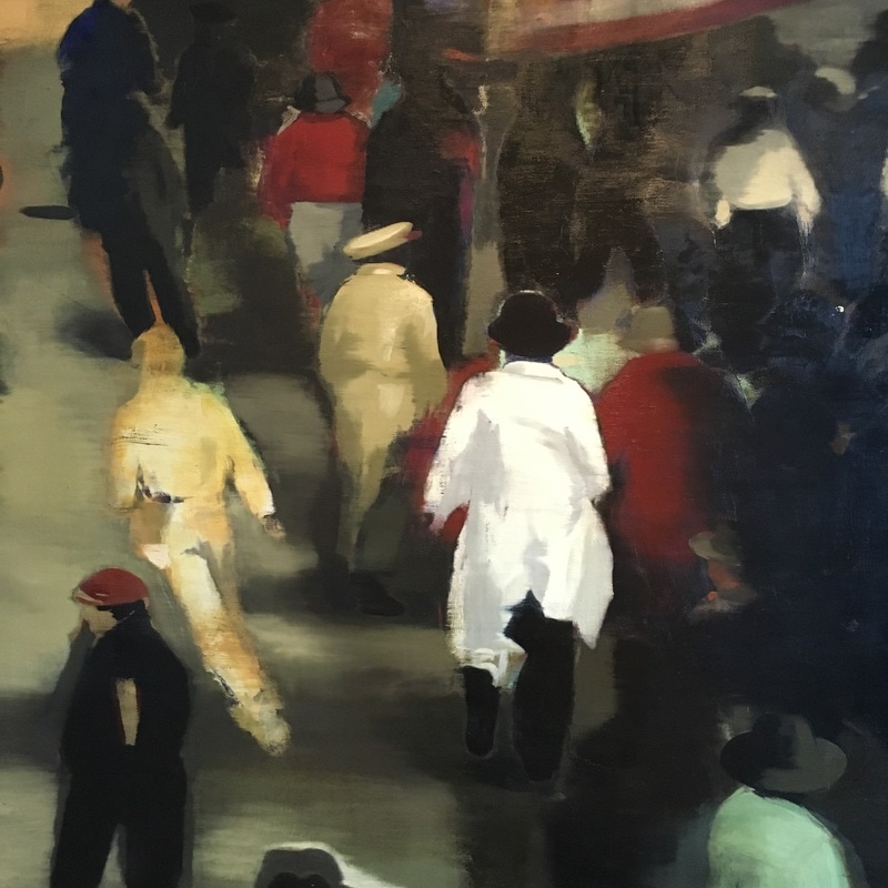 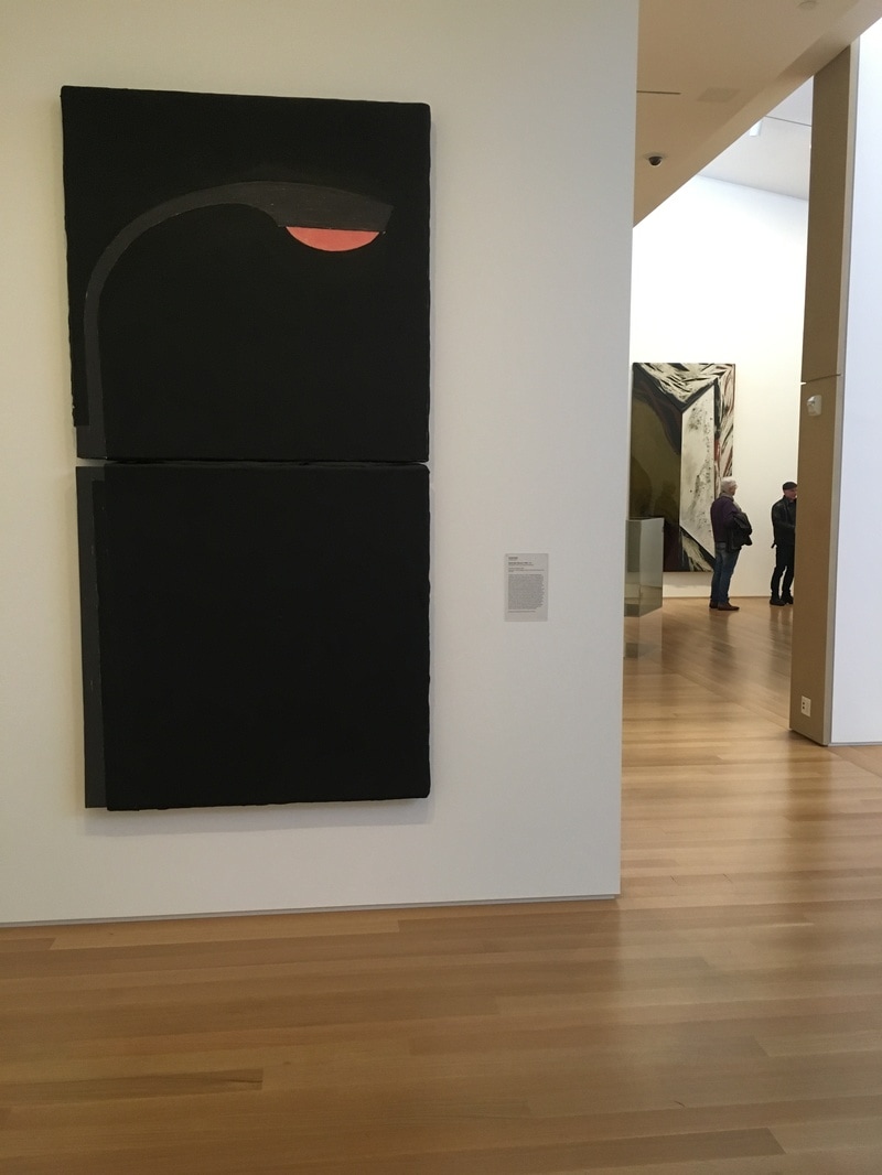 If I have one complaint about what is on view in the Stanford's Anderson Collection, it is the last of Pop Art. Yeah, there are a few pieces, but no Rauschenberg, Warhol, or Lichtenstein, though I know that some of it is on display at SFMoMA. It happens, though I know there are several of each of those folks in the collection. The piece on the floor as I visited that most was a Donald Sultan work depicting a streetlight. Why is it Pop Art? I mean, wasn't Pop mostly a 1960s thing and this is from the 80s? Yeah, true, but art movements don't so much as have edges as they do areas as fuzzy as the boundries of Rothko squares. Sultan chose a simple recogniseable image and gave it to us against a simple black background. There is nothing about the subject that would give us any idea as to the importance of it in the world. It's a street light, that's all. Like Warhol's soup cans or Lichtenstein's comic book images, it's not important what the subject is; it is important that it is being presented on a wall in a museum. It is a lovely piece, and the way it is presented in the space is what made it for me. It is on the end of a short wall. When you are facing it, you're looking down what I think of as the left-side hall. It is as if it is illuminating the way, marking a point in the trip where you can stand and know you're under light, and sometimes when it comes to contemporary art, that's a blessing. 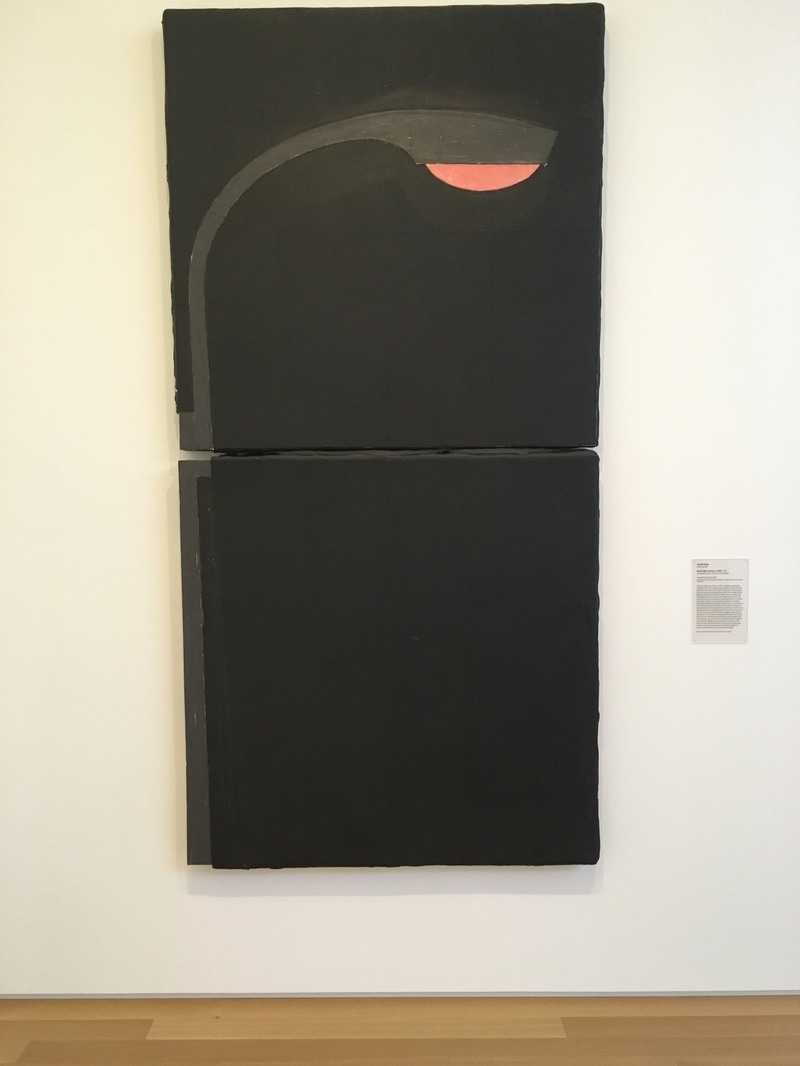 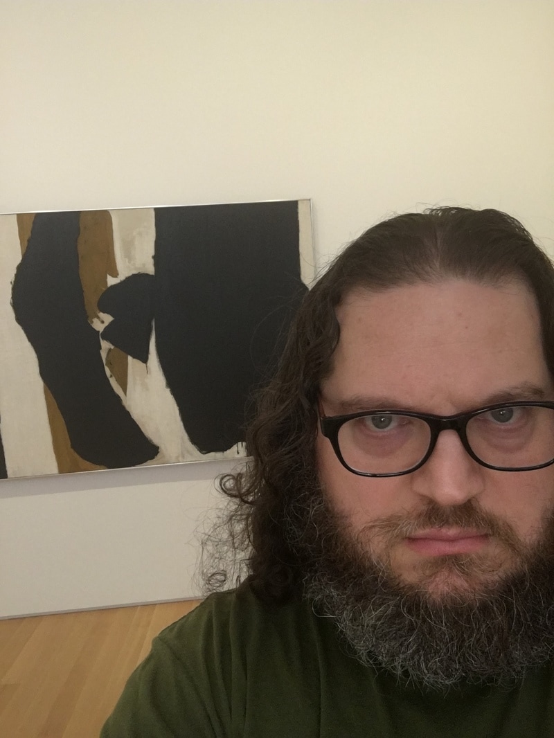 What of Robert Motherwell, his great black swatches in the center of the canvas, his quick globs of depth seeming to fester, infecting with other colors present? What did he mean by this, this haunting of a painting that seems more suited to the rambling than of any sort of conversation. I love Motherwell for his distance, his inability to allow you in. Even his series of Elegy for the Spanish Republic, a title worthy of mournful celebration, is nothing more than a collection designed to serve paint as sticking place. This work, where the black is front, the taupe behind, the white still further away, is worthy of inclusion in his best, but it is not so easily defined. It is neither map nor tombstone nor milemarker nor invitation. it is, instead, a work that feels like a work, and not one to be taken overly lightly. 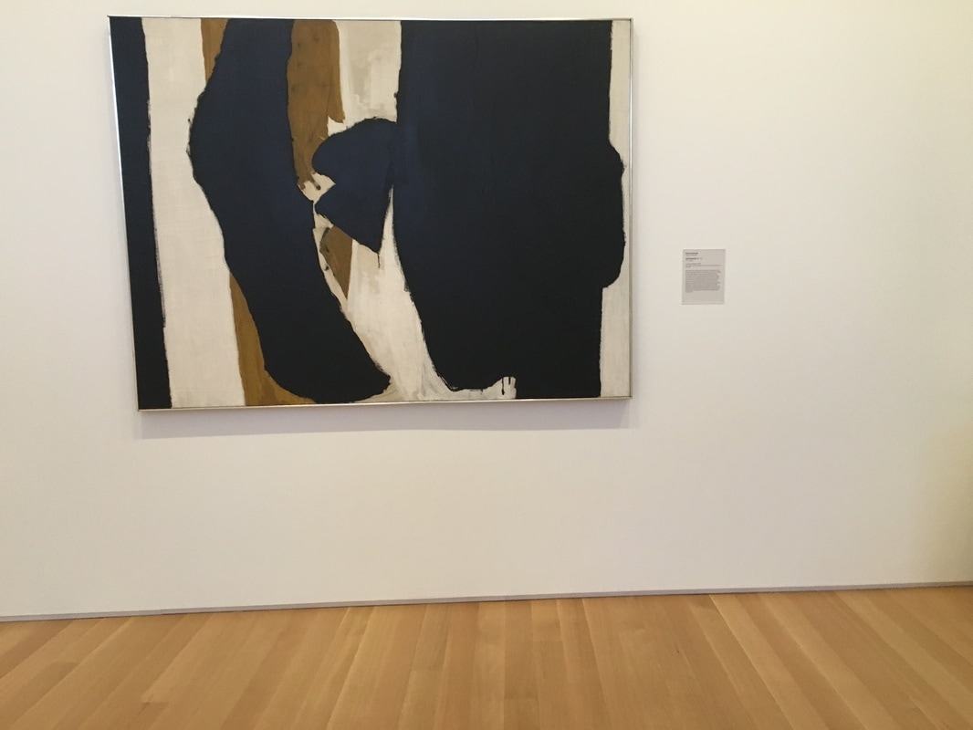 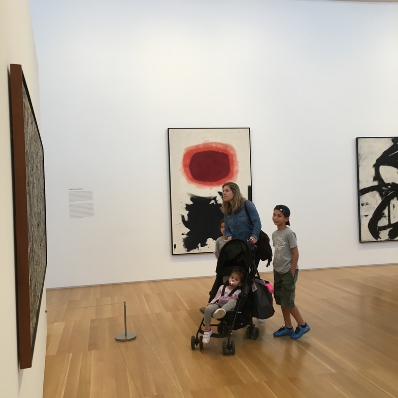 Adolph Gottlieb (1903 - 1974) oil on canvas 90 x 60 1/8 in. Bursts Gottlieb's grand unification theorem for Abstract Expressionism Developed within Unrelenting layers of twinned ill-defined shapes. 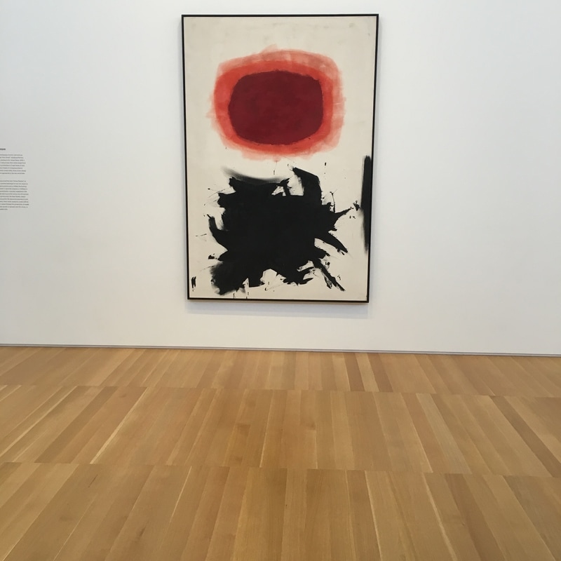 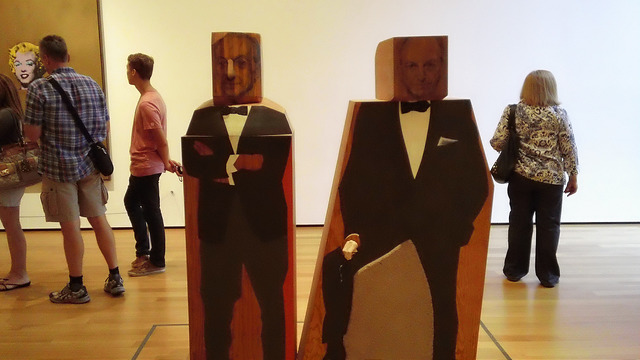 One of my favorite things about MoMA in New York is the fact that they get it; sometimes artists get lost. Marisol, the nom du arte of Marisol Escobar, was a sculptor who passed away in 2016. Her works are often called 'folky' and it certainly fits with many of her pieces, but the Pop Art sculptures she delivers are pretty damned impressive, especially when she played hard with titling. My Favorite piece of hers, and one of my favorite under-appreciated MoMA works, is Portrain of Sidney Janis Selling Portrait of Sidney Janis by Marisol, by Marisol. That titles, practically a Christopher Williams' title, is especially damning. Sidney Janis, famed art dealer. What we're not told in the title, or even by the positioning, is which is which. Is the cross-armed gentleman in the tux the life dealer selling the sporty portrait in wood as the image of himself to the world. Is the Captain Morgan-leaning version reality and the staid, confident one the portrait for sale? It's not answered, but the idea that this is a piece about representation, about how art figures present themselves to the world and the reality, about the intersection of an artist's work and the dealer and the subject of that work, all of that comes together in this marvelous piece.
|
Your HostChristopher J Garcia - Curator, Fan Writer, Podcaster, and a guy who just loves art. Archives
February 2019
|

 RSS Feed
