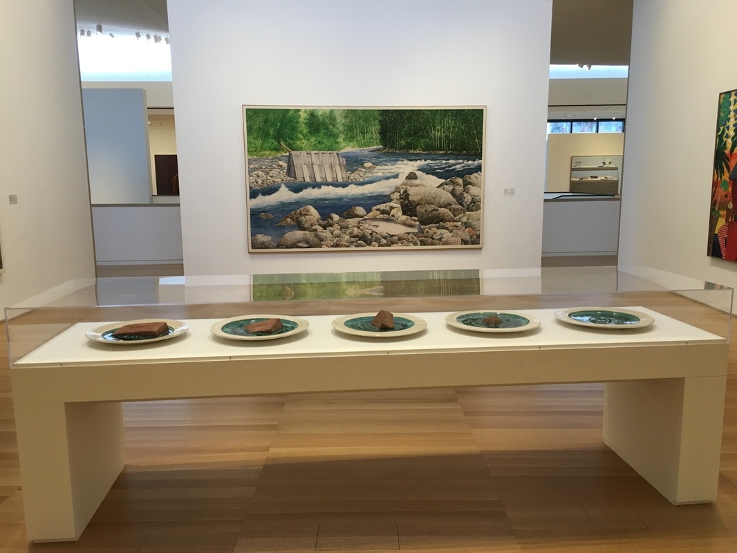
 When I think about puns, I think about paintings. Apparently, that's the best place for 'em! William Allan's Half a Dam is a visual and a word pun, all rolled into one! 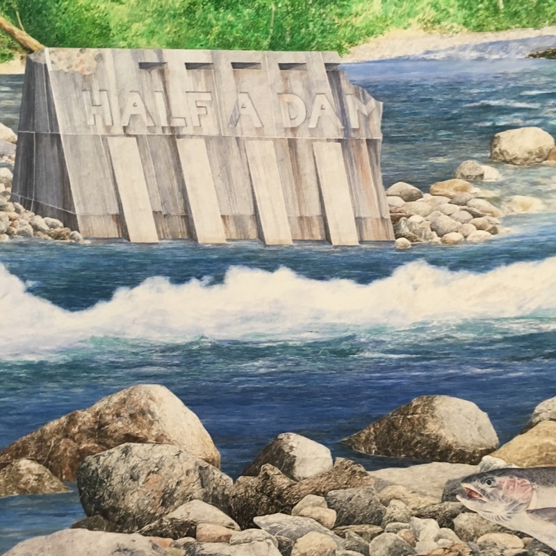
0 Comments
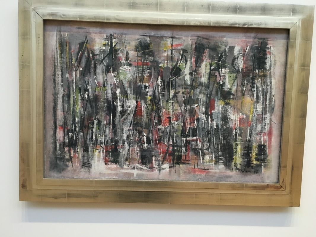
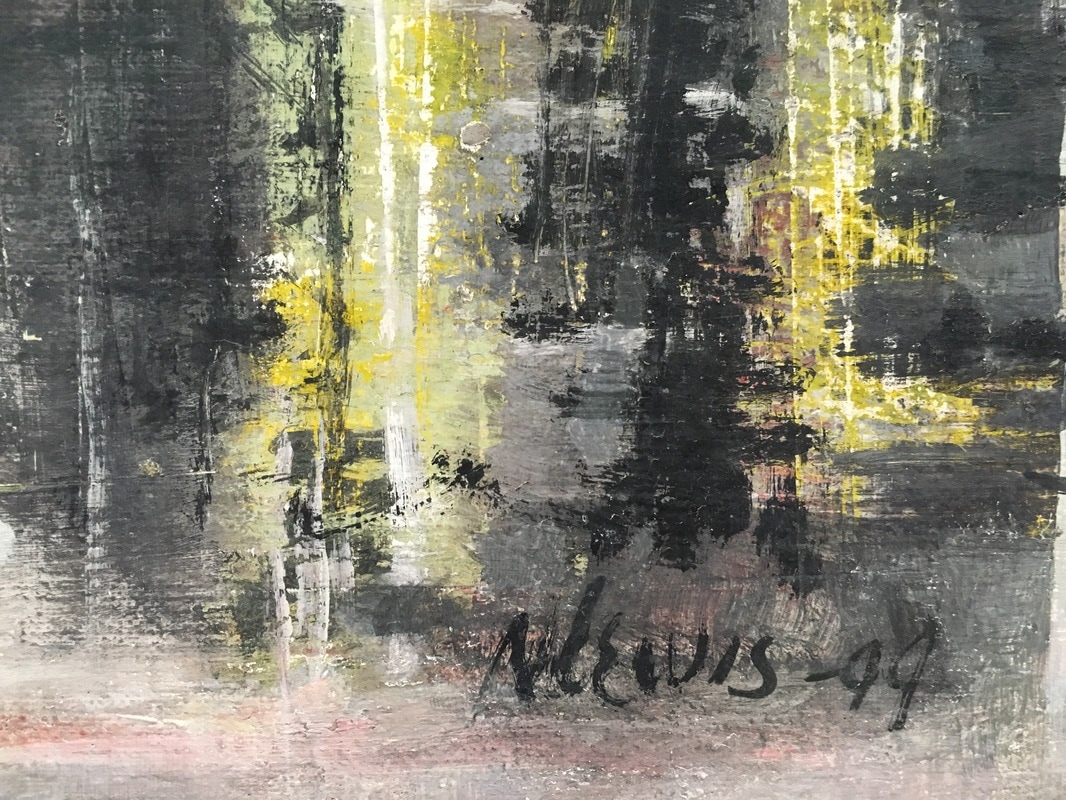
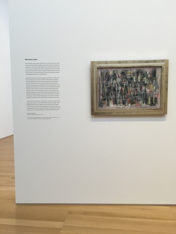 Norman Lewis is one of the very few African-Americans you read about when looking into the art of the era that brought us Abstract Expressionism. He was often exhibited alongside the works of the rest of the New York School. He was a master, but after being considered a major figure at the time, he was shunted to the side in the following decades, which is a shame as I find his work to be incredibly engaging. The inclusion of three of Lewis' work as a temporary exhibition is a very nice touch, especially since the three works are hung on the free-standing wall that has the Pollock work Lucifer on the other side. The piece Untitled from 1949 is a joy. I had only once seen a Lewis painting, and it was far more like the larger canvas, also Untitled. Here, Lewis is working in rough-hewn geometry, seeming to create a series of somewhat hazy intersecting and interlocking triangles. The effect is impressive, as it brings the eye not to the pinnacle of the forms, but to the splashes of color that are present at random intervals. Those alone made me wonder what was the idea here - to create an image which celebrated the colors presented by giving them room to land thoroughly, or was it to show them being consumed by the black and grey, as if they had once ruled the canvas and now the darkness was seeping in from all side.
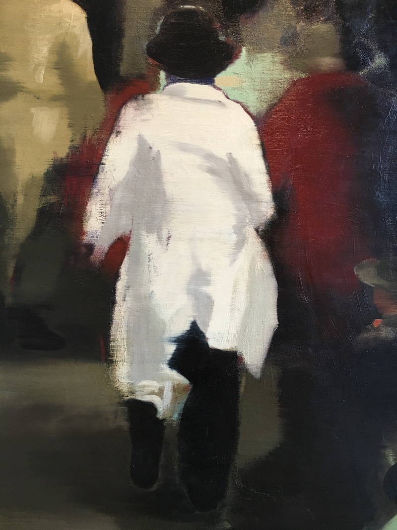
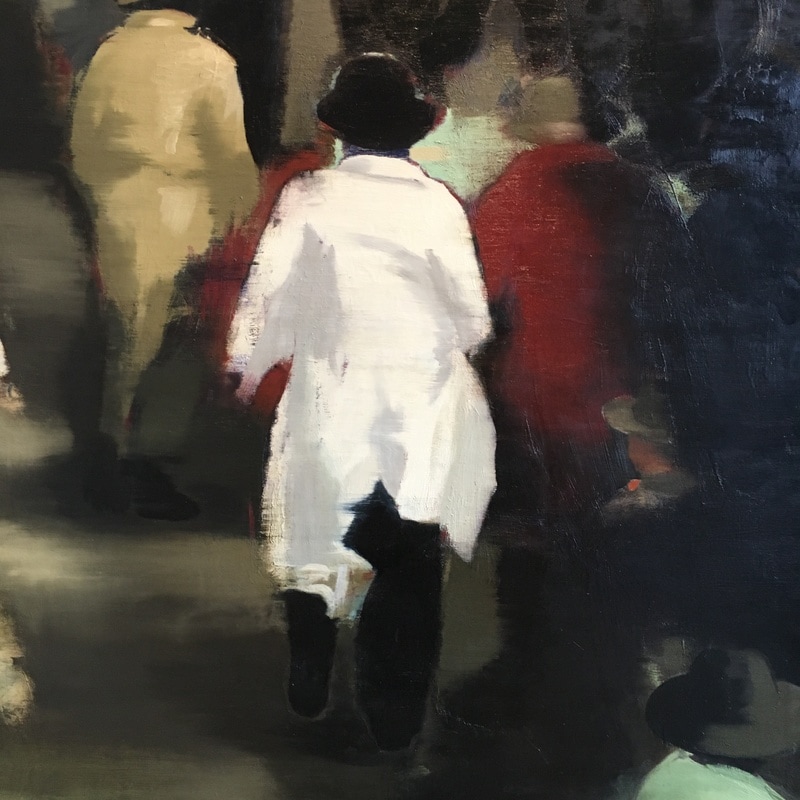
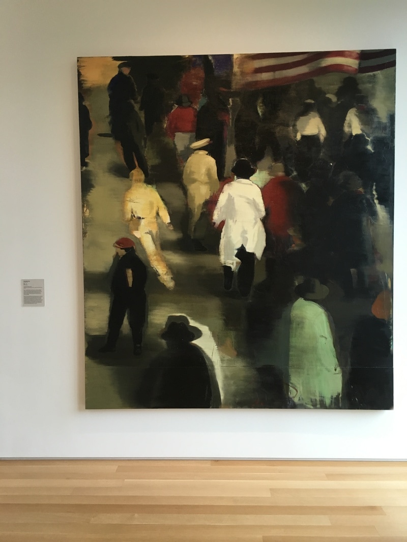
This work was not my favorite of the Lewis pieces, but it was the one I spent the most time with on two of my visits. 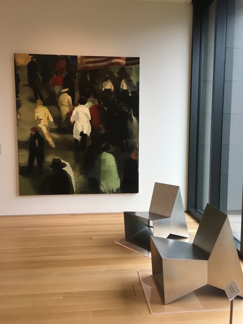 This is a painting of post-war America, moving forward, busy, hustling, streaming into the future. The flag shows that we were the winners, we had beaten back Japan, gone over and kicked Uncle Fritz right in the monocle! We were getting ready for the boom, the best years of our lives, of all lives, ever. And yet, here, no one is looking at you. Every back is towards you, as if you didn't matter. As if you were the one being left behind. This one hurts. It really does. It is a painful reminder that not everyone goes on to the bigger and the better and the best. Some of us watch the backs of those with ambition or connection or innovation or whatever. We are at the back of the pack, watching as the stream flows away from us, while we are the stones the creek flows over, maybe making a ripple, but often not even that. Christopher Brown is a helluva painter. This work was created, then sanded, then re-painted, and thus it makes it feel imprecise, or perhaps more accurately, like a memory fading. By the time he painted it in 1992, the memory was fading, we were no longer that America of 1946, fresh off the bomb and V-E and every other cliche. We were still moving away, still reaching for a new tomorrow, but it was nothing like what those Pamplonaing away from us would recognise. The painting of 1992 would be the same idea, different clothing, different timing, but the same idea; not every one moves ahead. 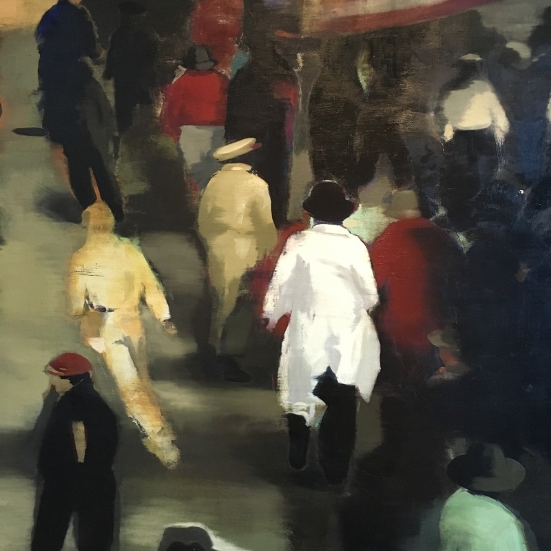 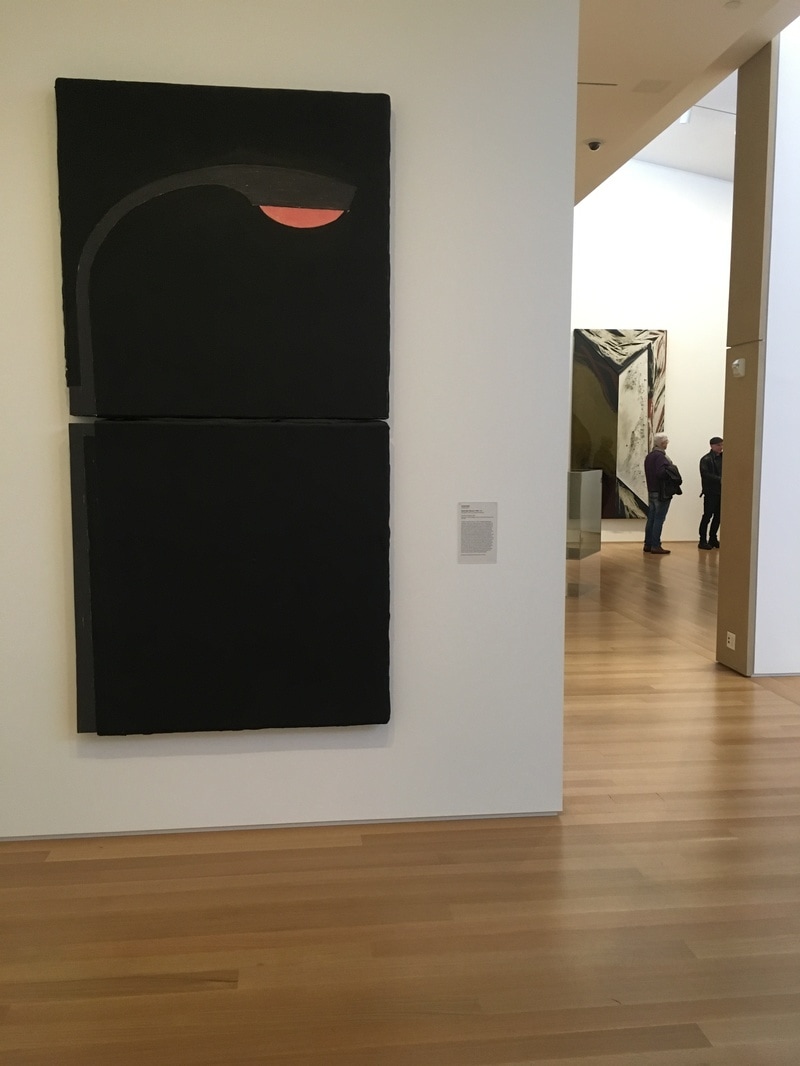 If I have one complaint about what is on view in the Stanford's Anderson Collection, it is the last of Pop Art. Yeah, there are a few pieces, but no Rauschenberg, Warhol, or Lichtenstein, though I know that some of it is on display at SFMoMA. It happens, though I know there are several of each of those folks in the collection. The piece on the floor as I visited that most was a Donald Sultan work depicting a streetlight. Why is it Pop Art? I mean, wasn't Pop mostly a 1960s thing and this is from the 80s? Yeah, true, but art movements don't so much as have edges as they do areas as fuzzy as the boundries of Rothko squares. Sultan chose a simple recogniseable image and gave it to us against a simple black background. There is nothing about the subject that would give us any idea as to the importance of it in the world. It's a street light, that's all. Like Warhol's soup cans or Lichtenstein's comic book images, it's not important what the subject is; it is important that it is being presented on a wall in a museum. It is a lovely piece, and the way it is presented in the space is what made it for me. It is on the end of a short wall. When you are facing it, you're looking down what I think of as the left-side hall. It is as if it is illuminating the way, marking a point in the trip where you can stand and know you're under light, and sometimes when it comes to contemporary art, that's a blessing. 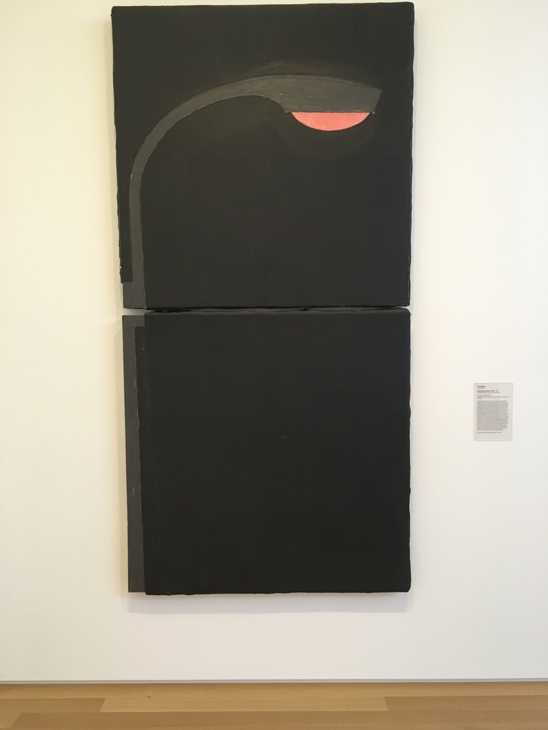 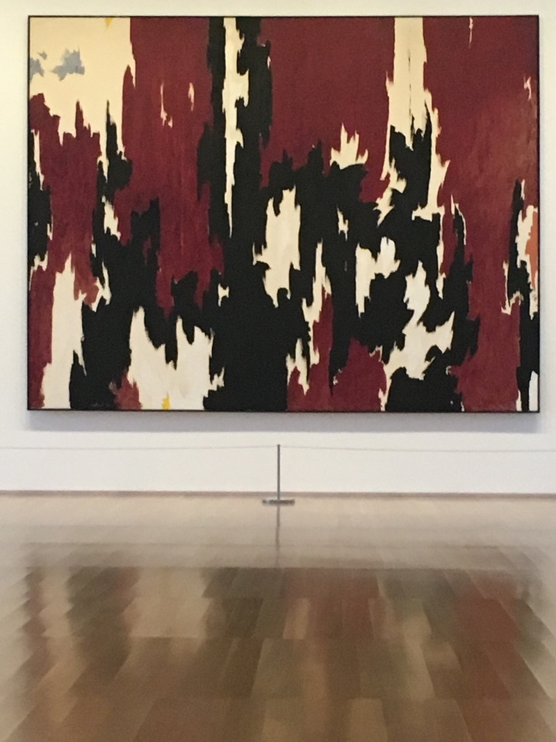 There is a set of stairs in the Anderson. It takes visitors from the first floor to the second where the vast majority of the art sleeps. As a rule, whatever you experience when you come to the top of the stairs is the focal point. At the top, on the wall facing you, is a Clyfford Still. Clyfford Still is going through a resurgance. He is one of the featured artists in the major Abstract Expressionist exhibit in London. While Pollock, Rothko, Motherwell, and deKooning have all become household names, Still was the one who came to abstraction first. The piece in the Anderson is large, and to my eyes, one of the most beautiful pieces in the entire collection. The contrast between the reds, blacks, and whites allows the mind to go from edge to edge of the surface, making it impossible to travel the distance in a straight line. The borders formed contain nations, zones, territories of pure colors, but they are full of weight. It is not a light piece, not like the MItchell around the corner, but it is also not nearly the AbEx impression as is given off by the Pollock, Rothko, or Frankenthaler in the collection. The feeling is something new, different, and when I first saw it, I could not place what I was experiencing. 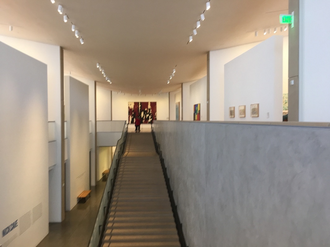 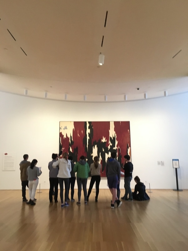 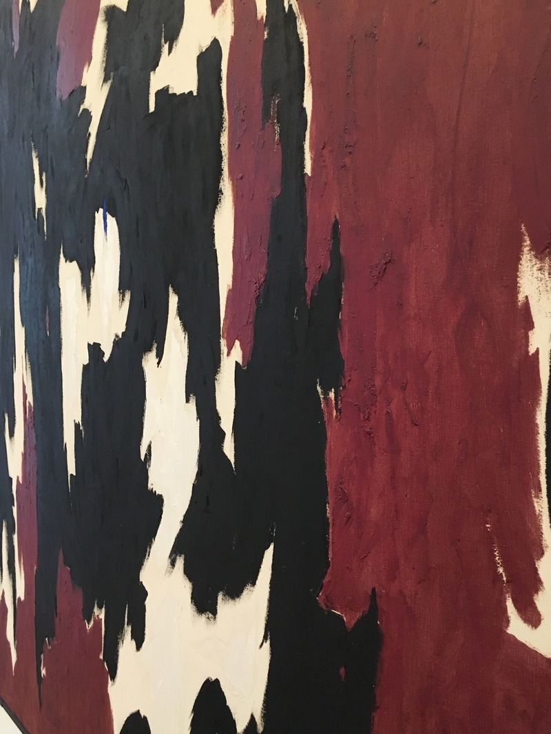 |
Your HostChristopher J Garcia - Curator, Fan Writer, Podcaster, and a guy who just loves art. Archives
February 2019
|


 RSS Feed
