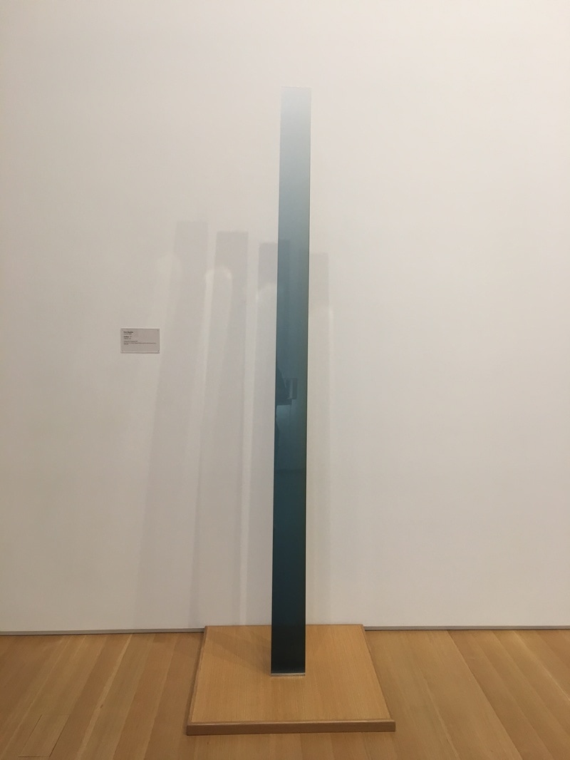
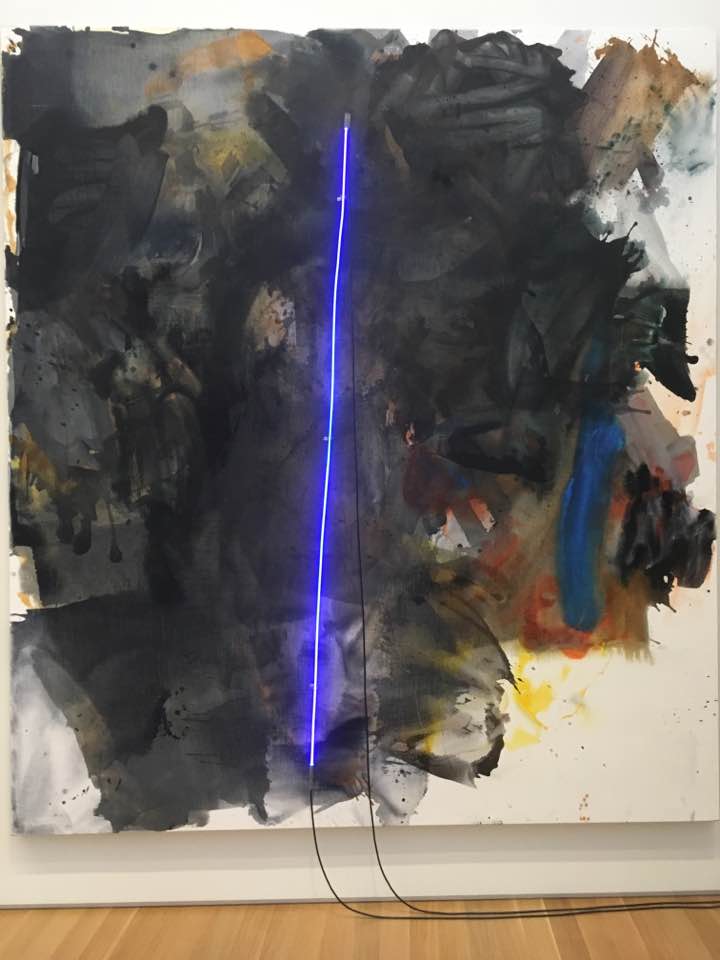
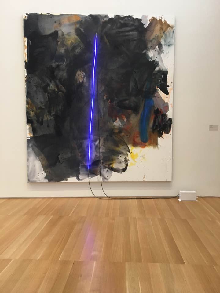
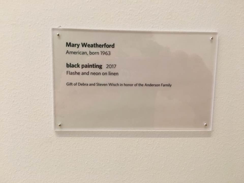
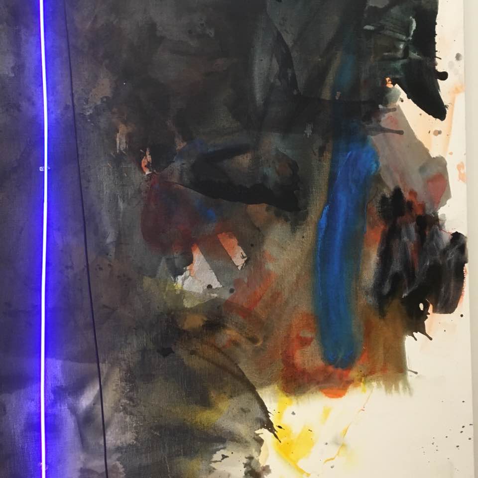
 Mary Abstract Expressionism was not killed by Pop Art. In fact, it continued in a fascinating direction, and has bubbled up from time to time into the popular art discourse. Mary Weatherford is one of those Abstract Expressionists who happened to have been born after the deaths of Pollack, Kline, and Ryan. Her work is in the vein of Joan Mitchell, Morris Louis, and the de Koonings, and though this is hte first piece of hers I've witnessed in the flesh, I was incredibly moved by experiencing it. it is a piece that comes to me with an impact of Joan Mitchel's 1970s and 80s work or early Philip Guston abstract pieces, but then there's the neon, a single stripe of neao buzzing blue through teh center, immediately bringing the power of Barnett Newman to the party. In a sense, this is a synthesis of the great Abstract Expressionist work of the 1950s, but using the neon tube seems to push the idea that this is a piece of technology as well, and since neon signage is the way I see the 1950s, it all ties togehter. The fact that this is a piece of 2017 is so impressive. The Anderson Collection is so smart with this piece. It is placed across from the Frankenthaler, between a Morris Louis, a Robert Motherwell, nest to the alcove where slumbers Lucifer, the Kline, the David Smith, the Gottleib, and the Rothkos. It is set among the Abstract Expressionist master that is seems to be speaking of, or perhaps speaking to, and that makes it a heavy punch. 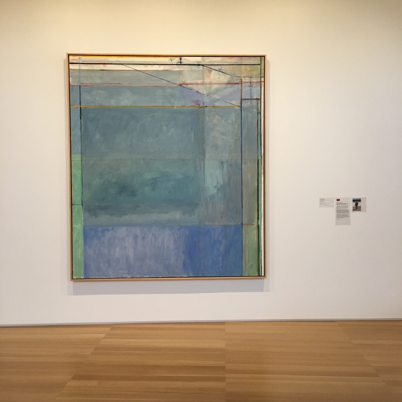 HAving experienced the Matisse-Diebenkorn exhibit at SFMoMA, I can say I'm a fan. I'm not big into Diebenkorn, though I appreciate him on several levels, and I really tend towards dislike of Matisse, but the combination played so perfectly off one another, and it exposed Diebenkorn in a way that I absolutely appreciated.
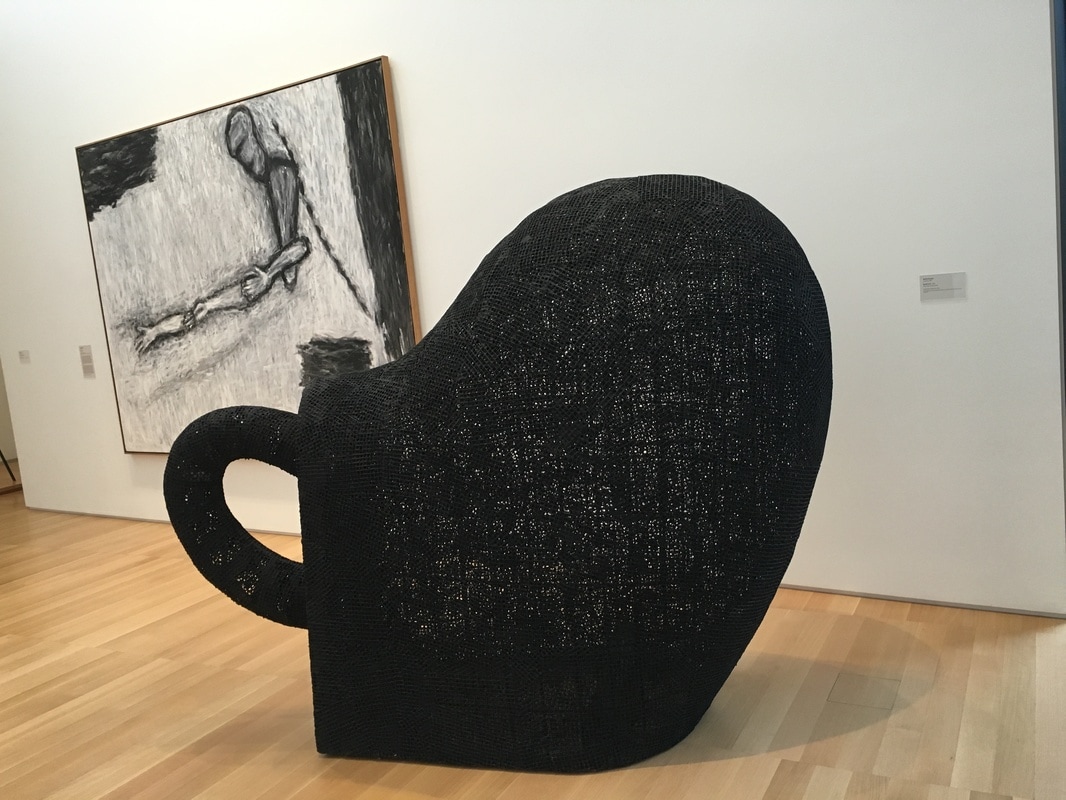
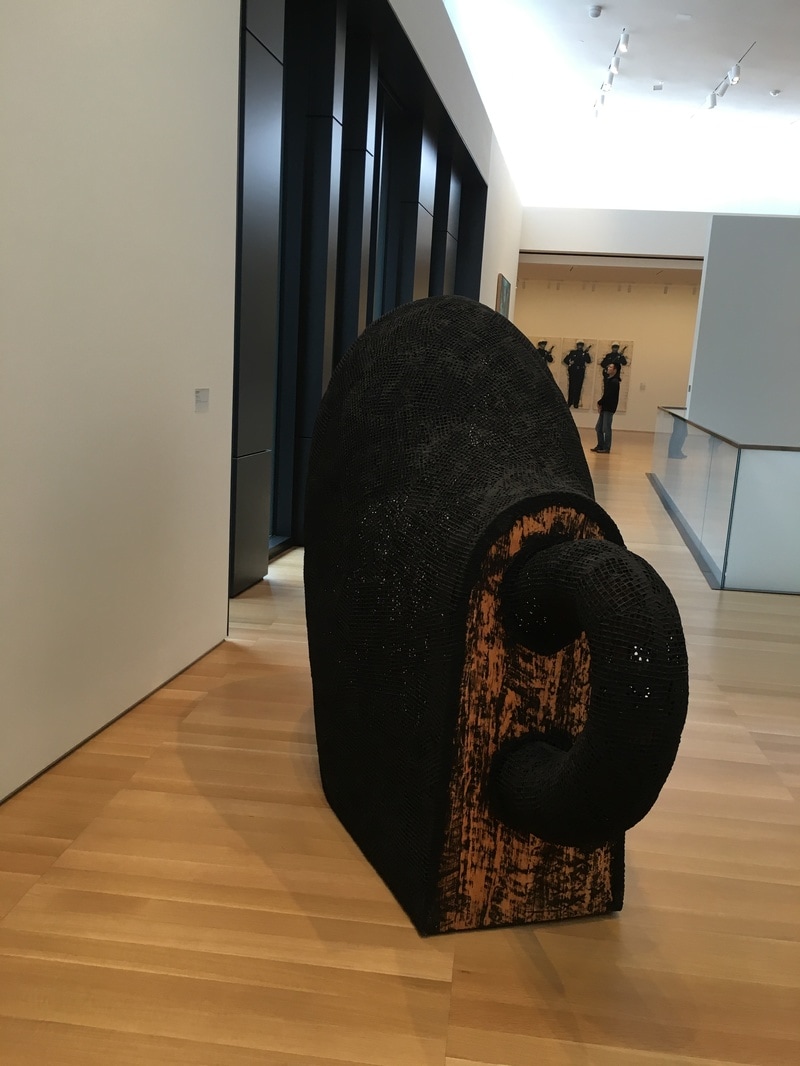
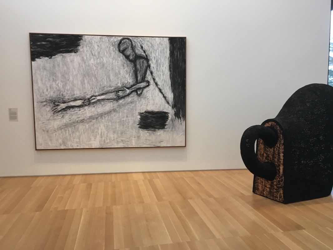
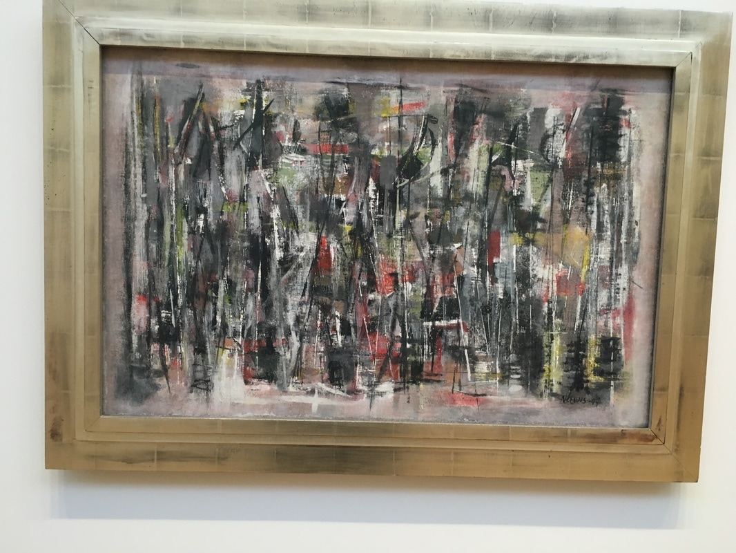
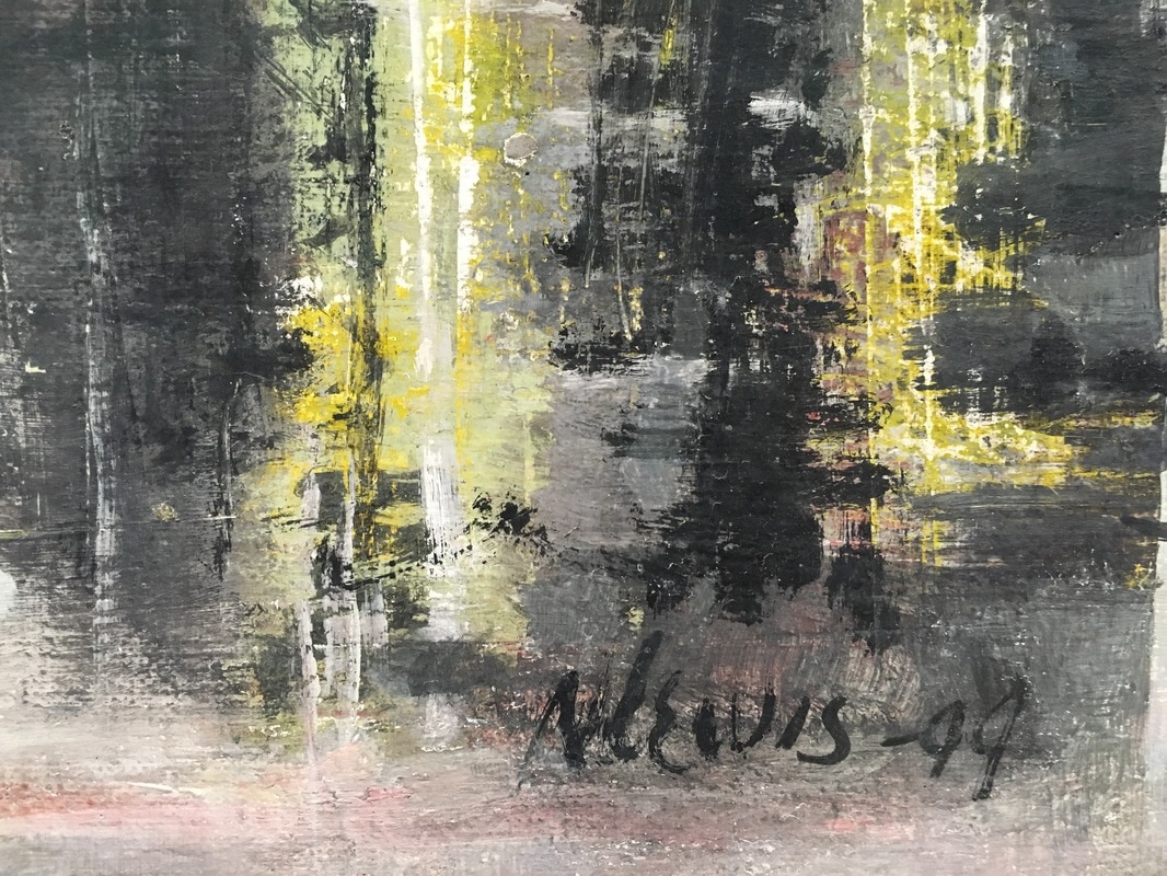
The work currently hanging at the Anderson that I have the most love for is Ocean Park #60 and it is a wonderful work. Not a color field painting, though certainly influenced by Motherwell and Rothko, and not a minimalist painting, and it almost feels like a Mondrian painting executed freehand. It is the colors, the marine sensation, the fact I feel as if I am being washed over, that takes me. The Ocean Park paintings in the SFMoMA exhibition are wonderful, and at least somewhat interchangeable, but this one, this one feels different, as if Diebenkorn was working out something. This was a middle work in the long series of Ocean Park paintings, but it not only feels as if it is a part of a fully-formed definition of the series, but it feels as if it is breaking away, giving us something both more and less meaningful to the entirety of the series. The firm geometric encounter is powerful, but it is left with a hazy feeling, and one that made me look deeper into it, to find where the perfection gave way to the sfumato. There is no point, both exist, quantum-entangled, waiting for a viewer to make the decision whether or not the method to Diebenkorn's madness is alive or dead. To me, it is the Ocean Park series that is alive, and the definitions of how Diebenkorn's work that die with this piece, and it does both of them at the same time. 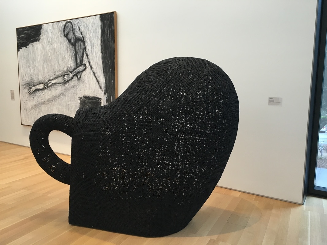 There are many people in the history of art whose works I adore, but the one work of their's I have access to is not my fave. Martin Puryear is an artist who I have been a fan of since I came across his stuff at the MoMA years ago. Just about the only piece there that I did not connect with was Dumb Luck. The whole Dumb Objects thing is weird to me, and here the name seems to refer to the shape of the piece, roughly lock-like, but at the same time, calling to mind a shoe. Or a coffee cup. Or a pacifier. But it's none of those. It's a dumb object; it's of a form that is useless, dumb, functionless, like all art, right? The problem for me here, and not with at least passingly similar works by the likes of Ruth Asawa, is that it has nothing beyond that. Yes, I get that it's kinda the point here, but there is making that point with something like Asawa's hanging 'baskets' that creates something in the space where it is exhibited, while this, this is just there, not just a dumb object, but an object that draws you in with the promise of 0% payoff. And that's what Puryear is really good at! He draws, he leaves breadcrumbs for you to follow, but in his other work (and the 2008 MoMA exhibit demonstrates it beautifully), you don't feel like you've been led into a field and left alone. Here, that's what I feel, and it's annoying more than thoughtful.  A look at a piece in the Anderson that I completely over-looked... I mean saw beneath... Comments? [email protected]  I love this gallery, but am not thrilled with this piece personally, though I completely get why it's one of the most important in the Anderson Collection, and absolutely adore how they've positioned it as a focal point, a defining aspect of the most important room of the museum! 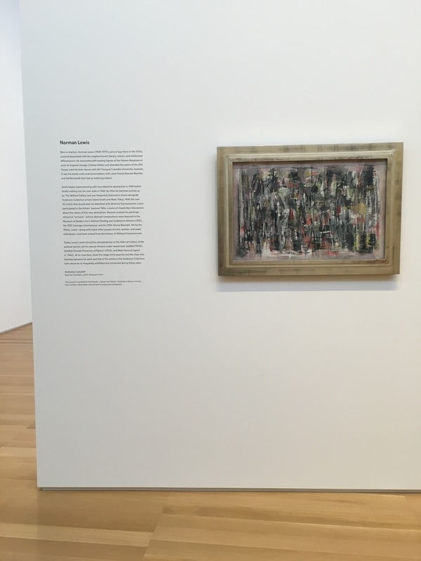 Norman Lewis is one of the very few African-Americans you read about when looking into the art of the era that brought us Abstract Expressionism. He was often exhibited alongside the works of the rest of the New York School. He was a master, but after being considered a major figure at the time, he was shunted to the side in the following decades, which is a shame as I find his work to be incredibly engaging. The inclusion of three of Lewis' work as a temporary exhibition is a very nice touch, especially since the three works are hung on the free-standing wall that has the Pollock work Lucifer on the other side. The piece Untitled from 1949 is a joy. I had only once seen a Lewis painting, and it was far more like the larger canvas, also Untitled. Here, Lewis is working in rough-hewn geometry, seeming to create a series of somewhat hazy intersecting and interlocking triangles. The effect is impressive, as it brings the eye not to the pinnacle of the forms, but to the splashes of color that are present at random intervals. Those alone made me wonder what was the idea here - to create an image which celebrated the colors presented by giving them room to land thoroughly, or was it to show them being consumed by the black and grey, as if they had once ruled the canvas and now the darkness was seeping in from all side.
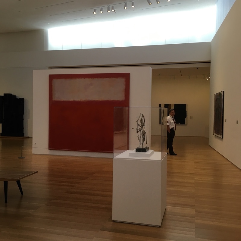
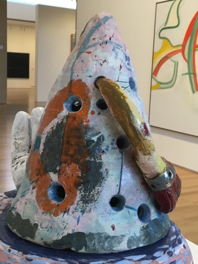
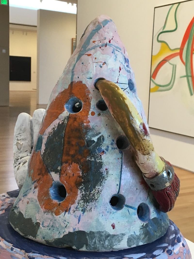
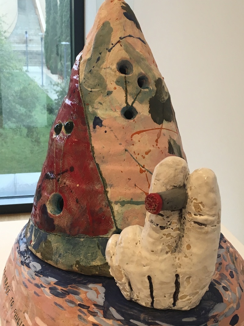
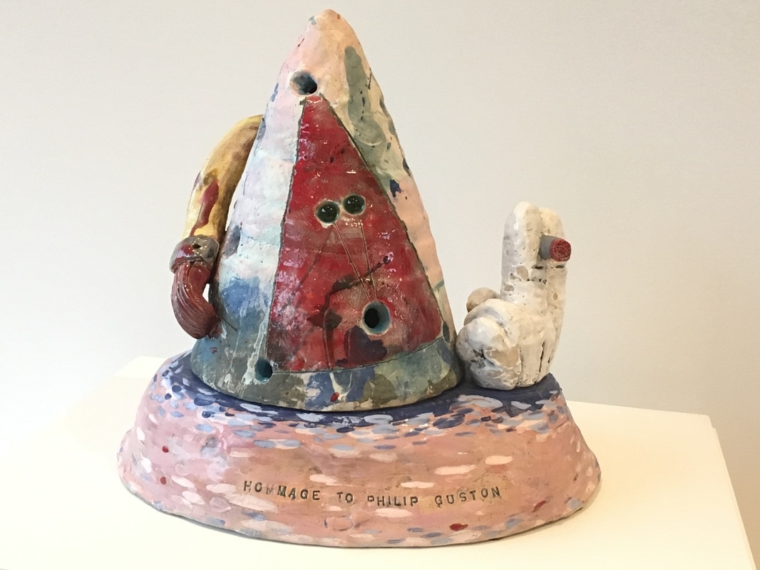
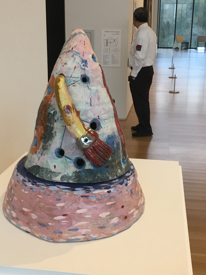
This work was not my favorite of the Lewis pieces, but it was the one I spent the most time with on two of my visits.  What of Robert Motherwell, his great black swatches in the center of the canvas, his quick globs of depth seeming to fester, infecting with other colors present? What did he mean by this, this haunting of a painting that seems more suited to the rambling than of any sort of conversation. I love Motherwell for his distance, his inability to allow you in. Even his series of Elegy for the Spanish Republic, a title worthy of mournful celebration, is nothing more than a collection designed to serve paint as sticking place. This work, where the black is front, the taupe behind, the white still further away, is worthy of inclusion in his best, but it is not so easily defined. It is neither map nor tombstone nor milemarker nor invitation. it is, instead, a work that feels like a work, and not one to be taken overly lightly. 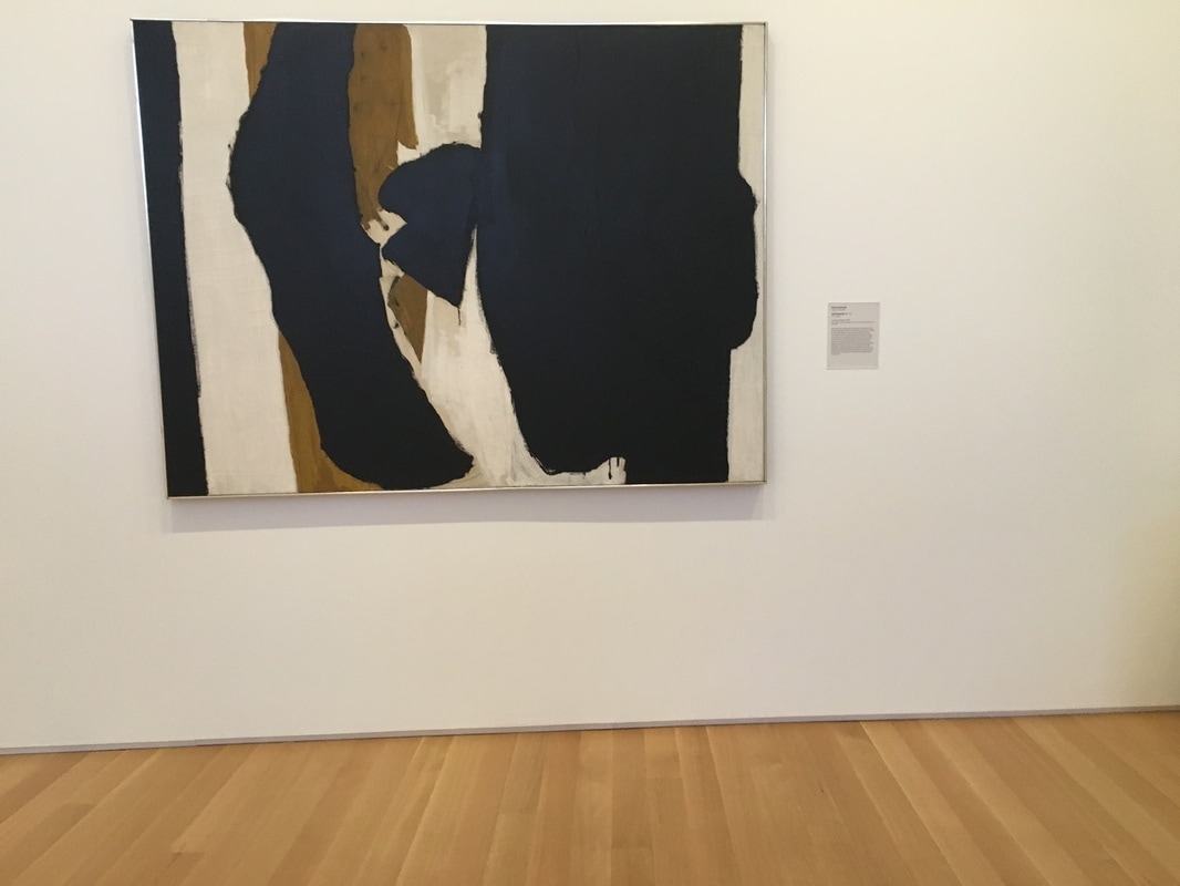 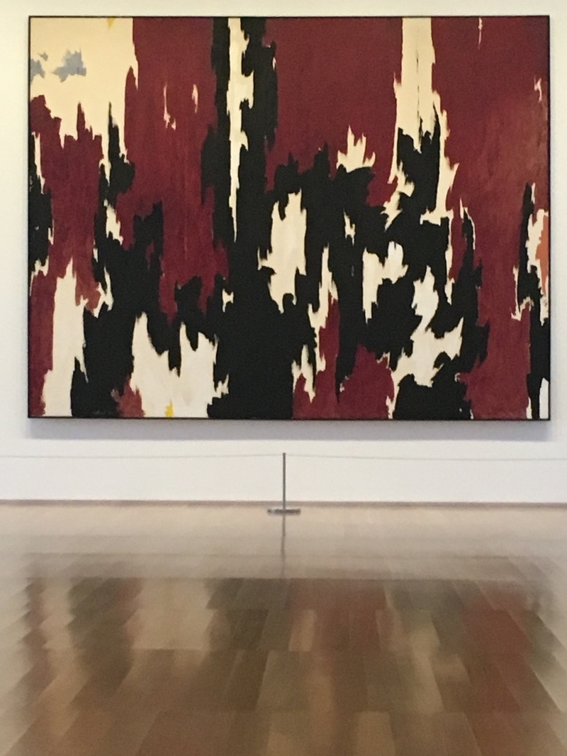 There is a set of stairs in the Anderson. It takes visitors from the first floor to the second where the vast majority of the art sleeps. As a rule, whatever you experience when you come to the top of the stairs is the focal point. At the top, on the wall facing you, is a Clyfford Still. Clyfford Still is going through a resurgance. He is one of the featured artists in the major Abstract Expressionist exhibit in London. While Pollock, Rothko, Motherwell, and deKooning have all become household names, Still was the one who came to abstraction first. The piece in the Anderson is large, and to my eyes, one of the most beautiful pieces in the entire collection. The contrast between the reds, blacks, and whites allows the mind to go from edge to edge of the surface, making it impossible to travel the distance in a straight line. The borders formed contain nations, zones, territories of pure colors, but they are full of weight. It is not a light piece, not like the MItchell around the corner, but it is also not nearly the AbEx impression as is given off by the Pollock, Rothko, or Frankenthaler in the collection. The feeling is something new, different, and when I first saw it, I could not place what I was experiencing. 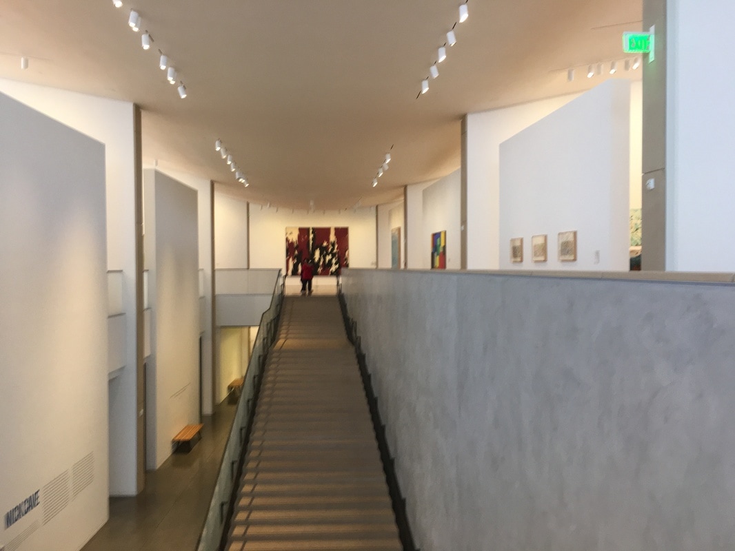 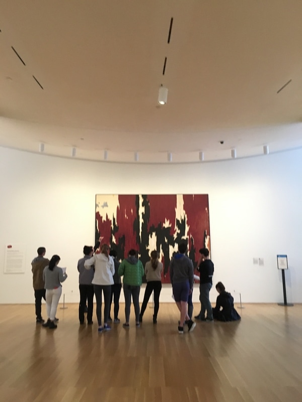 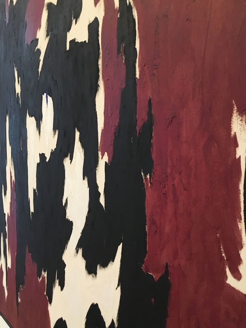 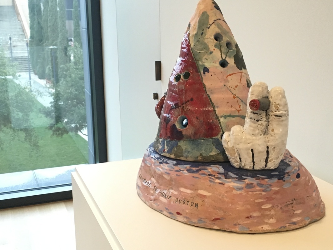 I am learning more and more about ceramics. Between Poncho Jimenez and David Gilhooly, I've come to Jesus on it. Of course, Robert Arneson, the Patron Saint of Three Minute Modernist and father of the Funk Art movement, has helped on that front. The work in the Anderson Collection, Homage to Philip Guston is just about the perfect reaction to the passing of the legendary artist in 1980. Guston, who famously moved away from Abstract Expressionism into a figurative form that folks have called Cartoony, and I tend to consider as a part of Funk. The work by Arneson is the perfect expression of Guston; it shows his AbEx days and his cartoon style in a single 3D piece... along with a cigarette. The two Gustons just around thew way, show how this work is a synthesis of those ideas, and I am so glad it's there!
|
Your HostChristopher J Garcia - Curator, Fan Writer, Podcaster, and a guy who just loves art. Archives
February 2019
|


 RSS Feed
