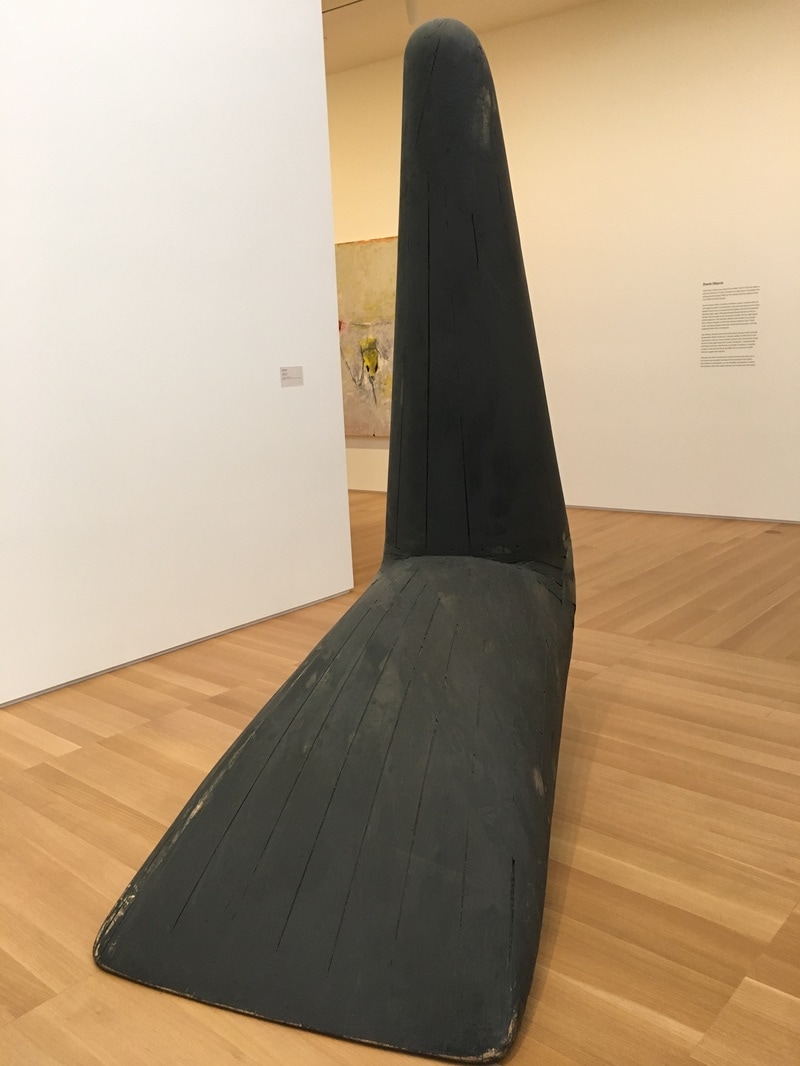
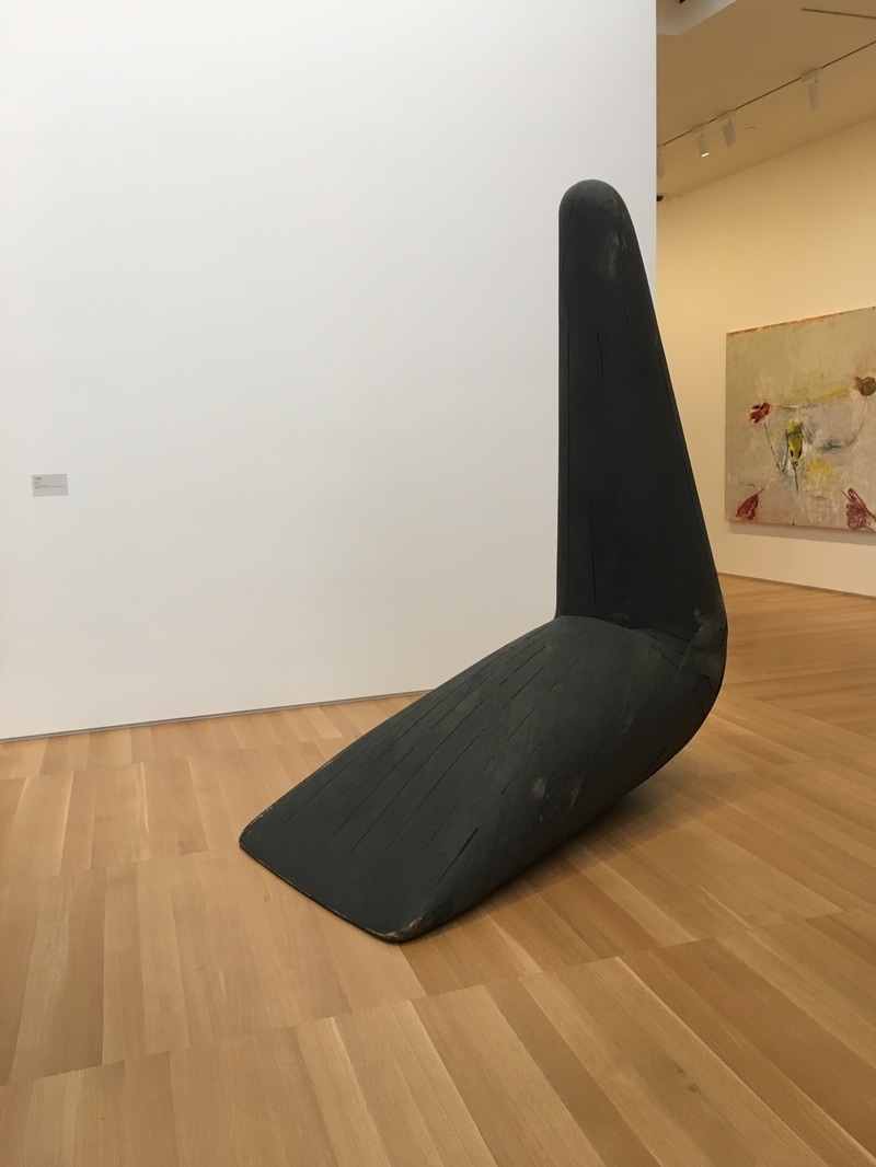
 A look at a Big Dumb Object, and why it might not mean anything, and why that may be the key to the entire piece...
0 Comments
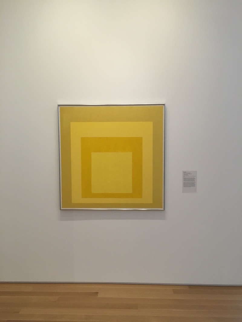
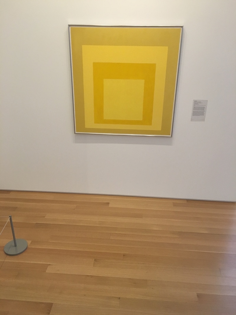
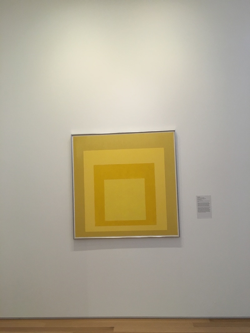
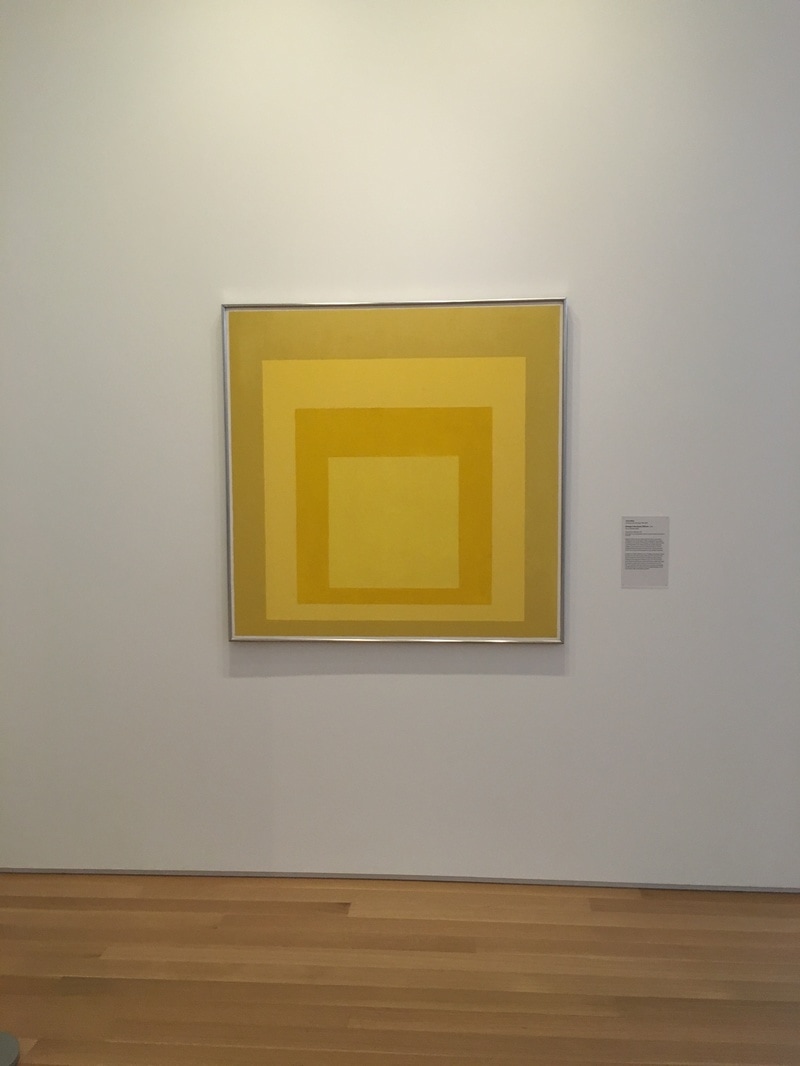
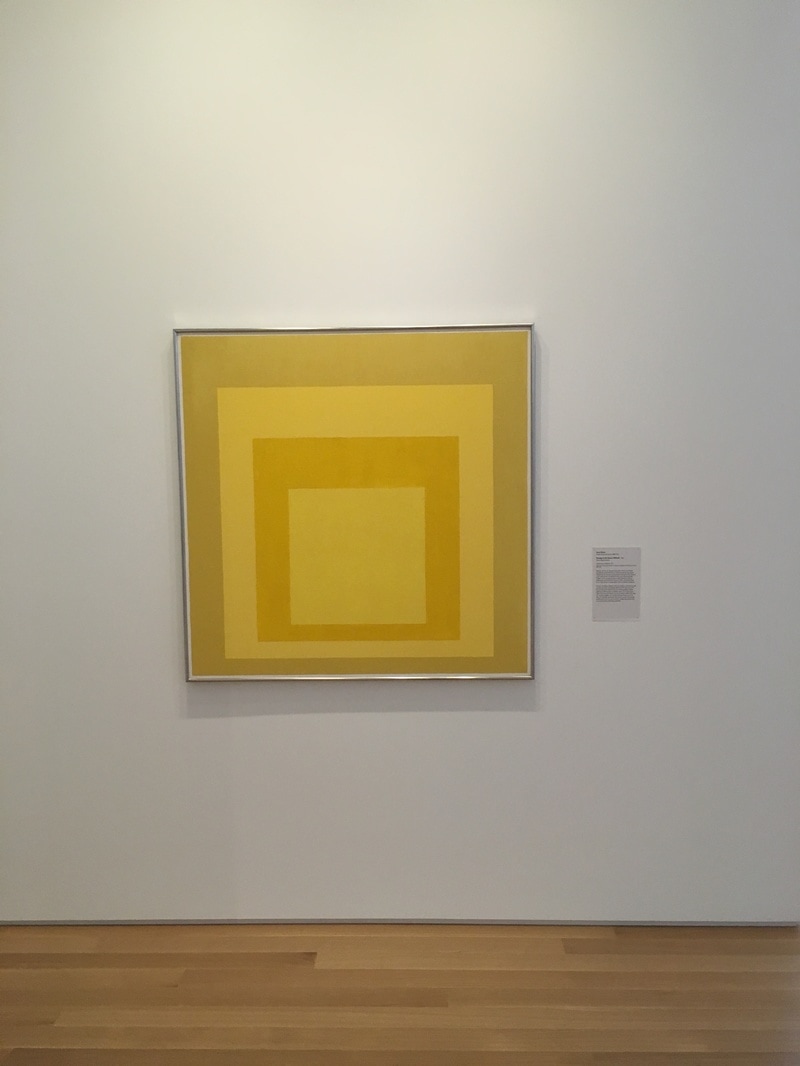
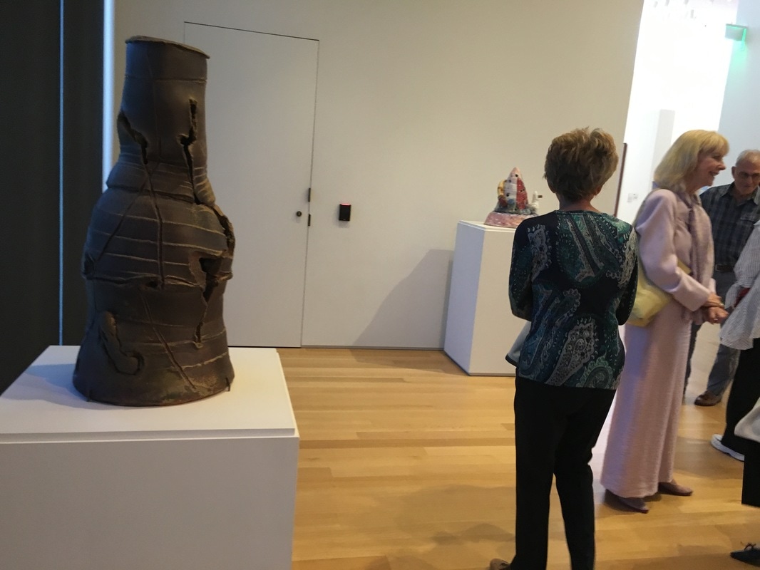
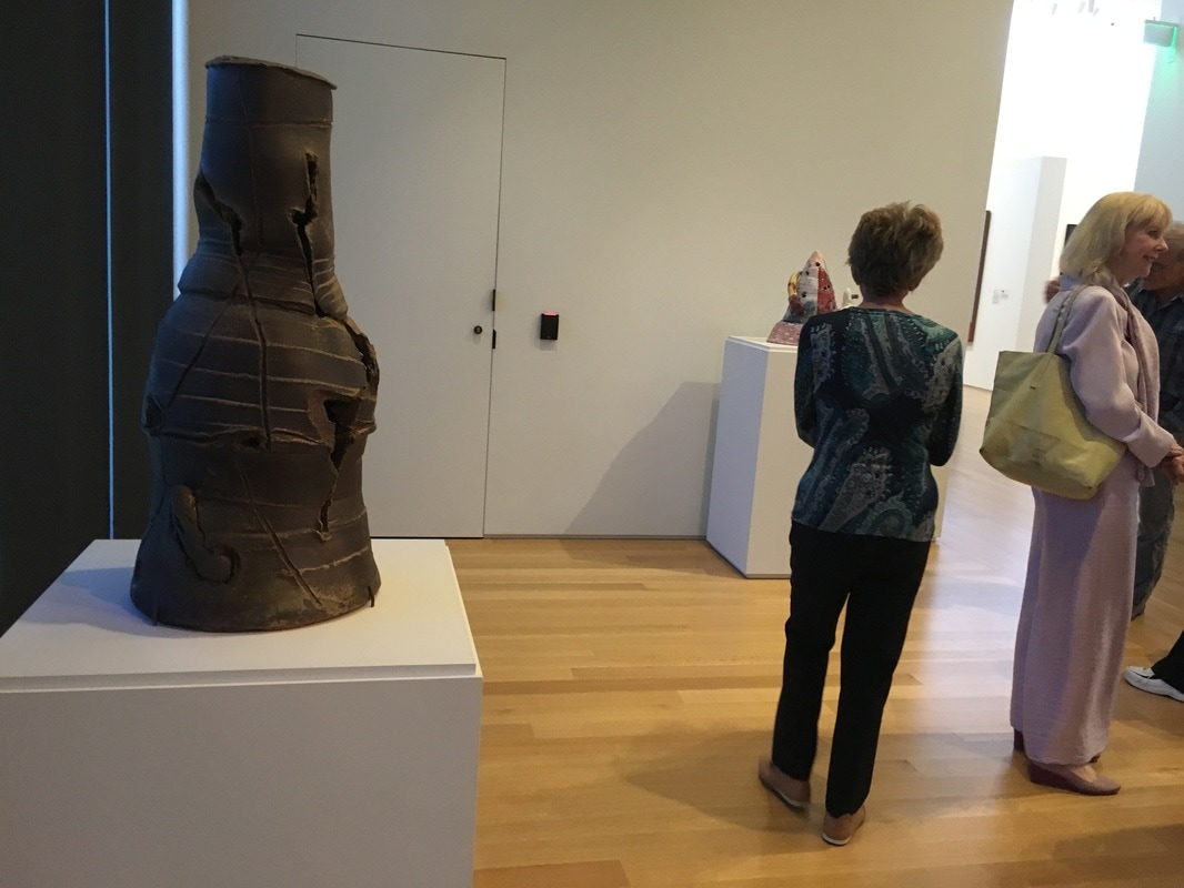
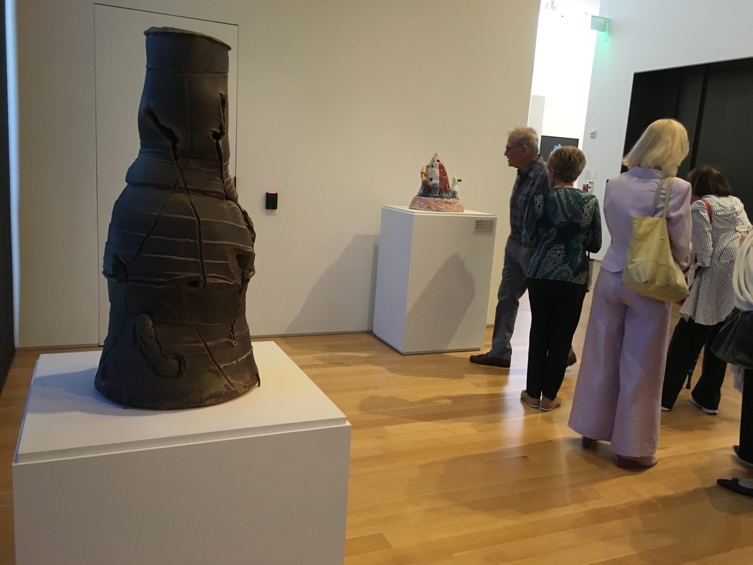
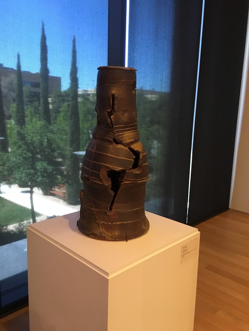
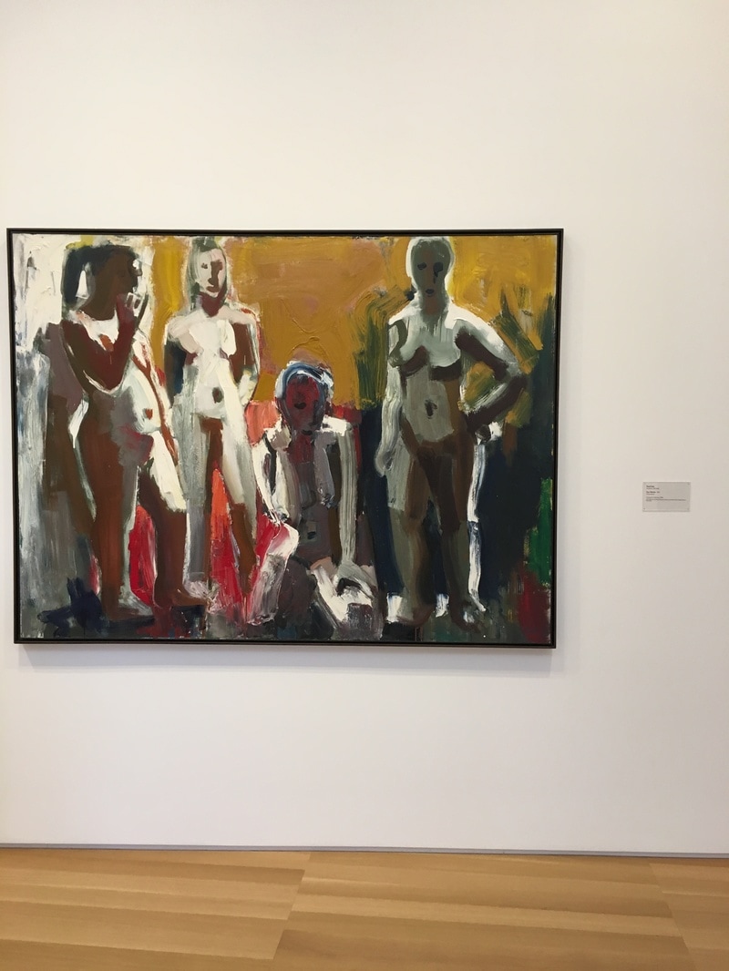
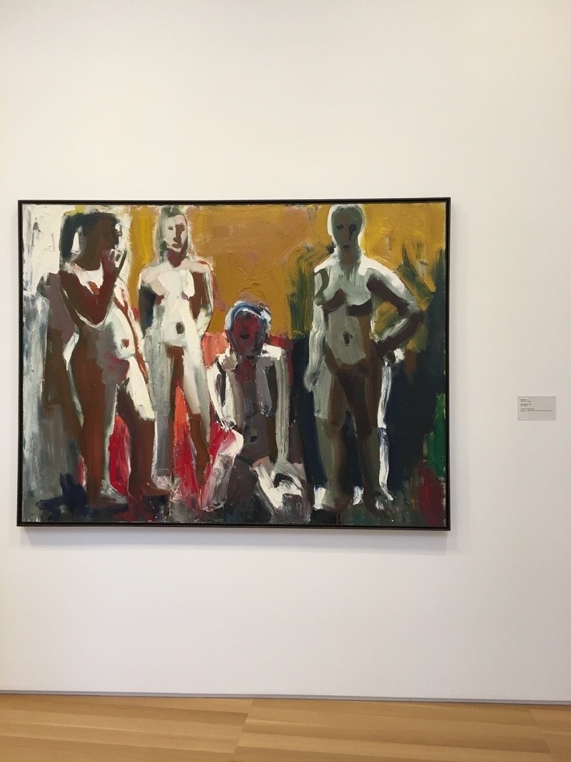
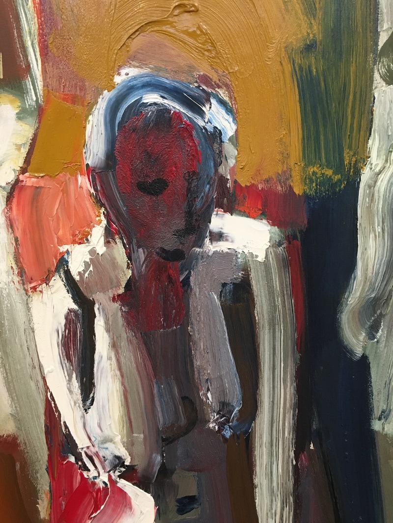
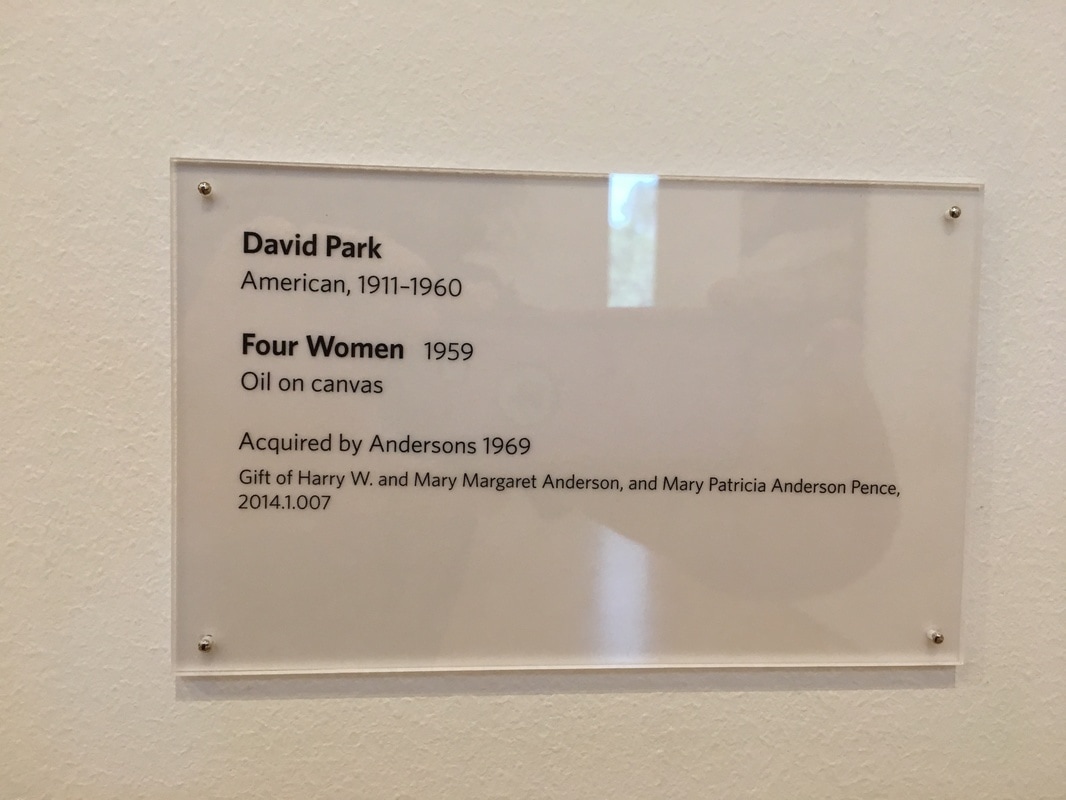
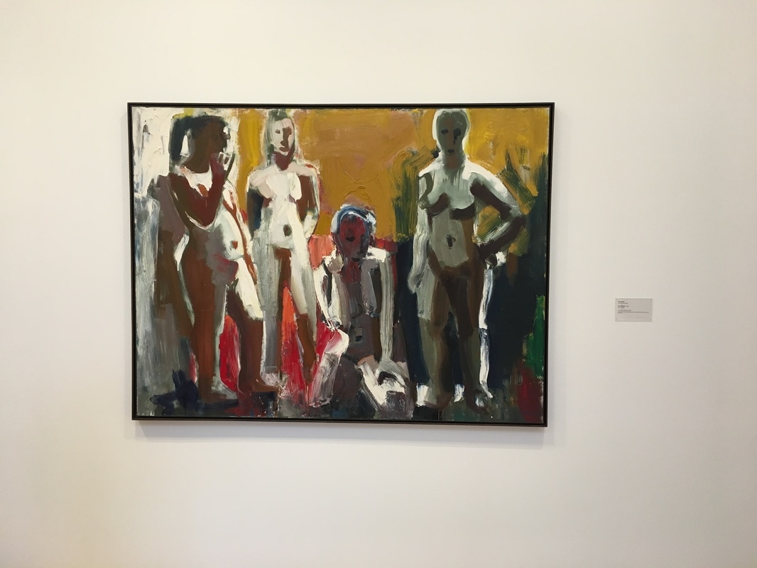
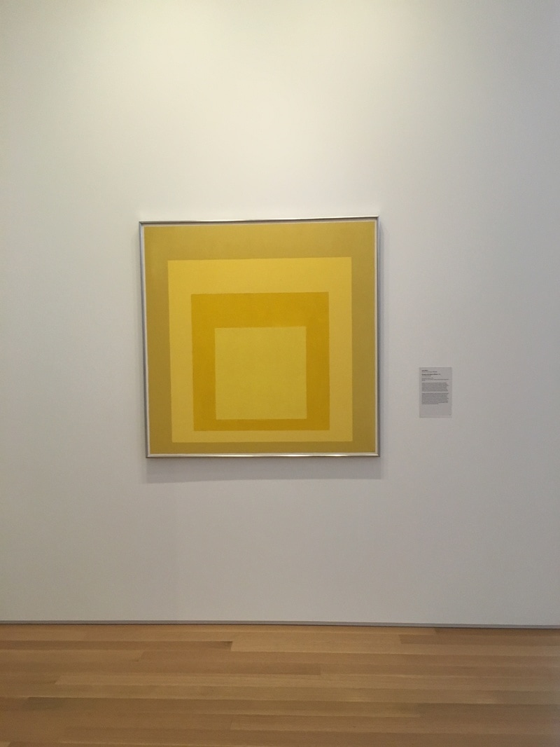 Hard Edge painting, which I really consider a subset of Minimalism more than anything else, can be difficult to grasp emotionally. Are these works about borders? Is it about the stark contrast between zones? Is it merely the intrusion of graphic design into High Art? Is it just painters who have straight-edges laying around they wanted an excuse to use? Any of these are possible, and Albers, who is far more important as the teacher of Ruth Asawa and Cy Twombley than an artist in his own right, produced some of the more interesting Hard Edge paintings, and this one, this is golden. The point here is not the square; the point is the lack of gradation. There is one color, a gentle almost mustard yellow, and then a brash, bold, in your face yellow, the color of Safeway mustard. There are these two feelings that this work is trying to bring about - a calm and a frenzied, a quiet and a loud. It does them both, completely depending on who is viewing it. 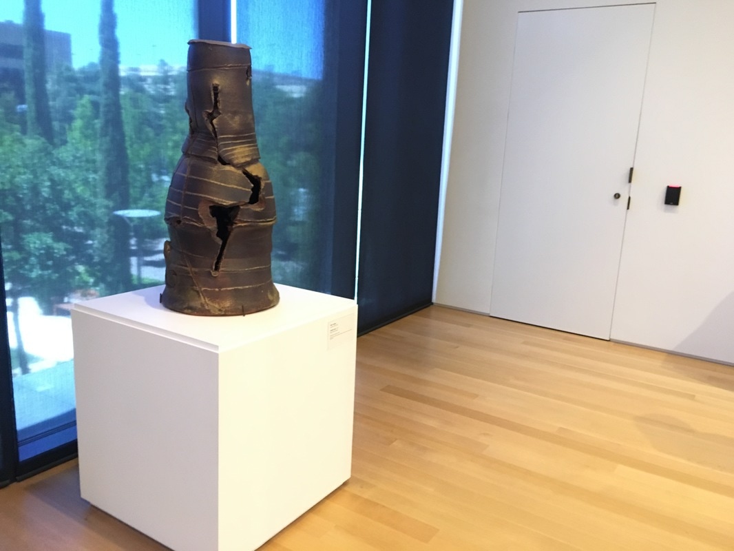 This piece is lovely, and to me, it feels as if it is a reference to the crumbling of industrial revolution. It is a melting boiler, or perhaps a smokestack, the kind you would find in mid-19th century England. There is the reading that is a vessel that is supposed to have been turned away from its use, instead, it is an useless art piece. I can see that, but at the same time, it feels as if that answer is too clipped, quick, not at all satisfying. 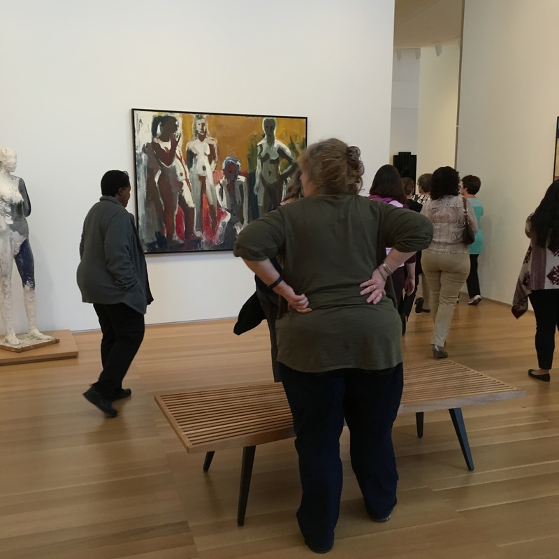 David Park is an artist who, had he lived another 20 years, would have been what de Kooning became. He began as yet another WPA-style realist in the mold of Paul Cadmus or Thomas Hart Benton, went into the AbEx sector briefly, but then returned, triumphant, to figuration and produced some incredibly important paintings in the 1950s, before falling to cancer in 1960. The work Four Women is about as remarkable as they come for Park. It is a staid piece, reserved, quiet. There is a sense, as in much of Park's work from 1955 or so, of Picasso's less cubistic works, of a primitivism that being abstracted from with an active brushstroke style. There is less of the stoicism of the Bay Area Figurativists of the time here, but no less a sense of ennui. In fact, this appears to be a painting about boredom, about allowing the colors that define four quadrants of the painting speak while the figures ignore it all for a distanced quiet introspection. The figures are not the focus of this painting; the focus is the color field work they are posed in front of. And perhaps that is the message of Bay Area Figurativism of the 1950s. Diebenkorn & co. may well have been saying that they were putting the figure in front, but at same time that it is not the execution of these figures that was important. What was important was that it was the same expression of the Abstract Expressionists, only using a recognisable form to gather the viewer in so that they can latch. |
Your HostChristopher J Garcia - Curator, Fan Writer, Podcaster, and a guy who just loves art. Archives
February 2019
|


 RSS Feed
